

Plum Noir works best in kitchens when it is tested first, placed in a controlled area, and balanced with cream, walnut, brass or polished nickel, marble or quartzite, warm task lighting, and one or two softer accents like blush or olive. It is darker and browner than aubergine, more purple-burgundy than black, and much more mature than glossy grape. The strongest plum noir kitchen ideas use the shade where its blackened wine undertone can feel dramatic without swallowing the whole room.
Plum Noir is not ordinary purple. In a kitchen, it behaves more like blackened plum, wine, burgundy-brown, and smoky berry layered together, which means the surrounding materials matter just as much as the paint.
These plum noir kitchen ideas focus on grown-up placement, warm lighting, cabinet color, stone, hardware, textiles, dishware, and low-commitment accents. The goal is a dark plum kitchen that feels mature and dimensional, not gloomy, novelty, or overly sweet.

Recommended Products


You Might Also Like These Blog Posts
- Aubergine Kitchen Ideas
- Burgundy Kitchen Ideas
- Moody Kitchen Ideas
- Quiet Luxury Kitchen Ideas
- Warm Neutral Kitchen Ideas
1. Test a Blackened Plum Paint Sample

Paint testing is the first real step because Plum Noir changes quickly with light. In one kitchen it can look wine-plum, in another it can read almost black, and under cool bulbs it may drift toward grape or muddy brown. Paint a large sample board and check it in morning light, under task lighting, and after sunset. Hold it beside counters, flooring, backsplash tile, hardware, and any wood tones. If the sample loses its burgundy-brown depth and becomes flat purple, keep looking. Move the sample vertically too. A color that works on an island side can feel heavier on a full-height pantry wall.
2. Paint Lower Cabinets Plum Noir

Lower cabinets are a strong place for Plum Noir because they add depth without darkening every vertical surface. The color grounds the kitchen while cream uppers, warm stone, or pale walls keep the room lifted. Use this approach if you want dark plum kitchen cabinets without committing to a fully color-drenched room. Plum Noir lowers look especially good with walnut shelves, aged brass pulls, cream counters, and warm under-cabinet lighting. Keep the backsplash quieter so the lower run feels deliberate.
3. Use Plum Noir on the Kitchen Island
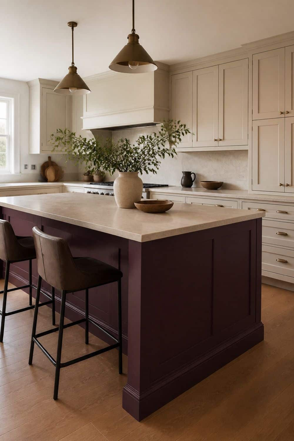
Kitchen islands give Plum Noir a contained focal point. The color can feel dramatic from the dining or living area without asking every cabinet in the kitchen to carry the same intensity.
Test the island color against flooring, stool upholstery, counter material, and the sight line from adjoining rooms. A dark plum island works best when the perimeter cabinetry or walls are calmer. If the island already has a heavy stone top, choose a softened plum finish rather than a glossy, saturated purple.
4. Color-Drench a Small Pantry Interior

Pantry interiors are a low-risk way to use Plum Noir with a lot of drama. The color appears when the doors open, then disappears again, which makes it ideal for cautious color lovers. Use dark plum paint or peel-and-stick wallpaper on the back wall of a pantry, larder, or tall cabinet.
Add warm lighting inside so the color does not go black. Cream bins, walnut trays, brass labels, or clear jars can keep the hidden zone organized and grown-up. That small hidden area can carry more drama than an open cabinet run because it is seen in short, controlled moments.
5. Paint a Beverage Cabinet in Smoky Plum

Beverage cabinets can carry Plum Noir beautifully because the shade already has a moody, evening quality. Smoky plum makes glassware and bottles feel more considered without turning the whole kitchen dark.
Use the color on cabinet interiors, doors, or a small built-in beverage nook. Add a picture light, glass shelves, or brass hardware if the area needs glow. Keep the bar edited so it feels like a polished dark-plum moment rather than clutter in a dark box.
This is also a good place to use the deepest version of the color, since the footprint is smaller than a full cabinet run. Check shelf depth and door swing before adding lighting, so bottles and glasses still move in and out cleanly.
6. Pair Plum Noir With Walnut Shelves

Walnut supports the brown undertone in Plum Noir and keeps the color from looking synthetic. The wood adds natural depth, which is exactly what a blackened plum kitchen needs.
Use walnut floating shelves, stool legs, cutting boards, cabinet interiors, or a small open-shelf moment near the plum area. Avoid pairing Plum Noir only with black and white, which can make it feel harsh. Walnut gives the palette a warmer, more mature base.
If the shelves will hold dishes, keep the display mostly cream, clear glass, or stoneware so the walnut and plum remain visible. Leave enough open shelf space around the wood so the plum color and walnut grain can both read clearly.
7. Use Cream Walls Instead of Stark White
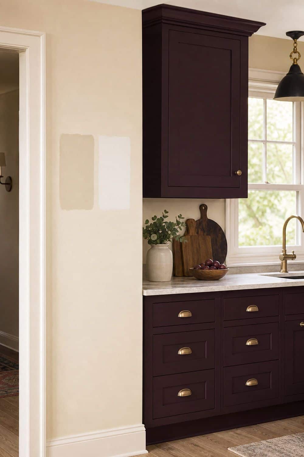
Cream walls soften Plum Noir better than stark blue-white paint. A warmer wall color helps the burgundy-brown undertone show, while cold white can make the plum look sharper and more artificial. This is especially important in kitchens with dark plum cabinets or low daylight.
Test cream, warm white, and ivory samples next to the plum before choosing. The wall color should give relief without creating a harsh contrast line around every cabinet. If the cream turns yellow beside the plum, move toward a cleaner ivory or warm white sample.
8. Add Blush Tile for Tonal Softness
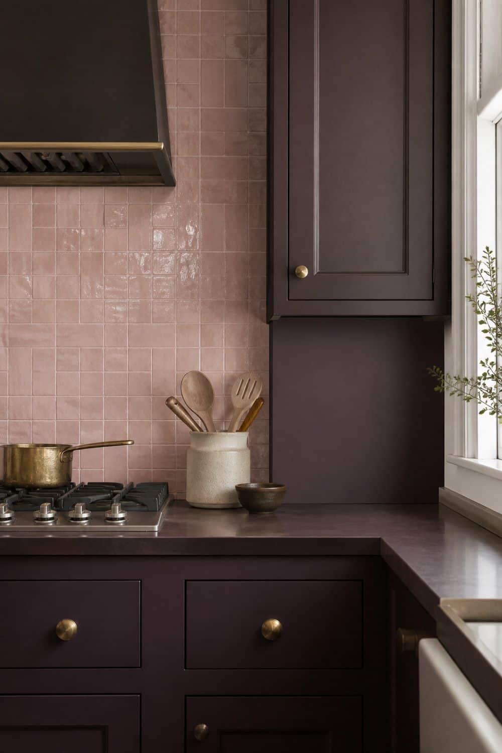
Blush tile can be a beautiful tonal neighbor for Plum Noir when it reads like plaster pink, not candy pink. The softness keeps the dark plum from feeling severe. Use blush on a backsplash, bar nook, or small wall tile area.
Pair it with cream grout, walnut, and aged brass so the palette feels warm and integrated. Avoid bright pink tile with cool undertones, which can pull Plum Noir toward novelty purple. Keep the grout and nearby counters quiet so the blush reads tonal rather than sweet.
9. Choose Oxblood Marble or Viola Stone

Stone with oxblood, violet, burgundy, or plum movement can connect the palette in a very grown-up way. Calacatta Viola-style marble, wine-veined stone, or a dramatic remnant can make Plum Noir feel intentional. Use samples before committing, because the veining can shift from elegant to overpowering quickly.
A small backsplash, shelf, ledge, or island surface may be enough. Let the stone echo the plum rather than competing with it for every inch of attention. Use the stone in one decisive place, then let simpler surfaces keep the room from feeling busy.
10. Use Honed Cream Quartzite for Relief
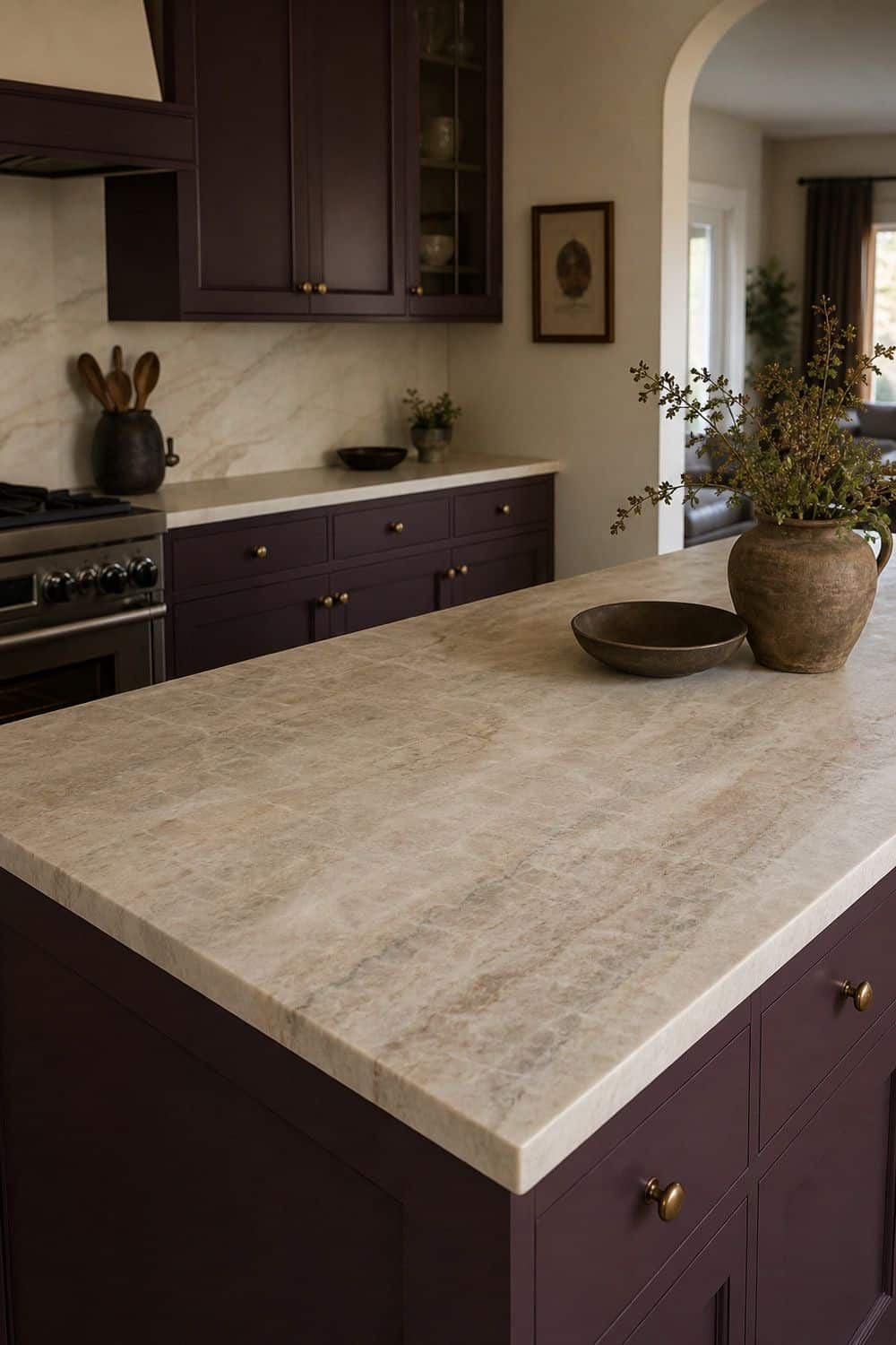
Cream quartzite gives Plum Noir breathing room. It is a better light counter direction than icy white if you want the kitchen to stay warm and layered. Choose honed or softly polished stone with cream, taupe, beige, or warm gray movement. The counter should lift the dark plum without making it look harsh. This pairing works especially well when dark cabinets need a lighter counter and a quiet backsplash. Bring the sample home before ordering, because showroom lighting can hide yellow, gray, or pink undertones.
11. Warm Plum Cabinets With Aged Brass Pulls
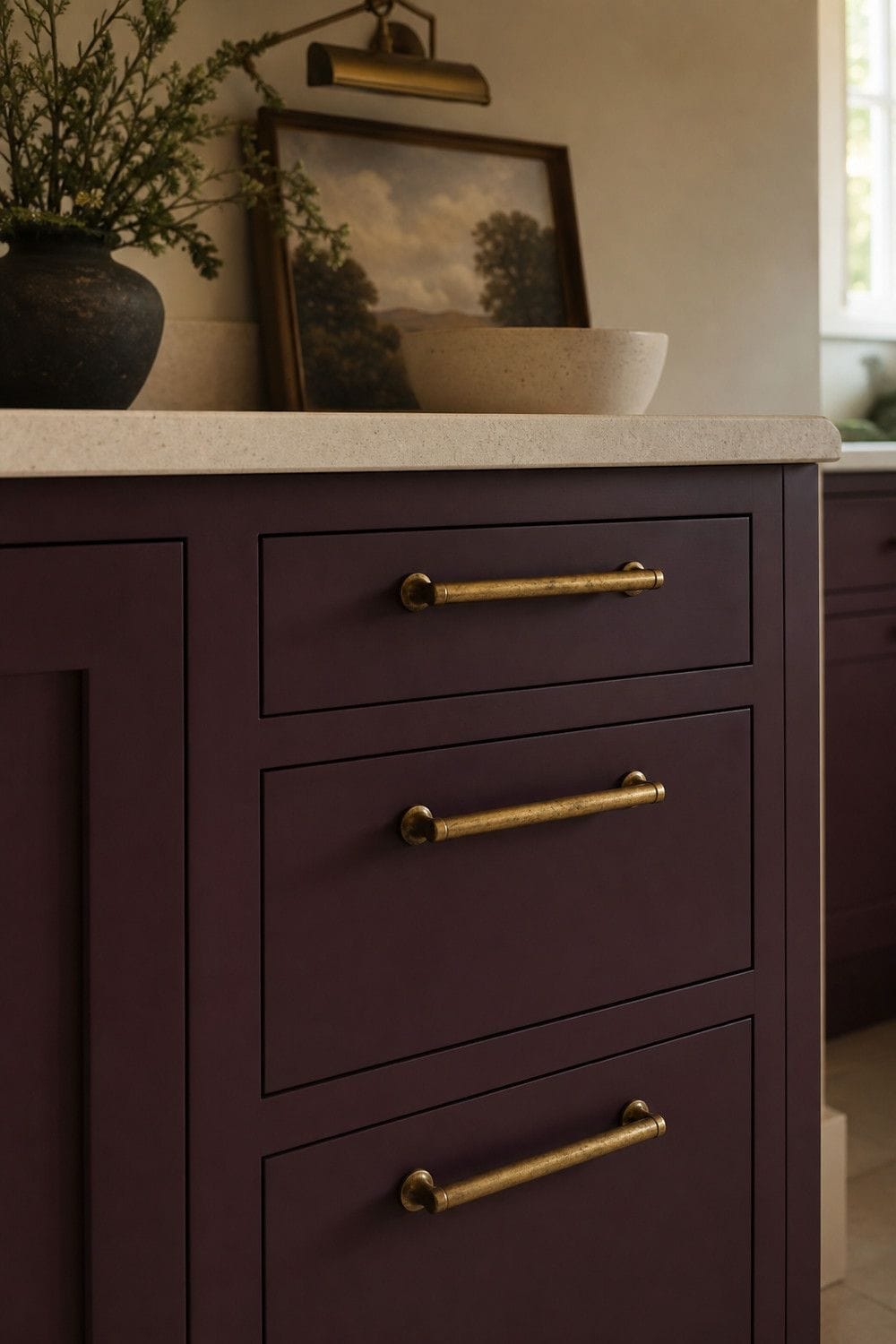
Aged brass works with Plum Noir because it adds warmth without turning the kitchen into shiny costume glam. The muted metal brings out the burgundy and brown undertones in the cabinet color. Choose pulls with enough presence for dark cabinets, but keep the shape simple.
Long, ornate hardware can make the color feel theatrical. Repeat the brass in a small way through a picture light, shelf rail, or hinge finish if the kitchen needs continuity. If the pulls are large, keep other brass details smaller so the kitchen does not look over-accessorized.
12. Try Polished Nickel for a Cooler Edge
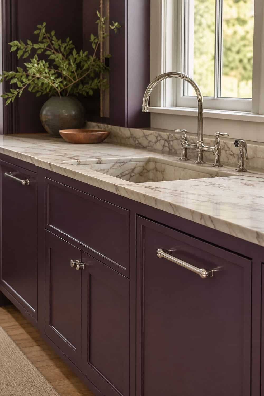
Polished nickel gives Plum Noir a sharper, more tailored edge than brass. It works well when the kitchen also has marble, black accents, or a quieter luxury direction. Use nickel knobs or pulls if aged brass feels too warm for the room.
The finish should look intentional beside the faucet, lighting, and appliances. Nickel can keep a dark plum kitchen from feeling too wine-bar heavy, especially when paired with cream stone. Keep nickel consistent with the faucet or lighting so it feels chosen, not mixed in by accident.
13. Use a Soft Black Faucet
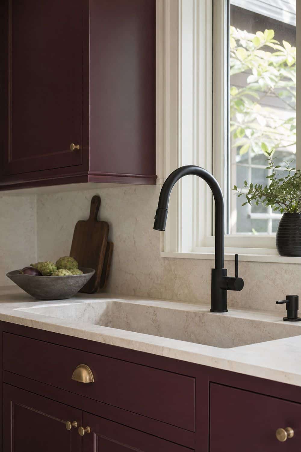
A soft black faucet can sharpen Plum Noir, but it needs enough cream, stone, or wood around it. Otherwise the palette can slide into an almost-black kitchen where the plum undertone disappears. Use matte or satin black at the sink, then keep other black elements limited.
A faucet, a few stools, or a light fixture may be enough. Plum Noir should still read as blackened plum, not as black cabinets with purple hints you only notice in bright sun. Let the faucet be the dark accent at the sink instead of repeating black on every nearby detail.
14. Light Dark Plum With Warm Task Strips

Warm task lighting is not optional with dark plum cabinets. Plum Noir can look flat or black in shadow, especially under uppers, near the sink, or along prep counters. Add warm under-cabinet lighting where you chop, rinse, plate, and make coffee.
Dimmable strips are useful because the kitchen needs bright task light for cooking and softer glow in the evening. Avoid cool blue light, which can make the plum look harsh and less brown. Use warmer bulbs after sunset so the cabinet color keeps its wine-brown depth at night.
15. Add a Picture Light Over Plum Shelves
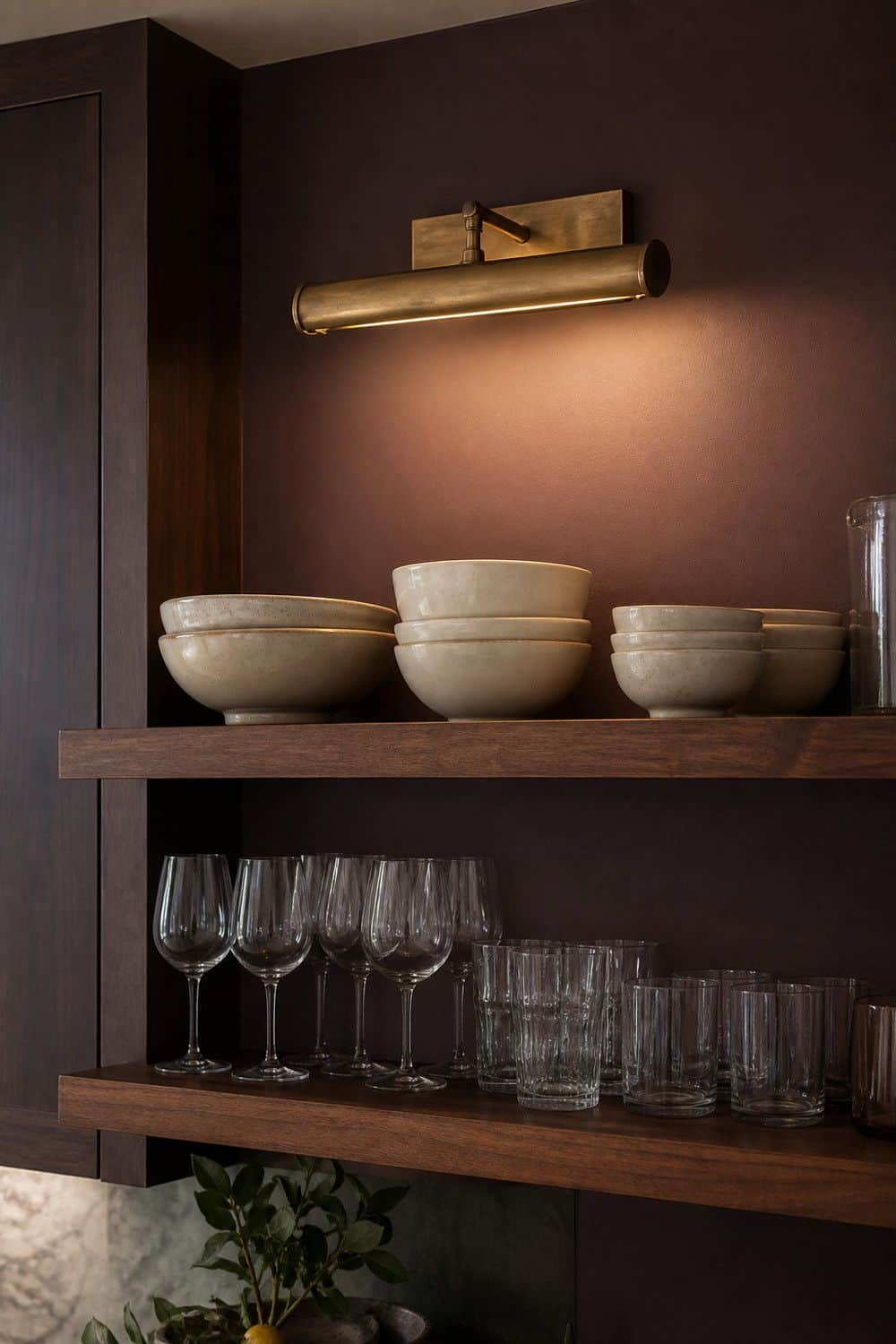
A picture light can make a Plum Noir shelf, bar nook, or pantry wall feel intentional. It is not task lighting for chopping, but it gives vertical surfaces a warm glow. Use a brass picture light above walnut shelves, a beverage cabinet, or a display area with plum backing.
Keep the bulb warm and the fixture scaled to the shelf width. This small lighting layer helps the dark color look rich instead of shadowy. Use this accent where it highlights shelves or glassware, not where it competes with true task lighting.
16. Use Plum Zellige Behind a Bar Nook

Handmade-look plum tile can work beautifully in a contained bar nook, coffee station, or small backsplash. The variation in the tile keeps the dark color from reading as one flat purple wall.
Use low-contrast grout and test the tile near the actual lighting. Glossy tile is different from glossy grape paint, because the surface variation can feel handmade rather than novelty. Keep it contained if the rest of the kitchen already has strong cabinet color.
For a cooking backsplash, check cleaning needs before choosing a highly irregular tile surface. Choose smoother tile or tighter grout lines if wipe-downs matter more than texture in that spot.
17. Use a Plum Runner to Soften the Floor
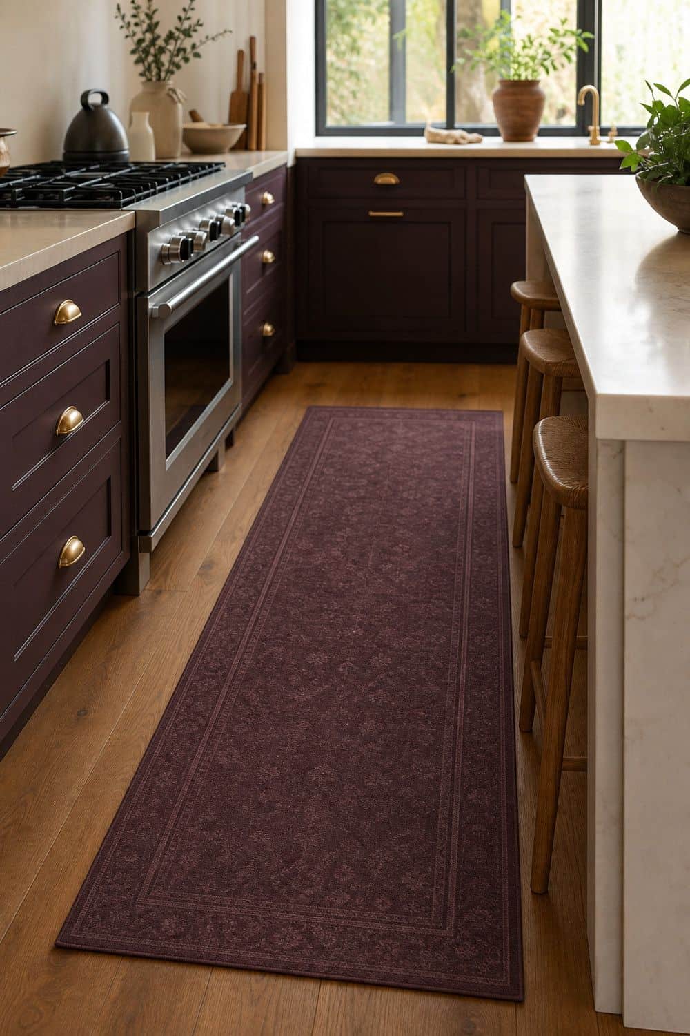
A runner is one of the easiest ways to test Plum Noir without changing cabinets or tile. It brings the color to the floor, where the shade can warm up white, cream, wood, or stone-heavy kitchens that need more depth.
Choose a washable low-pile runner in plum, wine, brown-plum, or muted burgundy. Pair it with walnut, black, cream, or aged brass so it looks tied to the kitchen rather than dropped in as a purple accessory. Avoid bright violet rugs if you want a mature effect, and keep the surrounding floor area clear enough for the color to read cleanly.
18. Hang Plum Cafe Curtains

Plum cafe curtains add softness near a window, breakfast nook, or sink without painting cabinetry. They are especially useful when you want the color at eye level but not across an entire wall. Choose linen, cotton, or a matte fabric that filters light.
Keep curtains away from the stove and any splash-heavy prep zone. A brown-plum or wine-plum fabric will feel more refined than a bright purple print, especially with cream walls and warm hardware. Let the fabric introduce movement and softness while the nearby surfaces stay calm and easy to wipe.
19. Add Deep Plum Stoneware to Open Shelves
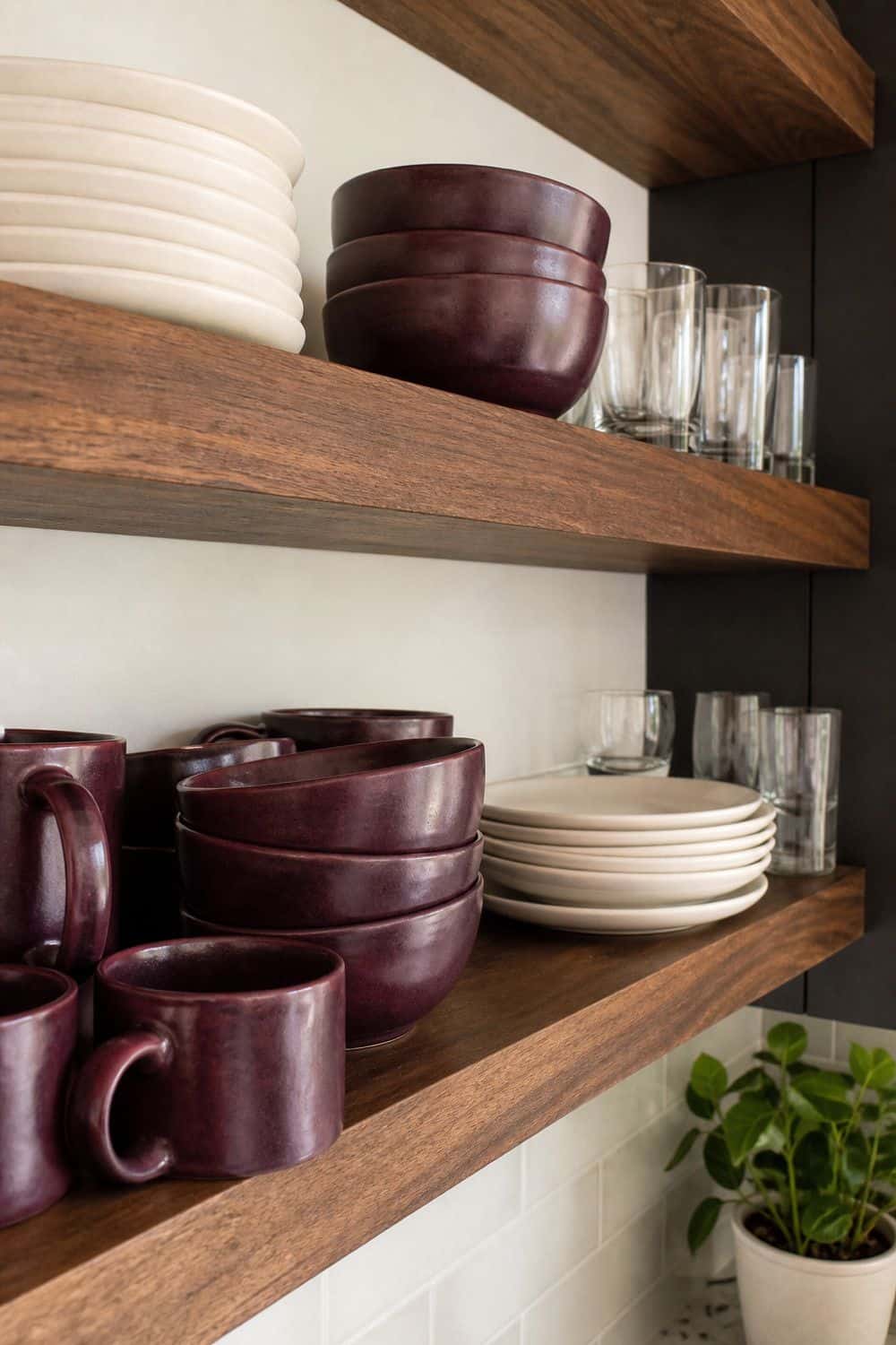
Deep plum stoneware is a subtle way to repeat the color on open shelves. One stack of bowls or mugs can connect to a Plum Noir island, pantry interior, or runner without making the shelves look themed.
Mix the plum pieces with cream plates, clear glasses, wood boards, or white serving bowls. Avoid filling every shelf with purple dishware. The color works best when it appears as a controlled echo, not a display wall. Keep the stack small enough that the shelves still function for everyday dishes.
20. Use Olive Green as a Grounding Accent
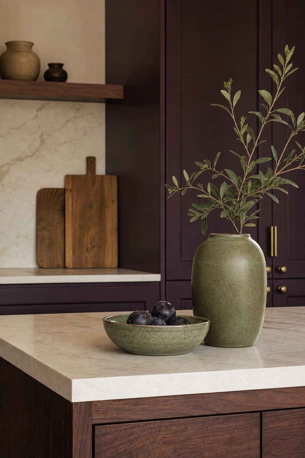
Olive green grounds Plum Noir because it feels natural and slightly earthy. It cools the red-purple undertone without making the palette icy. Use one olive bowl, planter, vase, or small textile near the plum area. The accent should feel like part of a material palette with walnut, cream, brass, and stone. Too much olive can turn the kitchen into a separate green-and-purple story, so use olive as a grounding note, not a second main color. A muted olive piece near wood or stone usually looks calmer than a bright green accent beside dark plum paint.
21. Add Chocolate Brown Leather Stools

Chocolate brown leather supports the brown undertone in Plum Noir and makes a dark island feel more grounded. It is warmer than black seating and less sweet than plum fabric. Check stool height, seat depth, and wipeability before choosing.
In a narrow kitchen, avoid bulky stool backs that crowd the island. Brown leather works best when the kitchen also has cream counters, walnut, aged brass, or another warm material to connect it. Leave enough clearance behind each stool so the island does not feel visually heavy or physically cramped.
22. Paint a Freestanding Hutch Plum Noir

A freestanding hutch, pantry cabinet, or sideboard is a smart place to use Plum Noir if you are not ready to repaint built-ins. It gives the kitchen a dark focal point that can move or change later.
Paint the piece in a matte or satin plum finish and keep the surrounding wall warm cream or soft white. Add simple brass, nickel, or black hardware depending on the rest of the kitchen. This is a good option for finished kitchens, older cabinet runs, or anyone testing the color before a larger remodel.
23. Avoid Glossy Grape Purple Finishes
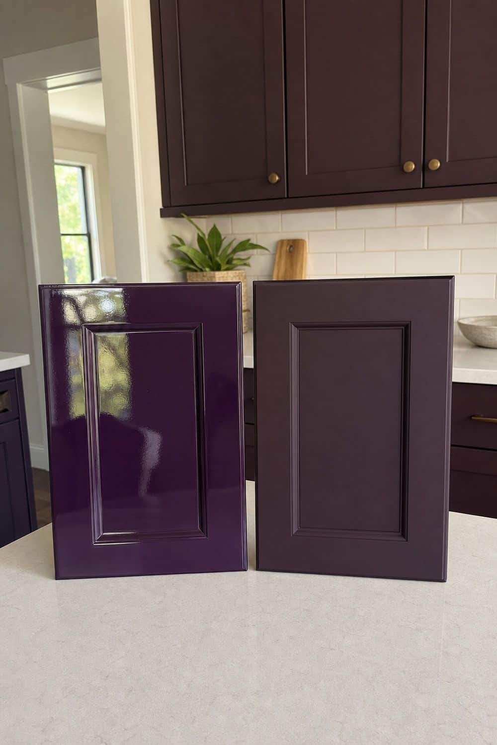
Glossy grape purple is the fastest way to make Plum Noir look novelty or dated. The mature version of the color needs depth, brown or burgundy undertones, and a finish that does not scream. Choose matte, satin, chalky, or softly sheened finishes.
Test samples beside natural materials like walnut, stone, and brass. If the color looks like candy under kitchen lights, it is not Plum Noir. It should feel closer to wine, berry, and shadow. If the finish looks candy-bright under bulbs, choose a muddier wine-plum before painting anything permanent.
24. Keep Plum Noir Distinct From Aubergine
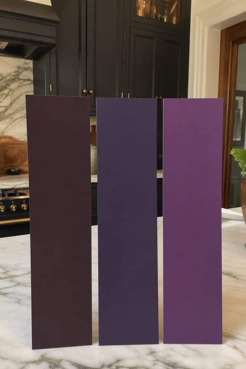
Compared side by side, Plum Noir should look smokier and more wine-brown than classic eggplant purple. Aubergine often reads as eggplant purple, while Plum Noir should feel blackened, smoky, and wine-like. Compare samples side by side instead of relying on color names.
Look at the undertone near cream paint, walnut, brass, and stone. If the sample goes too blue or too violet, it may be aubergine rather than the burgundy-brown plum direction this kitchen style needs. Use labels as a starting point, but let undertone tests decide which shade belongs in the kitchen.
25. Repeat Plum in Two Controlled Places
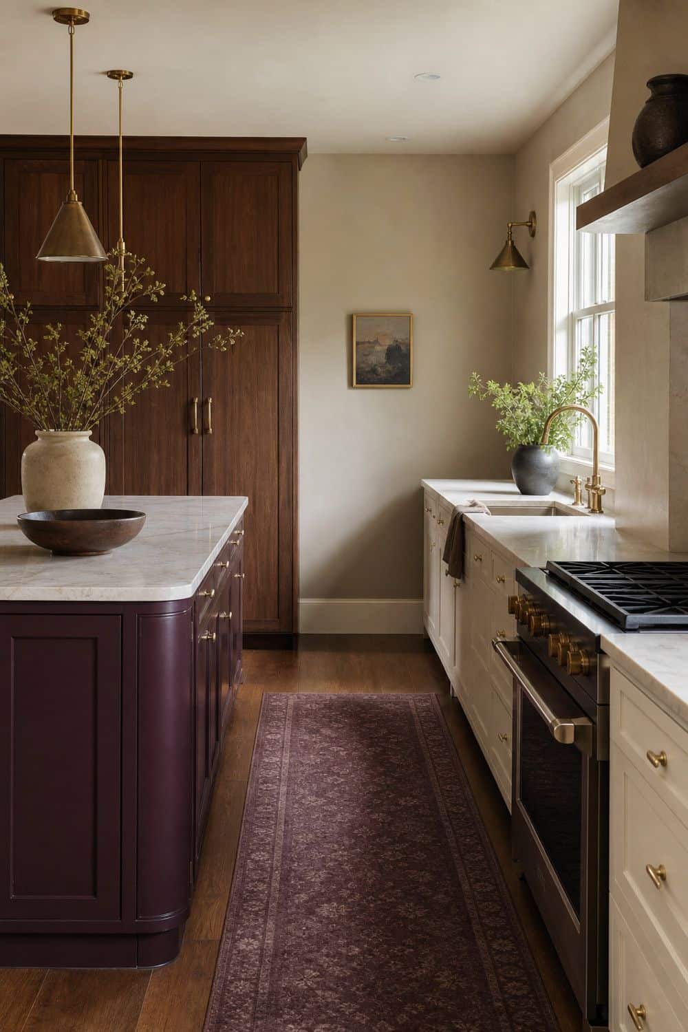
Controlled repetition keeps Plum Noir from feeling random. A kitchen can handle cabinets plus towels, an island plus a runner, a pantry interior plus stoneware, or tile plus cafe curtains.
Avoid scattering plum accessories across every surface. Too many little purple objects make the room feel themed instead of designed. Choose two controlled places, then let cream, walnut, stone, brass, olive, or chocolate brown support the color quietly.
Once the second plum moment is in place, stop and let the surrounding materials do the rest. After that, edit nearby objects before adding another accent.
How to Keep a Plum Noir Kitchen Mature
A mature Plum Noir kitchen starts with undertone control. The shade should read as blackened plum, burgundy-purple, smoky berry, wine-plum, or brown-plum, not bright purple, basic burgundy, or plain black.
Balance the color with cream walls, warm white, walnut, aged brass, polished nickel, soft black, blush, olive, chocolate leather, marble, quartzite, and warm task lighting. Use the strongest placements for bigger commitments, such as lowers, an island, a hutch, or tile. Use runners, towels, curtains, stoneware, and peel-and-stick wallpaper when you want dark plum kitchen style without repainting cabinetry.
FAQ
What color is Plum Noir?
Plum Noir is a very dark plum with burgundy, purple, and brown undertones. In low light, it can look almost black. In warm light, the wine, berry, and brown notes become more visible, which is why paint testing matters so much.
Is Plum Noir good for kitchen cabinets?
Yes, Plum Noir can be beautiful on kitchen cabinets when it is tested first and balanced with cream, walnut, stone, brass or nickel, and warm task lighting. It works especially well on lowers, an island, a pantry wall, or a beverage cabinet.
What colors go with Plum Noir in a kitchen?
Plum Noir pairs well with cream, warm white, walnut, aged brass, polished nickel, blush, olive, soft black, chocolate brown, marble, and cream quartzite. These colors and materials keep the shade warm, layered, and kitchen-appropriate.
How is Plum Noir different from aubergine?
Plum Noir is darker, browner, and more burgundy-black than aubergine. Aubergine usually reads more eggplant purple, while Plum Noir feels closer to wine, blackened berry, and smoky plum. Side-by-side samples are the easiest way to see the difference.
How do you use Plum Noir without painting cabinets?
Use a plum runner, cafe curtains, kitchen towels, stoneware, a freestanding hutch, peel-and-stick wallpaper, tile, art, or a pantry interior. These options let you test the color in controlled places before committing to built-in cabinetry.
Does Plum Noir make a kitchen look smaller?
It can if it is overused or poorly lit. Use Plum Noir on lowers, an island, a pantry, or a contained accent area if the kitchen is small. Cream walls, light counters, walnut, and warm task lighting help keep the room from feeling closed in.
What hardware works with Plum Noir cabinets?
Aged brass, polished nickel, soft black, and unlacquered brass can all work with Plum Noir cabinets. Brass warms the shade, nickel gives it a tailored edge, and soft black sharpens it when there is enough cream or wood nearby.
How do you keep a Plum Noir kitchen from looking too dark?
Use warm under-cabinet lighting, lighter counters, cream walls, walnut, limited black accents, and controlled color repetition. Avoid too many dark surfaces at once, and test the shade in the exact light where it will be used.
Final Thoughts
The best plum noir kitchen ideas treat the color as blackened plum with burgundy-brown depth, not as generic purple decor. Test the shade, choose a controlled placement, add warm lighting, and balance it with cream, walnut, stone, brass, nickel, olive, blush, or chocolate leather. When Plum Noir repeats in one or two intentional places, it can make a kitchen feel dramatic, mature, and deeply styled without becoming gloomy.
Last update on 2026-10-04 / Affiliate links / Images from Amazon Product Advertising API
