
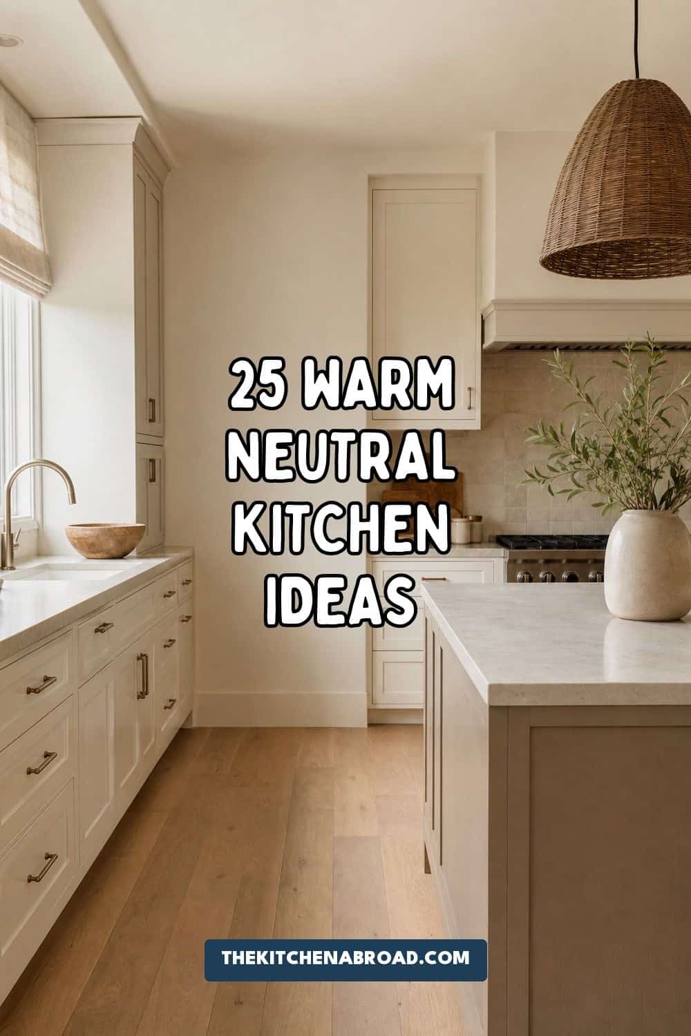
The best warm neutral kitchen ideas use cream, mushroom, taupe, oat, greige, wood, stone, soft metals, texture, and warm lighting so the room feels modern but still inviting. Avoid cold white, flat beige, builder-basic gray, and mismatched undertones by testing every finish in the actual kitchen light. A warm neutral kitchen works best when one base color, one deeper neutral, one wood tone, one stone surface, one metal finish, and one texture layer all relate to each other.
Warm neutrals are not just beige with better lighting. They are a controlled palette of cream, oat, mushroom, taupe, greige, stone, walnut, oak, brass, nickel, linen, tile, and soft black details.
If you are collecting warm neutral kitchen ideas for a remodel, refresh, or low-commitment update, start with the surfaces that carry the most visual weight. Cabinets, walls, counters, backsplash, lighting, hardware, and wood tone matter far more than extra decor on the counter.
Top Recommended Products


You Might Also Like These Blog Posts
- Cream Kitchen Ideas
- Natural Wood Kitchen Ideas
- Earthy Kitchen Ideas
- Terracotta Kitchen Ideas
- Olive Green Kitchen Ideas
1. Choose Warm White Cabinets Instead of Stark White
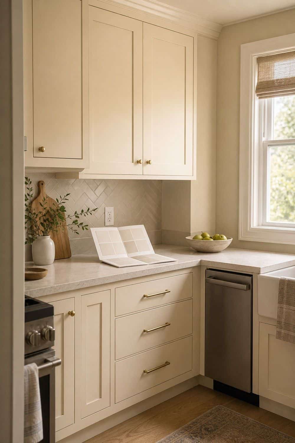
Warm white cabinets are softer than bright gallery white, especially in kitchens with wood floors, brass hardware, stone counters, or north-facing light. Look for creamy whites with a little beige, putty, or ivory in them rather than a blue-white cabinet paint.
Sample the color vertically on a cabinet door, not just on the wall. Cabinet fronts catch shadows differently, and the wrong white can make a warm neutral kitchen feel chilly before any decor is added, even with pretty wood and brass nearby.
2. Paint Cabinets a Mushroom Neutral
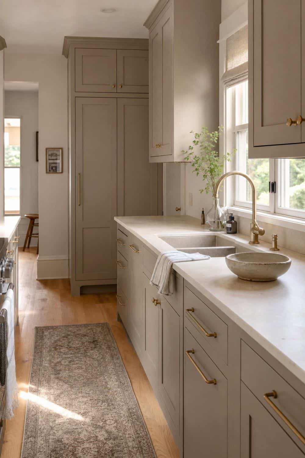
A mushroom cabinet color sits between beige, gray, and taupe, which makes it beautiful but a little moody. It works best when the counters, backsplash, and flooring are not fighting it with sharp yellow, pink, or blue undertones.
Pair mushroom cabinets with creamy stone, unlacquered brass, warm nickel, oak, or soft black accents. The color should feel earthy and grounded, not like a gray kitchen trying to become beige at the last minute, so check it beside both daylight and evening bulbs.
3. Try Taupe Lower Cabinets
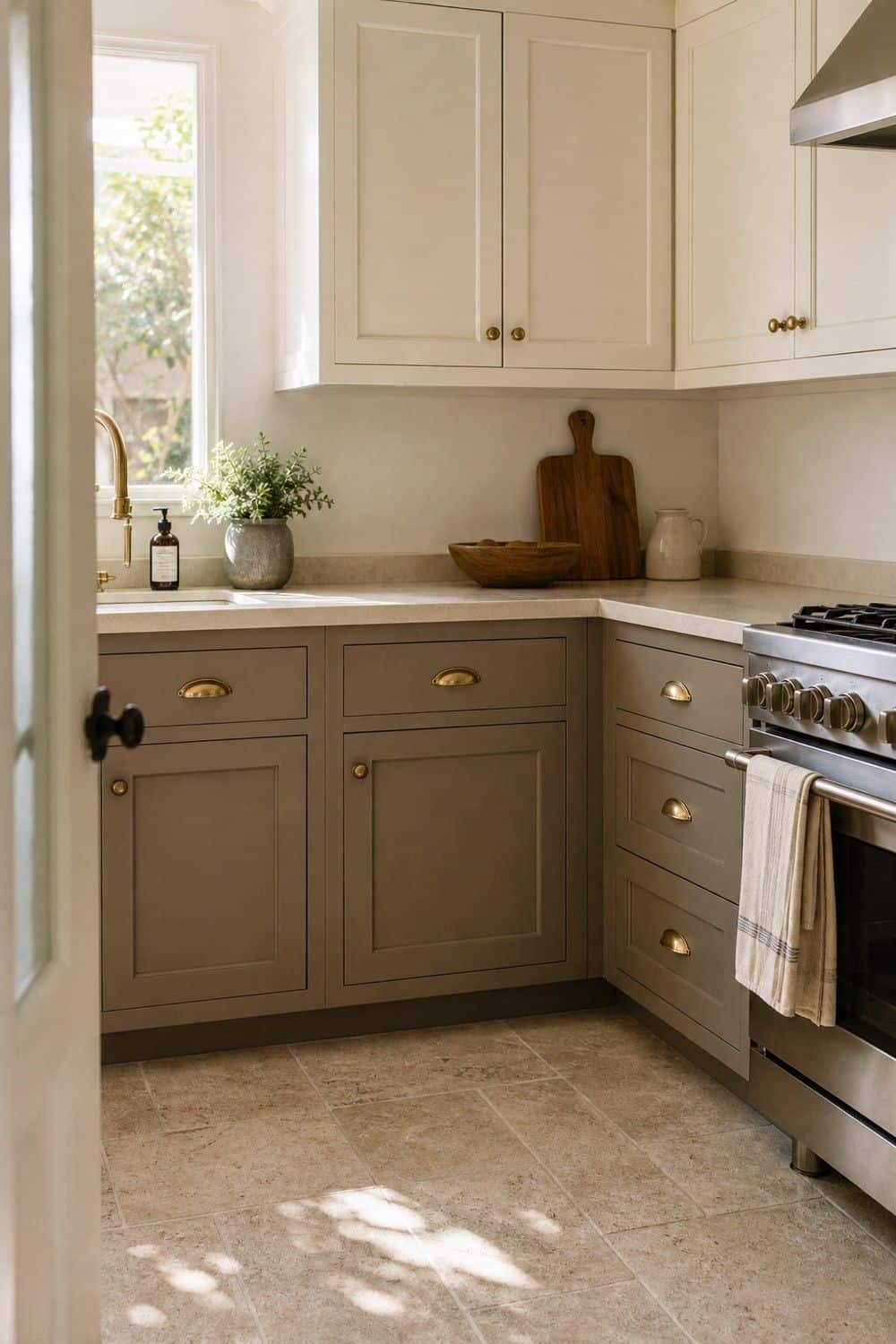
Taupe lower cabinets are a good compromise when you want warmth without making the whole kitchen dark. Keep the upper cabinets, walls, or open shelves lighter so the lower half anchors the room instead of closing it in.
This color is especially nice with cream counters, limestone-look tile, oak floors, and aged brass. Test taupe beside the actual floor, because some shades turn purple or muddy once they sit next to wood or shadowed toe-kicks. A slightly warmer taupe usually feels more relaxed than a cool gray-brown.
4. Add a Putty-Colored Kitchen Island
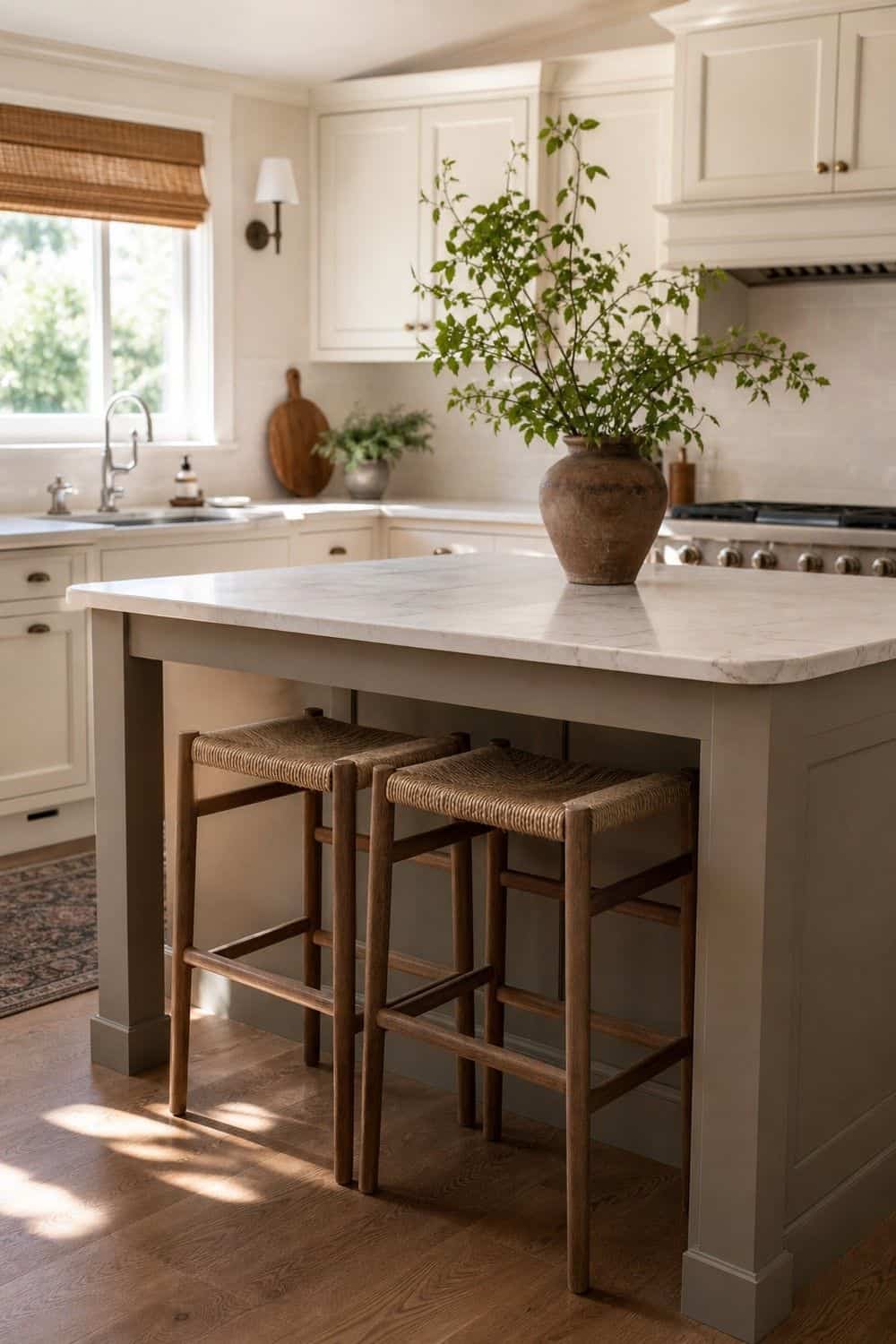
A putty-colored island can warm up a kitchen that already has white or cream perimeter cabinets. The island gets to be the soft middle note: deeper than the walls, quieter than brown, and less expected than gray.
Let the island connect to something nearby, such as veining in the counter, a clay vase, woven stools, or warm hardware. It should feel like part of the palette, not a random painted block in the center of the room, especially from the doorway.
5. Use Natural Wood Cabinets as the Warmth Source
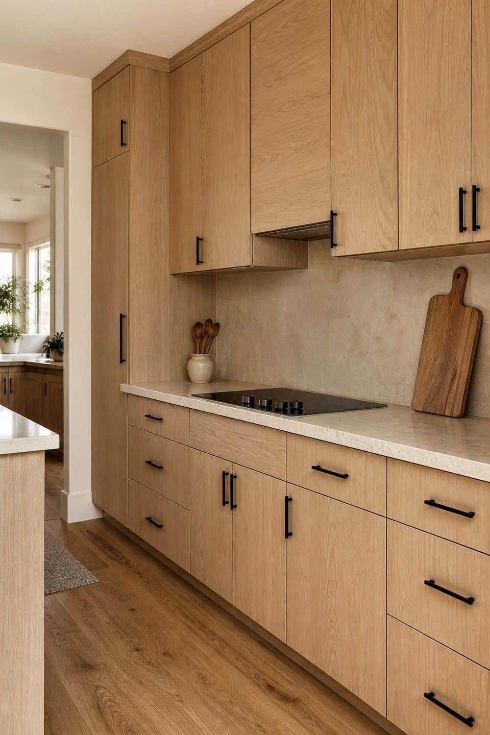
Natural wood cabinets can be the warmth source all by themselves, especially when the grain is calm and the finish is not too orange. White oak, ash, maple, and light walnut can all work beautifully in a warm neutral kitchen.
Keep the surrounding finishes quieter if the wood has movement. Cream walls, soft stone, plain tile, and simple hardware let the cabinet grain read as texture rather than visual noise, which is what keeps the whole room calm. If the wood is very knotty, use it on lowers or an island instead of every cabinet front.
6. Mix Cream Cabinets With Walnut Accents
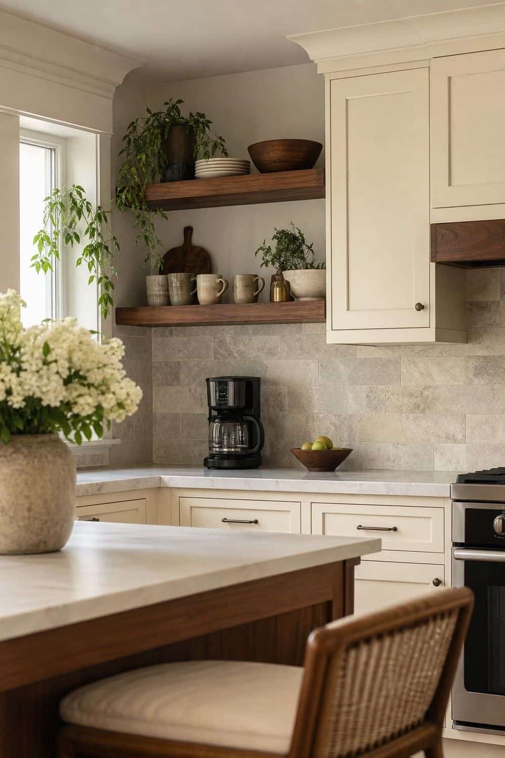
Cream cabinets with walnut accents feel layered without needing much decoration. Use walnut on open shelves, an island base, stools, a range hood trim, or a small coffee station so the darker wood has a clear job.
The balance matters: too much walnut can make the kitchen feel heavier, while too little can look like an afterthought. Repeat it two or three times and let the cream surfaces keep the room bright enough for everyday cooking. Walnut looks especially good when the counter and backsplash stay simple.
7. Choose Creamy Quartz or Quartzite Counters
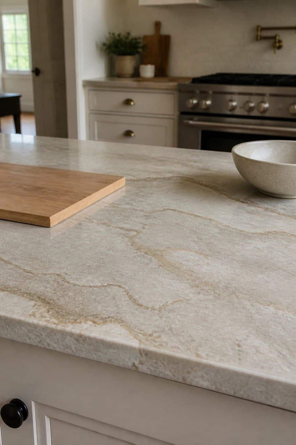
Creamy quartz or quartzite counters are an easy way to keep a neutral kitchen from feeling stark. Look for soft veining, warm gray movement, beige undertones, or a stone pattern that picks up the cabinet color without matching it exactly.
Bring cabinet, floor, and backsplash samples together before choosing. Countertops cover a lot of visual ground, and a slab that looks warm in the showroom can read icy once it is beside your own lighting, flooring, and cabinet paint. Ask to see a larger sample if the veining changes across the slab.
8. Extend Stone Into a Full-Height Backsplash
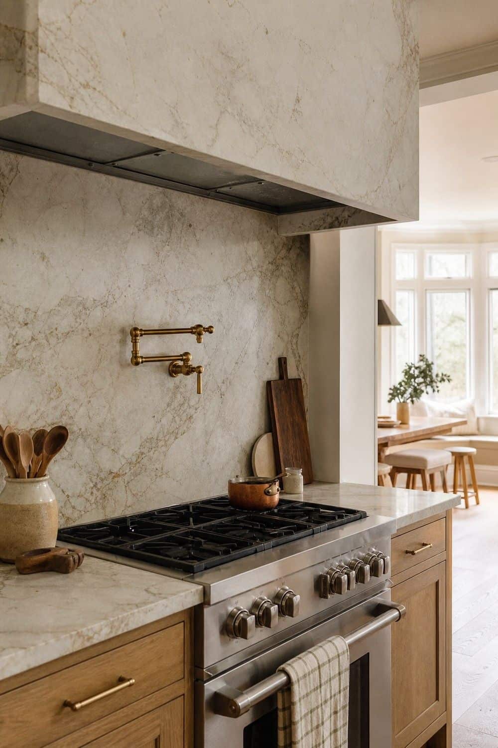
A full-height stone backsplash makes a warm neutral kitchen feel more tailored than a short tile strip. It works especially well behind a range, along a sink wall, or anywhere the veining can continue from counter to wall.
Choose this move when the stone is calm enough to live with every day. Heavy veining can be beautiful, but in a neutral room it should add movement without becoming the only thing you see from the breakfast table. A quieter slab lets hardware, stools, and lighting still have a voice.
9. Use Handmade Beige Tile
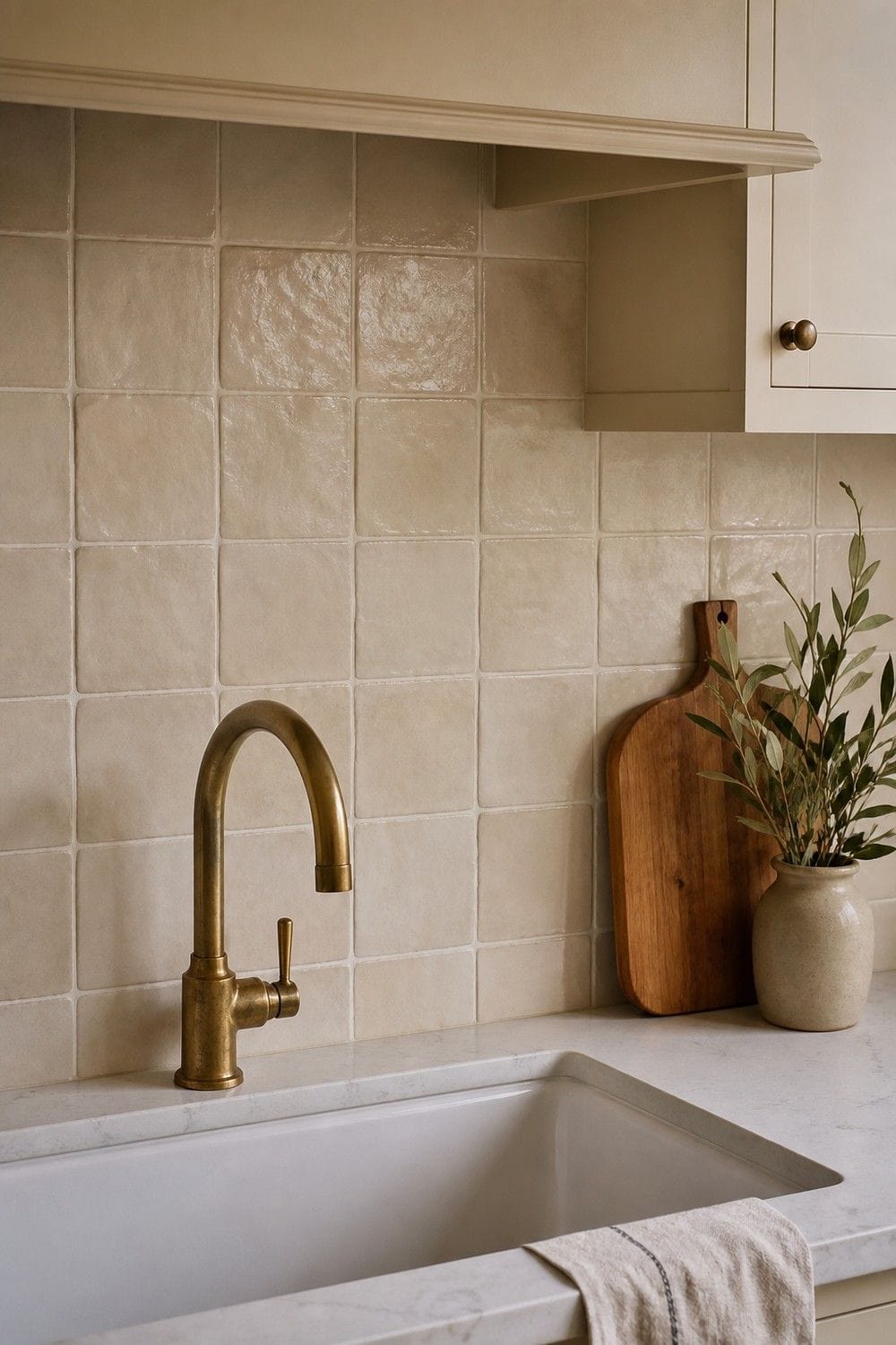
Handmade beige tile adds the tiny irregularities that warm neutral kitchens need. Slightly wavy edges, uneven glaze, and soft color variation keep beige from looking flat, especially on a backsplash or short feature wall.
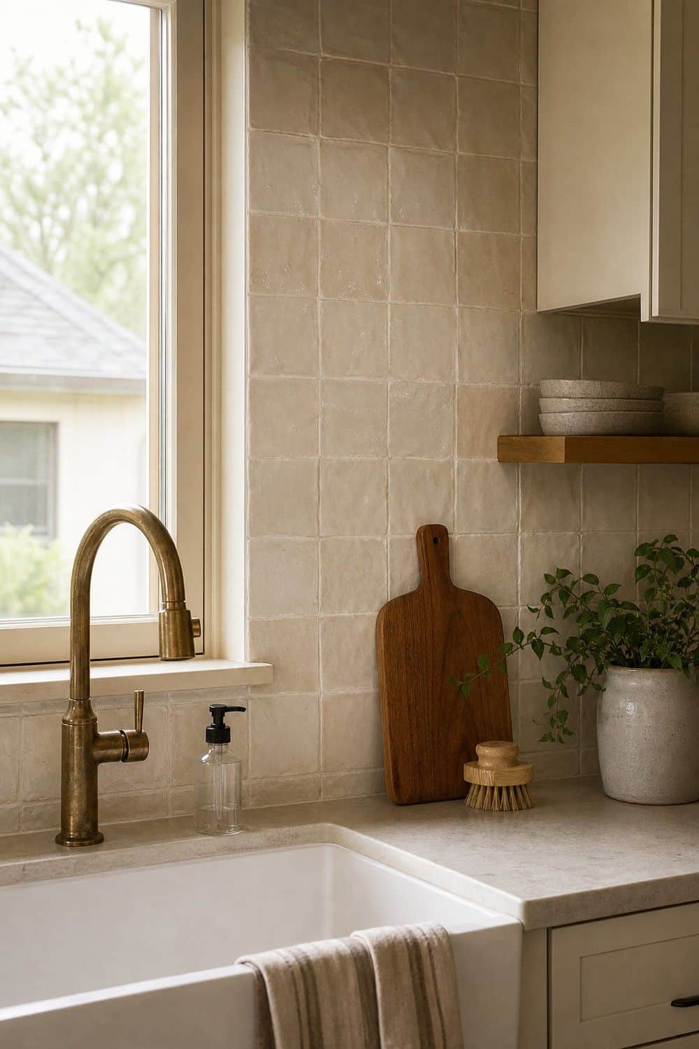
Choose grout carefully. A close grout color feels seamless and quiet, while a darker grout makes the tile pattern more visible. For a softer kitchen, I would usually let the glaze texture do most of the talking instead of outlining every tile. Handmade tile is already interesting, so it rarely needs high contrast.
10. Add Plaster or Limewash Walls
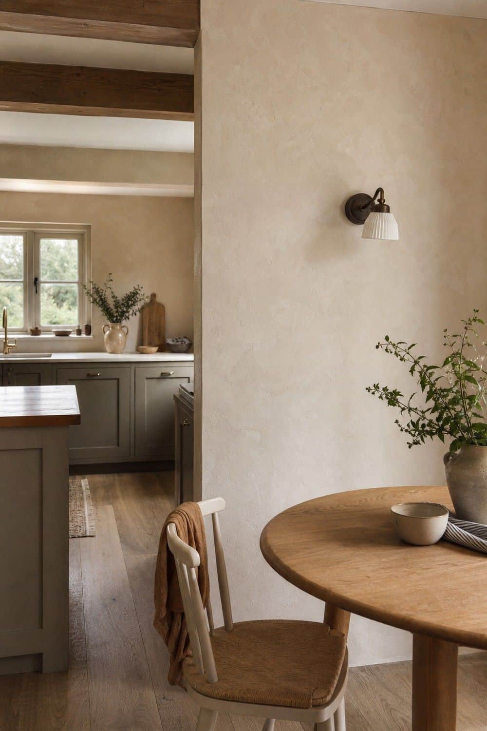
Plaster or limewash walls give a neutral kitchen depth without adding another obvious color. The finish works well around dining nooks, range walls, pantry corners, or open shelving where the light can catch subtle movement. Keep it away from the heaviest splash zones unless the finish is sealed for kitchen use, and pair it with plain trim so the wall texture stays soft rather than busy. It is a lovely way to warm up a room that has many flat cabinet fronts.
11. Layer Oat, Cream, and Greige
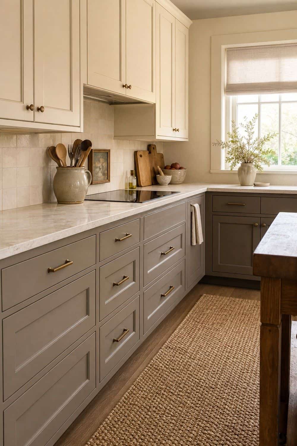
Layering oat, cream, and greige keeps a warm neutral kitchen from depending on one perfect paint color. Use cream for the brightest surfaces, oat for textiles or tile, and greige for cabinets, island paint, or a small built-in moment. The mix works when each shade has a job: one light, one mid-tone, and one grounding note that keeps the palette from turning flat. Repeat each shade at least once in a small, believable way so the room feels collected, not accidentally patched together.
12. Add Brushed Brass Hardware
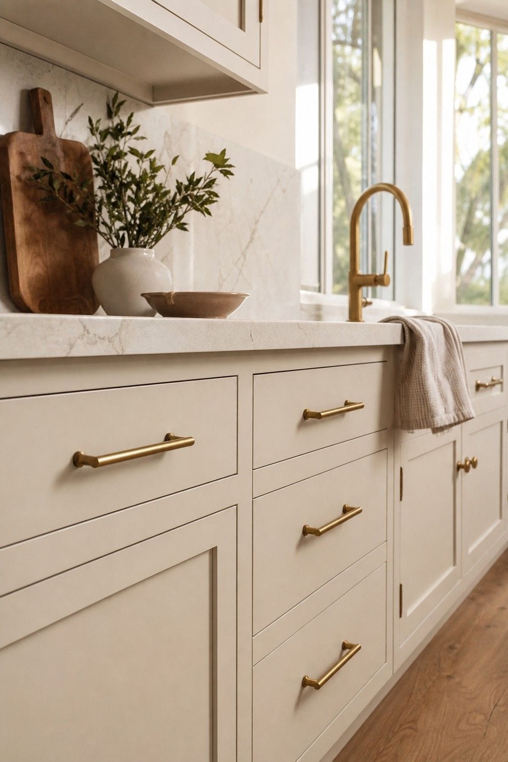
Brushed brass hardware adds warmth, but it looks best when the finish is soft rather than shiny yellow. Choose simple knobs, pulls, or latches that feel good in the hand and repeat the metal in one other place, such as lighting or a faucet. If the room already has warm wood, brass can be used sparingly; a few quiet repeats are better than turning every detail gold. This is where restraint makes the finish look more expensive and less showroom-perfect.
13. Use Satin Nickel for a Quieter Neutral Kitchen
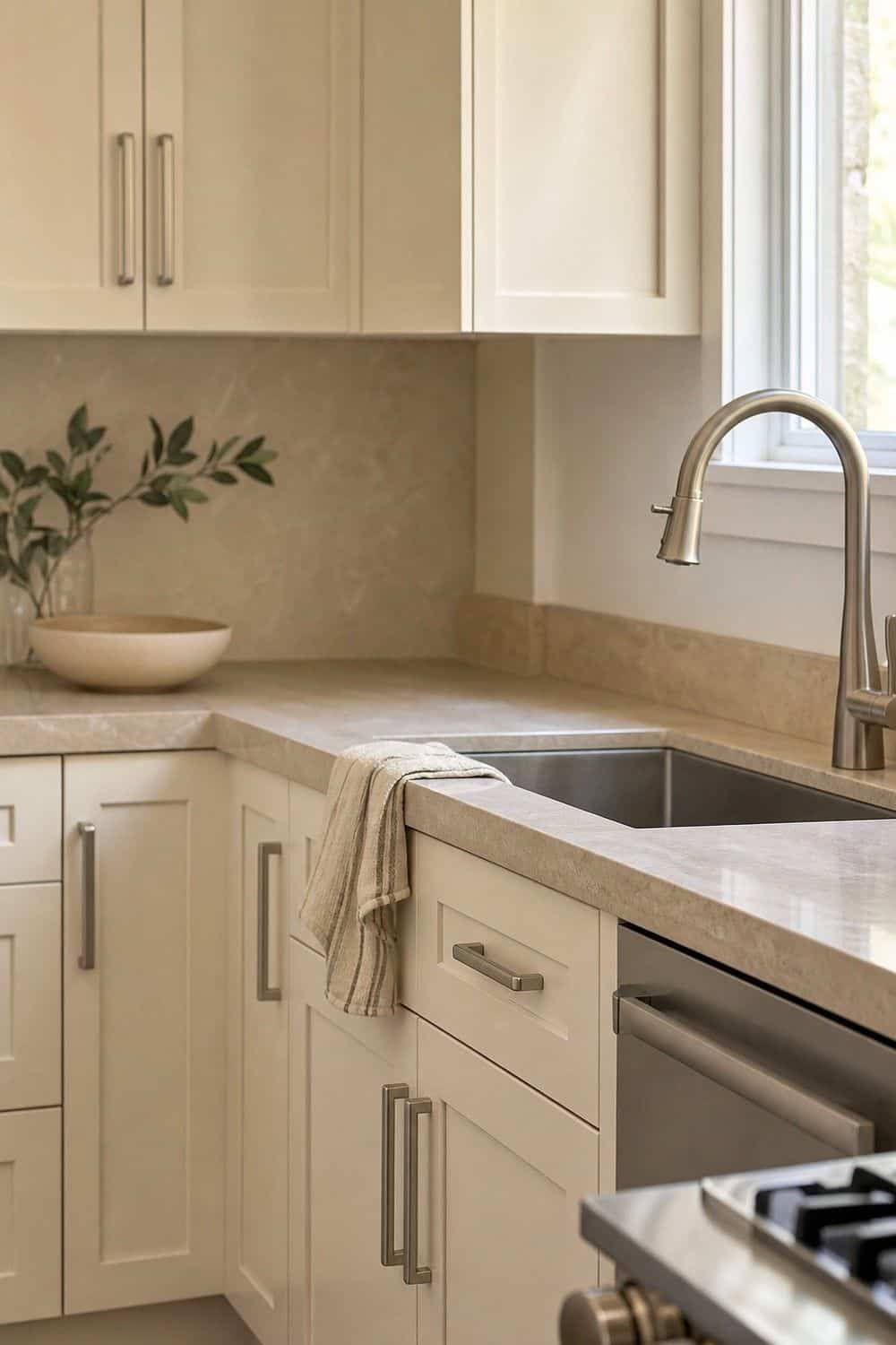
Satin nickel is a quieter choice when brass feels too decorative. It still works in a warm neutral kitchen if the surrounding finishes have enough softness: creamy cabinets, warm stone, wood shelves, or beige tile. I like it when the kitchen needs a cleaner edge but not the cool, sharp feeling of chrome. Keep the shape simple so the finish stays calm. It is also forgiving beside stainless appliances, which many kitchens already have, and it mixes gently with pale stone.
14. Choose Woven Pendant Lighting
Woven pendant lighting adds texture above an island or breakfast table without adding a new hard finish. Rattan, cane, paper, or linen shades can soften stone, painted cabinets, and square cabinet lines. Choose a shade with enough openness for useful task light, and keep the scale generous rather than tiny. A pair of warm woven pendants can make a plain island feel much more relaxed, especially with simple stools underneath and quiet hardware nearby. Keep shades high enough for clear sightlines.
15. Use Warm Bulbs and Layered Lighting
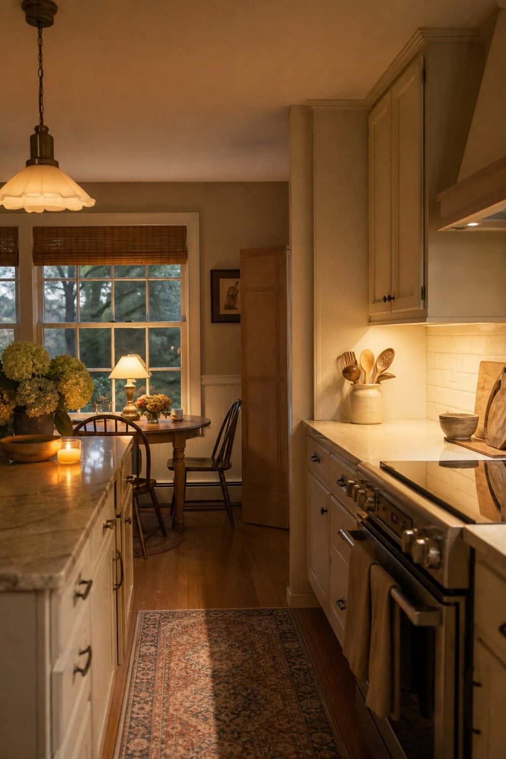
Warm bulbs change a neutral kitchen more than people expect. Use soft white bulbs in pendants, under-cabinet lights, sconces, and lamps so cream paint, wood, and stone do not turn gray at night.
Layer the light instead of relying on one overhead fixture, especially if the island, sink, and dining corner all need different moods during cooking, cleanup, and slow evenings.
A warm neutral palette feels calmer when prep areas are bright enough to use and corners have a softer glow after dinner or early coffee.
16. Add a Neutral Kitchen Runner
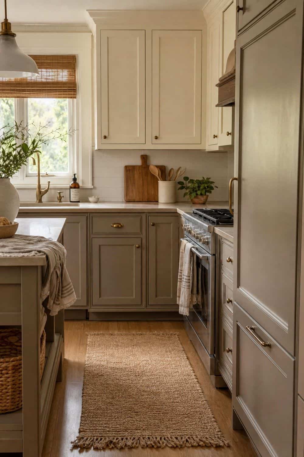
A neutral kitchen runner can bring warmth to the floor without changing tile, wood, or cabinets. Look for washable wool, cotton, jute blend, or indoor-outdoor styles in oat, tan, muted rust, greige, or faded brown. The runner should sit where people actually stand, like the sink or long prep counter, and it should be low enough that doors and stools do not catch on it. A faded pattern hides crumbs better than a perfectly plain rug and feels less precious.
17. Bring in Linen Window Treatments
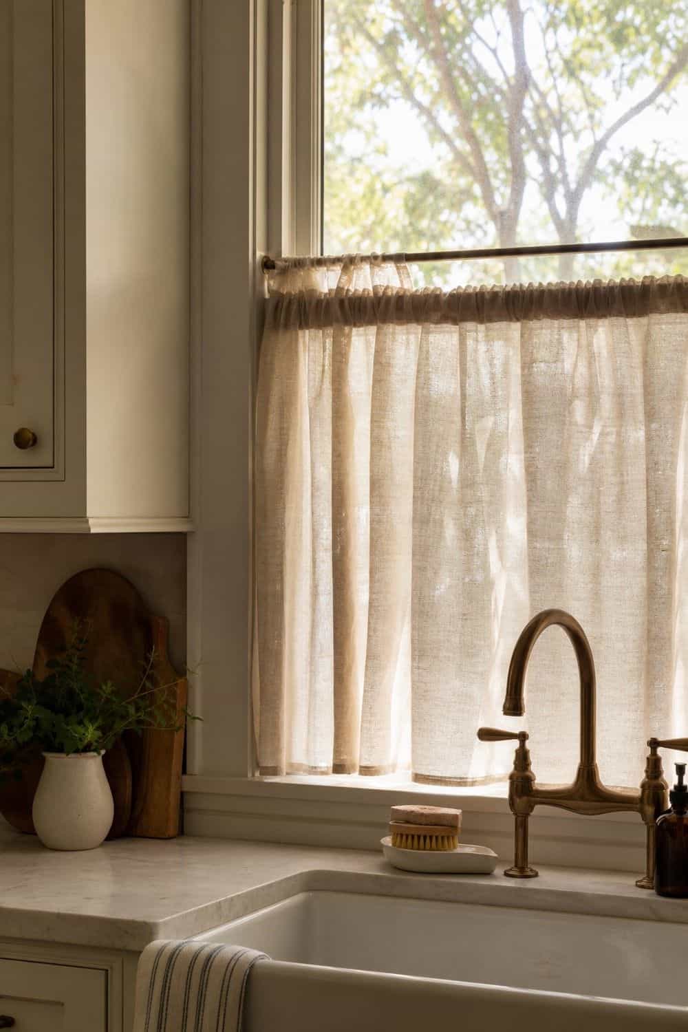
Linen window treatments soften a kitchen without making it feel dressed up. Cafe curtains, relaxed Roman shades, or a simple panel can filter harsh light and add movement beside stone, tile, and cabinet fronts. Choose warm white, flax, oat, or mushroom fabric, then keep the hardware slim so the window still feels like part of the kitchen rather than a formal room. Washable fabric is worth considering near a sink or breakfast nook where splashes, steam, and crumbs happen often.
18. Use Stoneware and Ceramic Decor
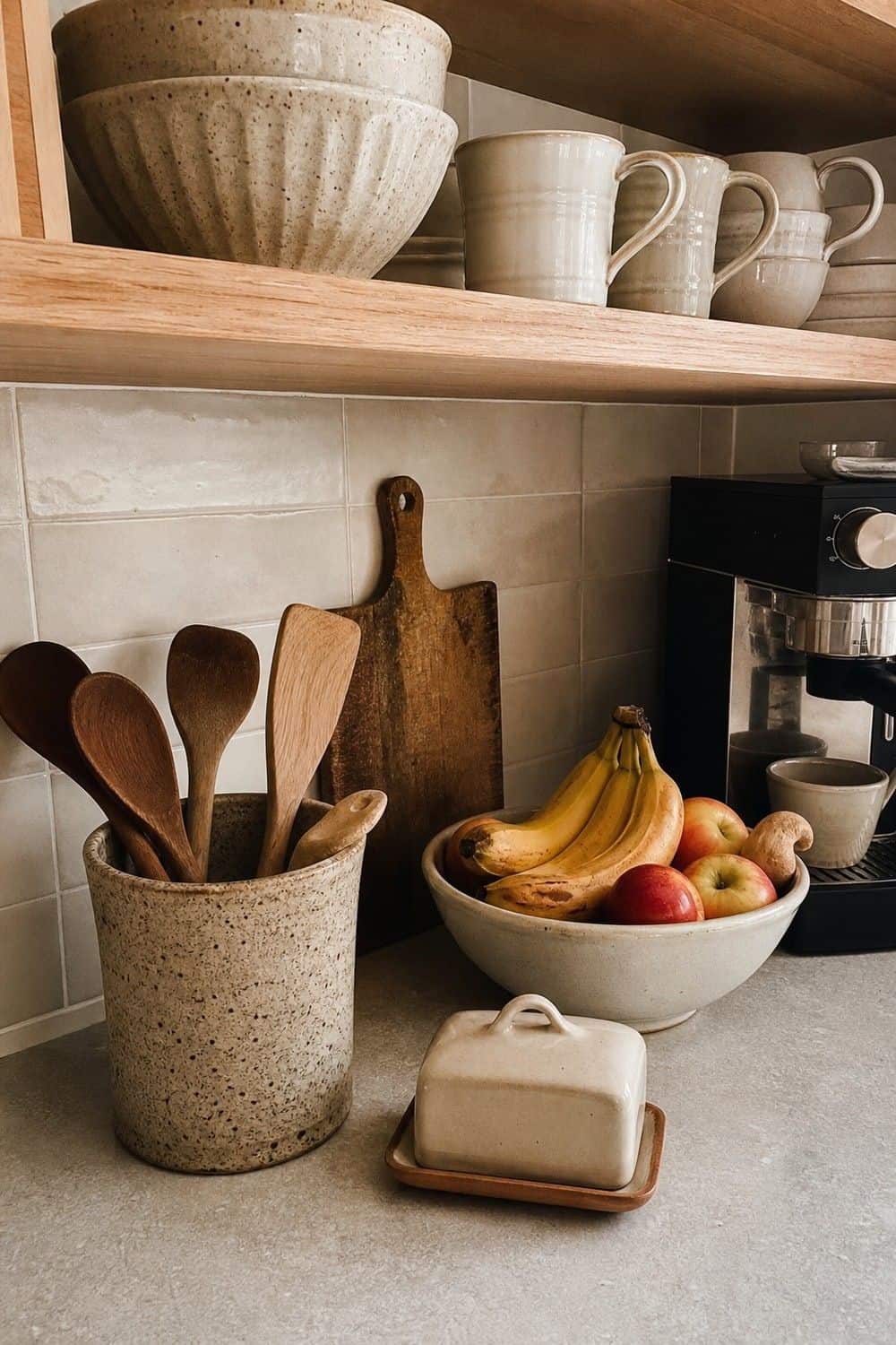
Stoneware and ceramic decor can warm up open shelves, coffee corners, and counters when the pieces are useful. Try a crock for wooden spoons, a fruit bowl, a butter dish, or a stack of everyday mugs.
Choose matte cream, speckled clay, or warm gray pieces with slightly varied finishes rather than a perfect matching set from one shopping trip at one store.
The room feels more natural when the ceramics look collected over time and still earn their place during breakfast, cooking, or coffee instead of sitting out as props.
19. Add a Soft Black Accent
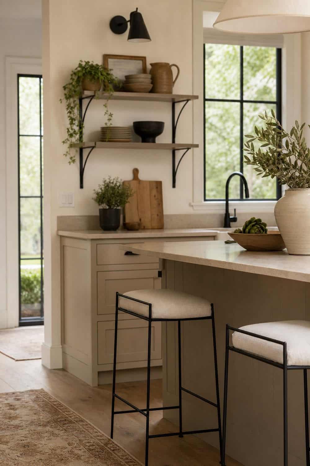
A soft black accent gives a warm neutral kitchen a little edge. Try it on picture frames, a sconce, a range knob detail, a stool frame, or a slim shelf bracket rather than turning every metal finish black. The black should outline the room gently, like eyeliner, not become the main palette. A few small hits can make cream and taupe feel cleaner without cooling down the whole space or making the palette harsh. Matte black is usually softer than glossy black.
20. Add One Muted Green Accent
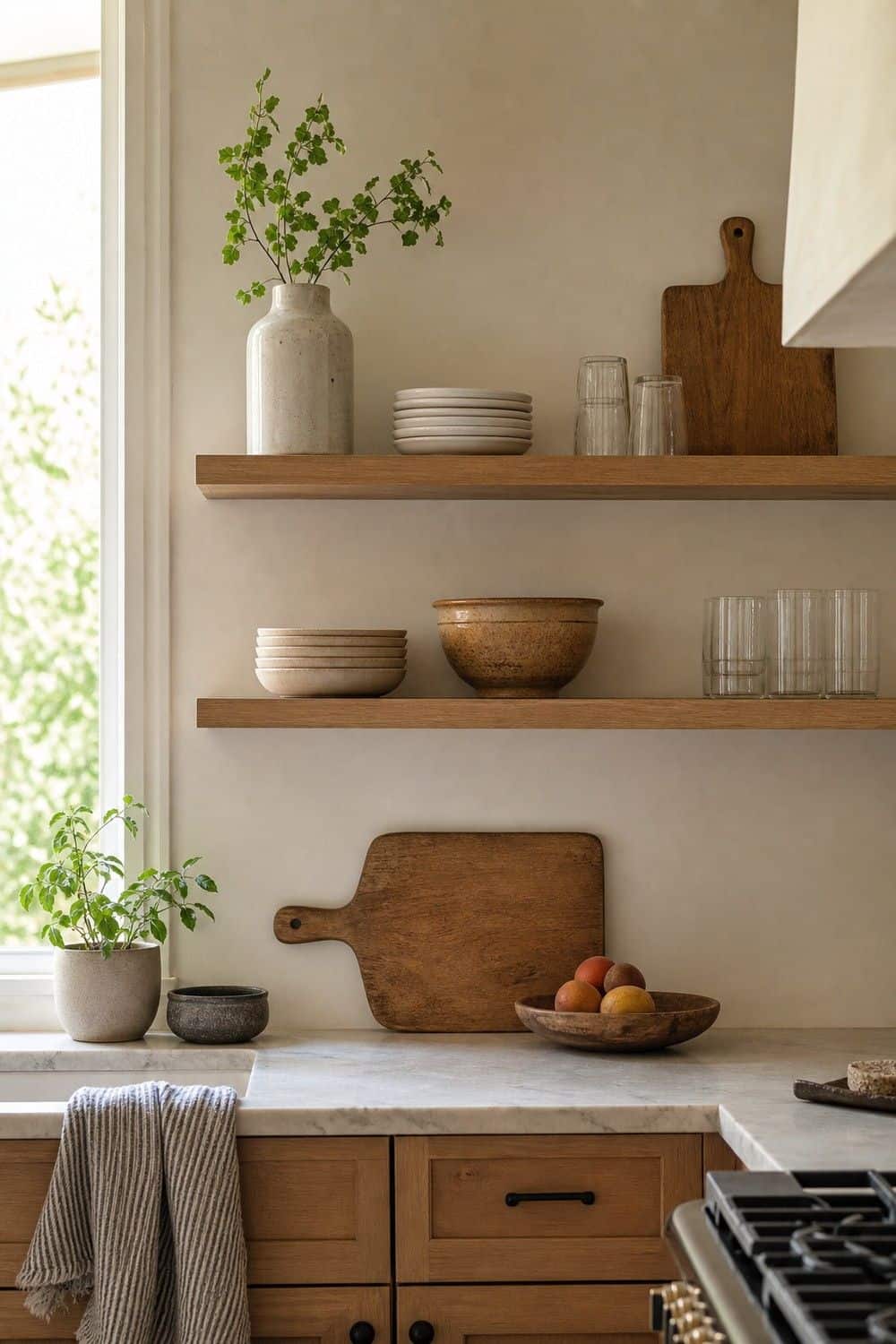
One muted green accent can make a neutral kitchen feel alive without pushing it into a full color scheme. Olive, sage, eucalyptus, or gray-green works well in a vase, art print, cafe curtain, or small painted cabinet. Keep the green dusty rather than bright, and repeat it only once or twice so it feels like a natural note beside wood, stone, and cream. Fresh herbs can echo the color quietly on the counter without feeling too styled, forced, or separate from the rest of the room.
21. Use Curved or Rounded Details
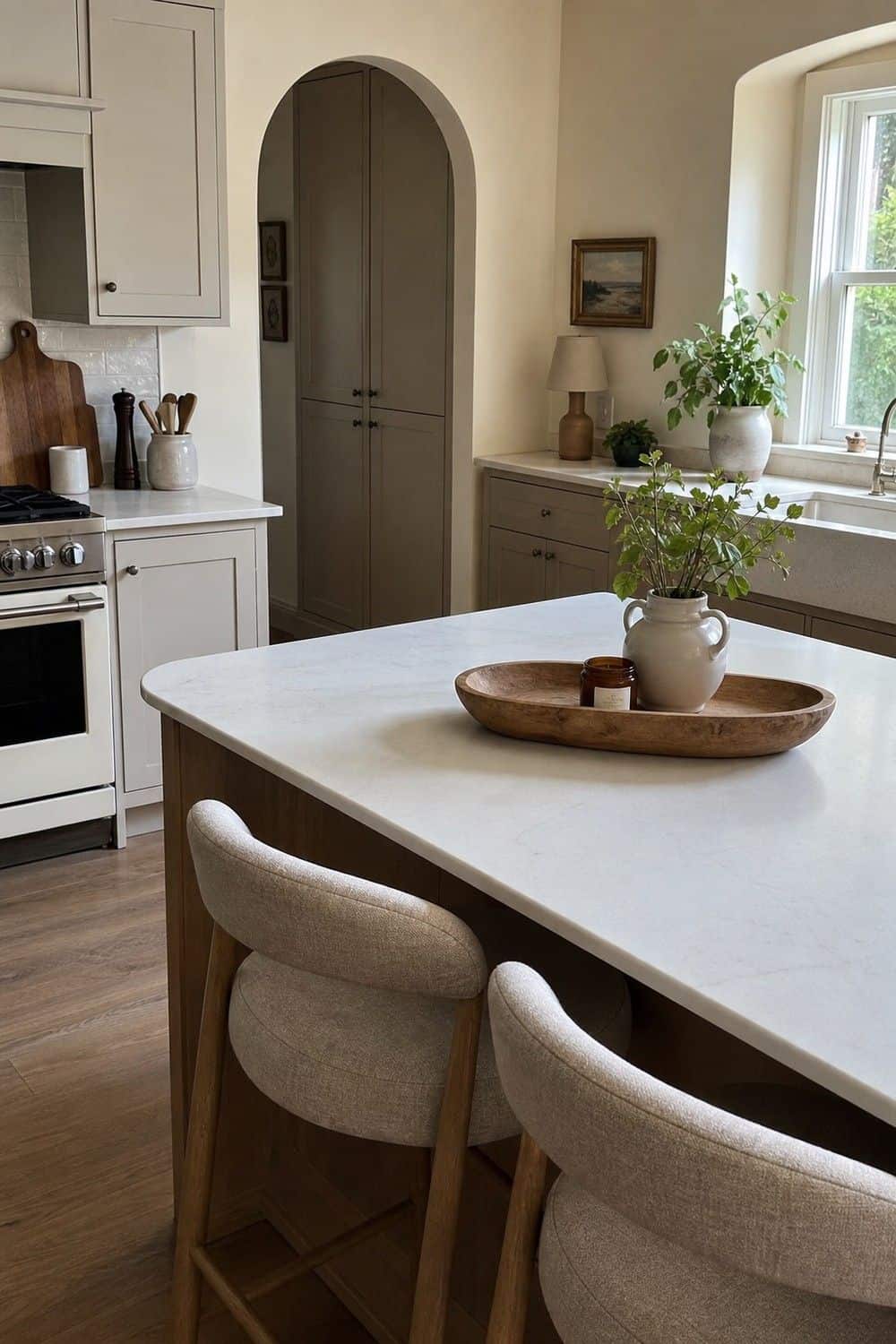
Curved details help a warm neutral kitchen feel less boxy. Rounded stools, arched cabinet doors, curved shelf brackets, oval trays, or a soft-edged range hood can break up straight cabinet lines. You do not need every shape to curve; one or two softer silhouettes are enough to make the room feel gentler, especially when the cabinets and tile are very linear. Repeating curves too often can start to look themed instead of relaxed, so let the shape appear quietly where the room already needs softness.
22. Style Open Shelves With Breathing Room
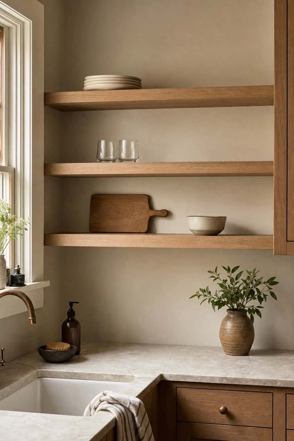
Open shelves need breathing room in a warm neutral kitchen. Use fewer pieces than the shelf can technically hold: cream plates, clear glasses, wood boards, stoneware bowls, or one small framed print.
Leave open space around the tallest pieces and avoid lining up every object by color, which can make the shelf feel stiff and overly arranged.
The shelves should feel useful and airy, not like a beige display case built only for matching objects that never come down for dinner or coffee.
23. Choose Beige or Stone Small Appliances
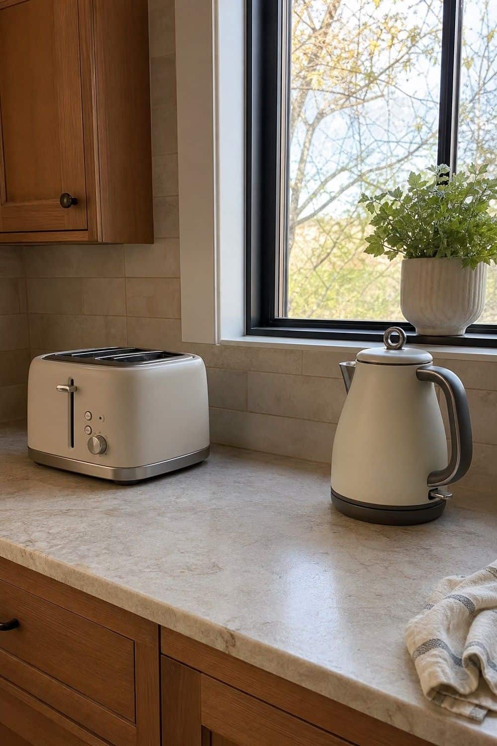
Beige or stone-colored small appliances are useful only when they replace visual clutter, not when they create a beige lineup on the counter. Choose one or two pieces that stay out because they are used daily. A toaster, kettle, or coffee machine in a soft finish can blend in nicely, but backup gadgets still belong behind cabinet doors. The counter should feel calmer after the swap, not more crowded or showroom-staged. Leave breathing room around each piece during use and avoid buying a matching appliance just for the color.
24. Create a Warm Neutral Pantry Corner
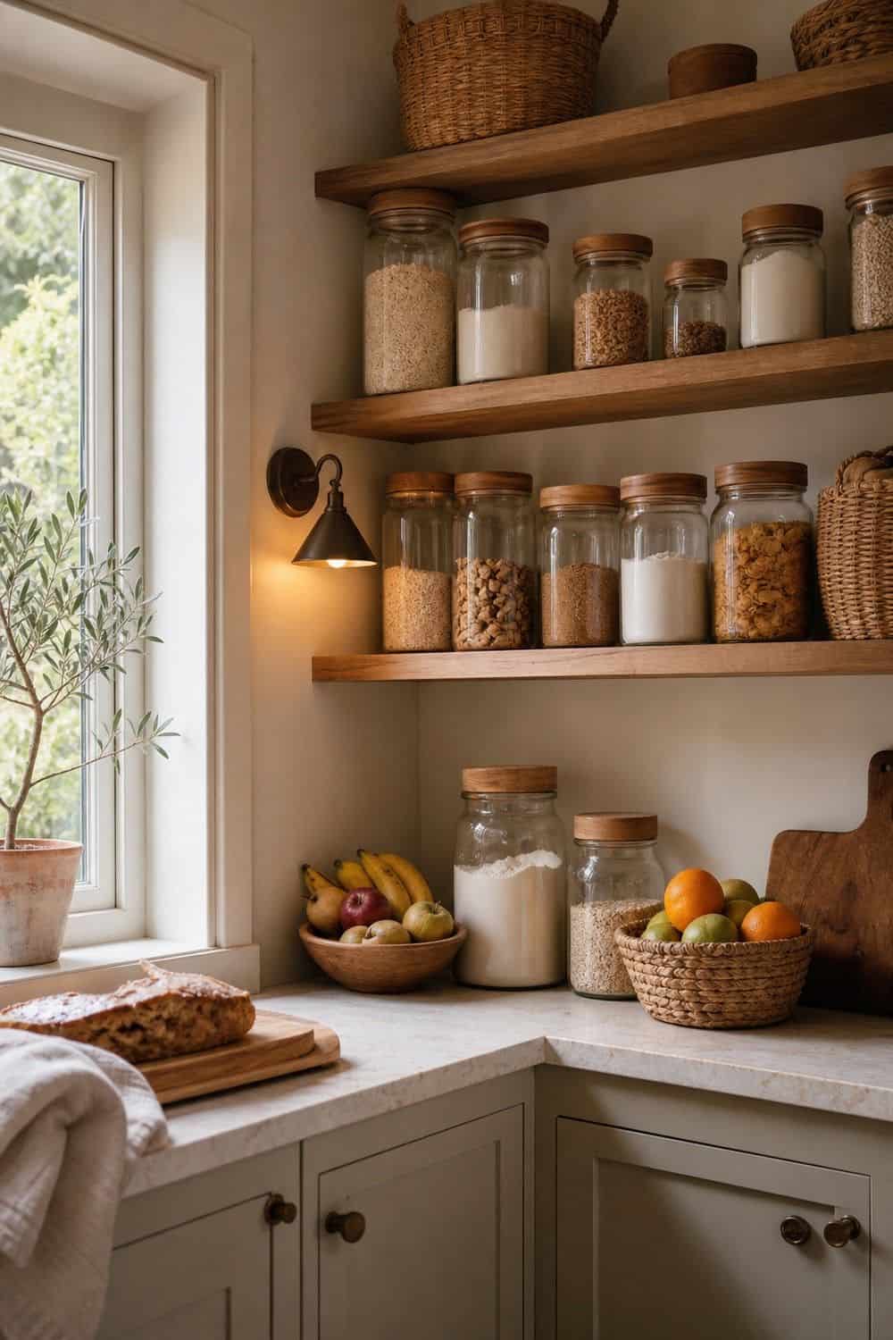
A warm neutral pantry corner can be as simple as glass jars, wood lids, woven baskets, and a small lamp or sconce nearby. The look works when the food storage is still readable and easy to refill.
Keep labels plain and categories honest, especially for staples that multiple people in the house reach for during breakfast, baking, or lunch packing each week.
If every jar is chosen for color instead of use, the pantry starts feeling staged; the best version still helps breakfast, baking, and snacks move faster.
25. Finish With an Undertone Audit
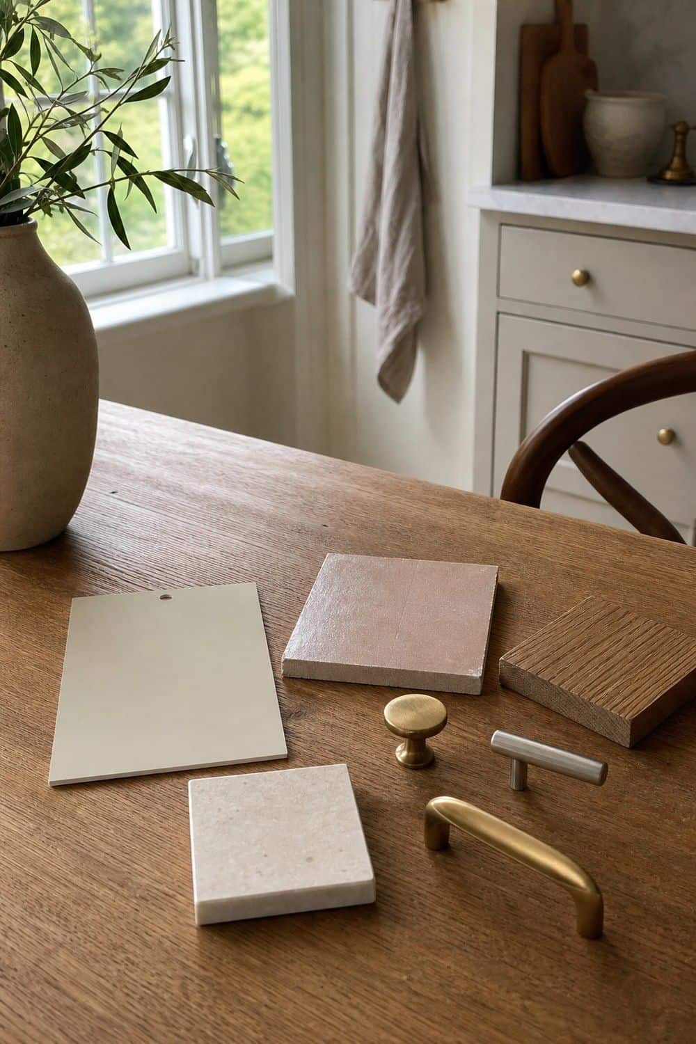
An undertone audit is the final step before buying paint, tile, stone, or hardware. Place samples together in the actual kitchen and look at them in morning light, afternoon light, and under the bulbs you use at night.
Watch for clashes: pink beige beside yellow cream, blue gray beside warm oak, or orange wood beside cool stone before anything permanent is ordered or installed.
A warm neutral kitchen does not need every finish to match, but the undertones should feel like they are having the same conversation together in the same room.
Warm Neutral Kitchen Design Notes
Warm neutral kitchens work best when undertones, texture, and light are chosen together. Cream, mushroom, taupe, greige, wood, stone, brass, linen, and soft black can all feel calm, but only when the room has enough contrast to avoid looking flat.
FAQ About Warm Neutral Kitchen Ideas
What is a warm neutral kitchen?
A warm neutral kitchen is built around cream, oat, beige, mushroom, taupe, greige, warm white, wood, and stone instead of stark white, cool gray, or silvery finishes. It can still feel modern, but the materials, lighting, and undertones make the space softer and more inviting.
How do you make a neutral kitchen feel warm?
Add wood, warm lighting, brass or satin metals, textured tile, creamy stone, linen, runners, and layered neutral paint tones. The biggest shift usually comes from undertones and light. A kitchen can be neutral and still feel warm if the whites, grays, and beiges are not cold or flat.
What colors are best for a warm neutral kitchen?
Warm white, cream, mushroom, taupe, putty, oat, greige, warm stone, walnut, white oak, muted clay, and soft green accents all work well. The best color depends on your floor, counter, and natural light. Always compare samples together before choosing cabinets or walls.
Are white kitchens still in style?
White kitchens can still look current when the white is warm and paired with texture, wood, stone, and soft lighting. Stark blue-white cabinets with icy counters can feel cold, but cream, plaster, ivory, and oat whites can look timeless and fresh.
What backsplash works with warm neutral cabinets?
Good backsplash options include handmade beige tile, cream zellige, full-height stone, warm quartz, plaster-look walls with a practical splash zone, or subtle textured ceramic. Choose a backsplash that connects to the cabinet and counter undertones rather than adding a separate color story.
How do you keep a beige kitchen from looking boring?
Add tonal contrast, wood grain, stone movement, matte metals, layered lighting, textiles, and a few darker accents. Beige looks flat when every surface has the same value and texture. It looks richer when cream, taupe, wood, tile, metal, and light each add a different layer.
What hardware works with warm neutral cabinets?
Brushed brass, antique brass, satin nickel, aged bronze, and soft black can all work with warm neutral cabinets. Brass adds warmth, satin nickel keeps the look quieter, bronze adds age, and soft black gives definition. Choose the finish based on how much contrast the kitchen needs.
What is the difference between warm neutral and cool neutral kitchens?
Warm neutral kitchens lean cream, beige, taupe, mushroom, warm stone, brass, wood, and oat. Cool neutral kitchens lean blue-white, silver, gray, cool marble, and chrome. Both can be beautiful, but warm neutrals usually feel softer and more inviting in everyday kitchens.
Final Thoughts
The best warm neutral kitchen ideas are specific, not generic. Choose warmer whites, deeper neutrals, natural wood, creamy stone, textured surfaces, soft lighting, and carefully tested undertones so the kitchen feels calm, current, and lived in.
Last update on 2026-09-17 / Affiliate links / Images from Amazon Product Advertising API