
The easiest way to bring jewel tones into a kitchen is to choose one saturated color first, then balance it with warm light, natural wood, stone, cream, brass, or glass. Start with a contained feature like an emerald island, sapphire runner, plum ceramics, or teal tile before spreading color across the whole room. Jewel tones look best when the kitchen still has clear counters, practical storage, and a few quiet surfaces around the drama.
Jewel tone kitchen ideas are all about using rich color in a way that still feels livable. Emerald, sapphire, plum, ruby, amethyst, and teal can make a kitchen feel layered and memorable, but they work best when the rest of the room gives them support.
The trick is choosing where the color belongs: cabinets, an island, tile, stools, textiles, lighting, or a few pieces you see every day. Once the main color has a job, the kitchen can feel bold without turning chaotic.

Top Recommended Products


You Might Also Like These Blog Posts
- 25 Moody Kitchen Ideas for a Beautiful Kitchen
- 25 Dark Green Kitchen Ideas for a Beautiful Kitchen
- 25 Walnut Kitchen Ideas for a Beautiful Kitchen
- 25 Cozy Kitchen Ideas for a Cozy Home
- 25 Warm Modern Kitchen Ideas for a Cozy Home
1. An Emerald Island as the Color Anchor
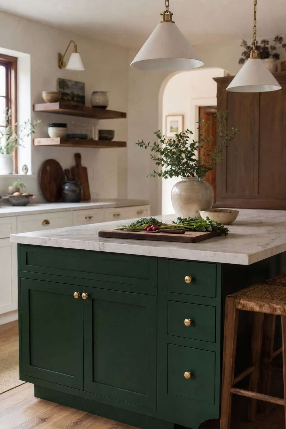
An emerald island gives a kitchen one strong color anchor without asking every cabinet to carry the drama. It looks especially good with cream counters, walnut boards, brass pulls, warm white walls, or marble with soft movement. Before painting, test the color on more than one side of the island. Emerald can look lush in morning light and almost black at night. Keep the stools, runner, and pendant shades calmer so the island feels rich, not crowded. The best version still leaves the top clear enough for chopping, serving, and weeknight dinner prep.
2. A Sapphire Runner Through the Kitchen

A sapphire runner is a low-commitment way to bring jewel color into the kitchen. The blue adds depth underfoot, especially in a galley, between an island and sink, or along a cabinet wall that feels too plain. Choose a washable runner with enough pattern to forgive crumbs but not so much contrast that it fights the cabinets. Sapphire works beautifully with brass, walnut, cream, black, and dark green. If the kitchen already has a strong cabinet color, let the runner be the only saturated textile in the room.
3. Brass Pulls Beside Rich Color
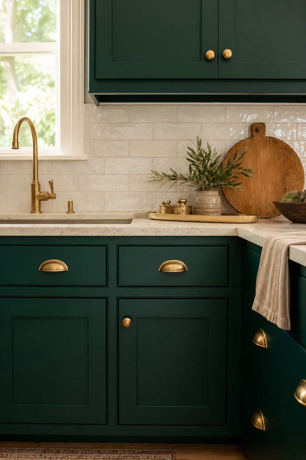
Brass pulls give jewel tones the warmth they need. Emerald, teal, plum, and sapphire can lean cool on cabinets or tile, and aged brass keeps the palette from feeling flat or icy. Pick a finish that looks softened rather than bright yellow. Satin brass, antique brass, or unlacquered brass usually sits better beside saturated color. Long pulls can sharpen modern cabinets, while knobs feel more classic. Repeat the metal once through a faucet, light, frame, or tray so it looks connected to the room.
4. Plum Ceramics on Open Shelves
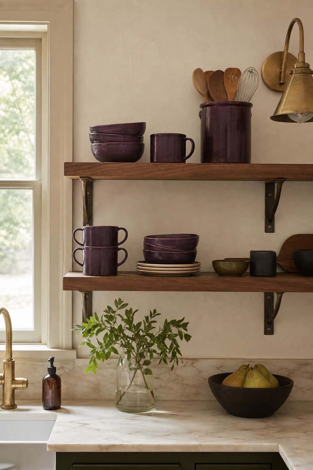
Plum ceramics bring a softer kind of color than red or purple paint. A bowl on the island, a crock by the stove, or a few mugs on open shelves can make the room feel moody without changing the bones of the kitchen. Use plum near warm whites, walnut, brass, olive, or charcoal so it reads as deep and cozy instead of sugary. Keep the shapes simple, because the color already has presence. A single beautiful bowl often does more than several small pieces scattered across the counter.
5. Teal Zellige in Real Kitchen Light
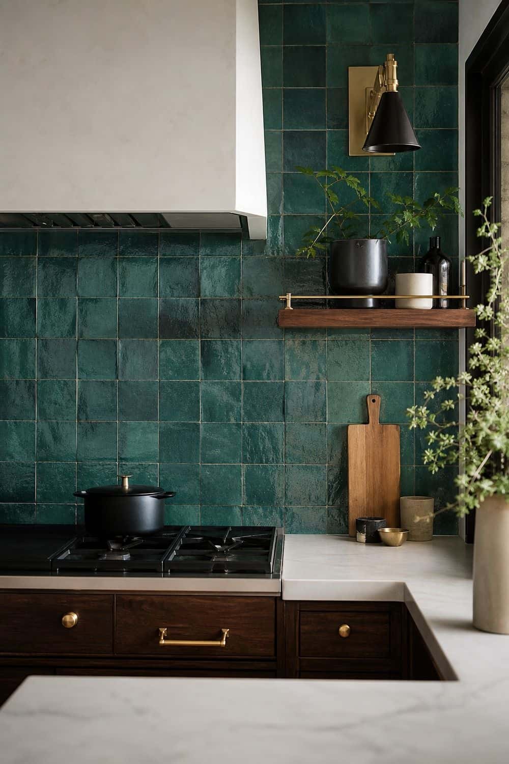
Teal zellige tile can make a backsplash feel alive because the color shifts across each imperfect surface. It is a natural fit for kitchens with cream counters, dark wood, brass hardware, or soft black accents. Look at samples in the exact spot where the tile will live. Teal can turn brighter near a window and moodier under warm bulbs. If a full backsplash feels too strong, use teal behind a range, inside a bar nook, or on a smaller wall. Let the grout stay quiet so the tile variation can do the work.
6. Ruby Towels as a Small Color Moment
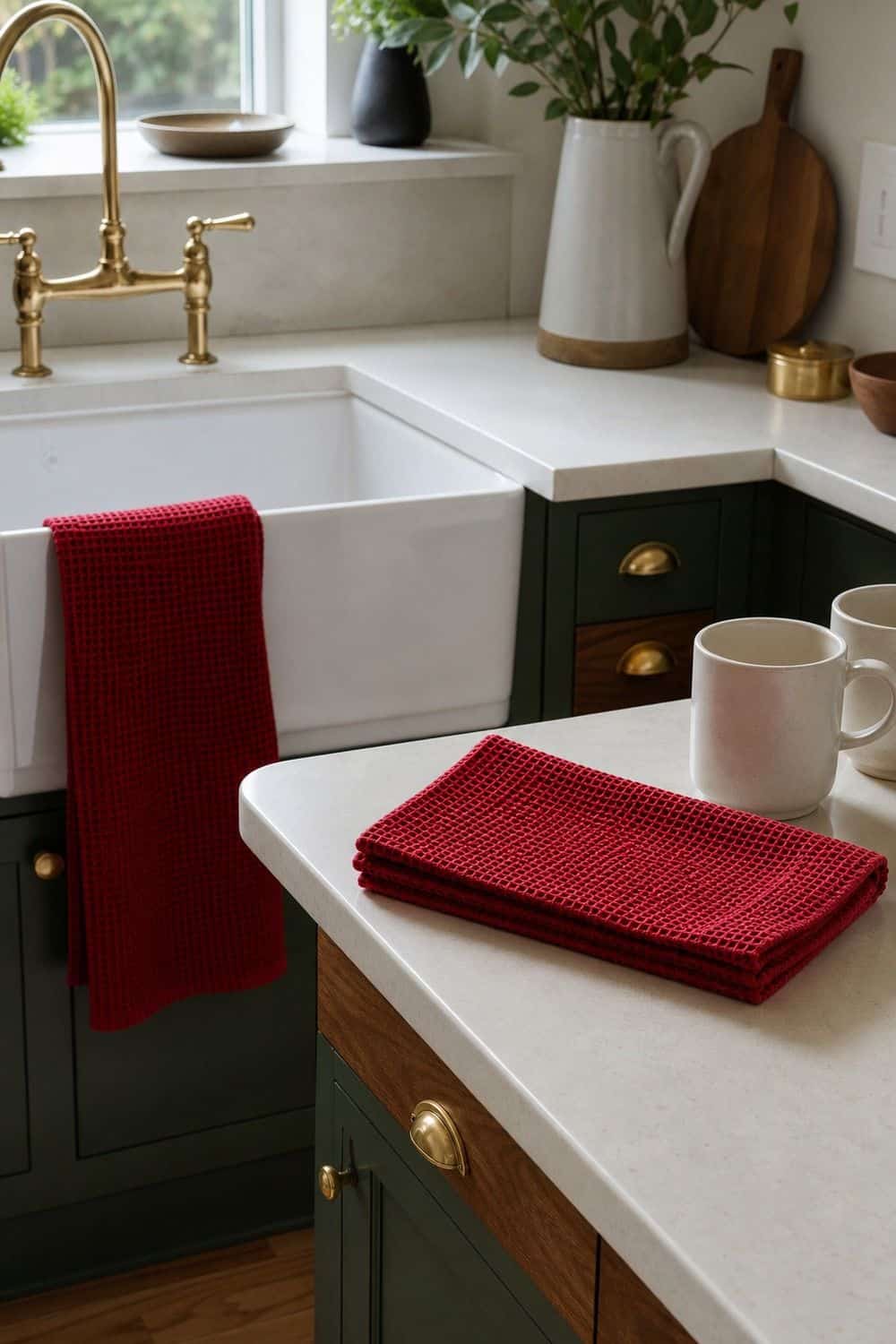
Ruby towels are the easiest way to test a red jewel tone in a kitchen. They bring warmth to dark green, walnut, cream, black, or navy rooms without asking you to paint, tile, or replace furniture. Choose towels that feel useful, not precious.
Cotton, linen, or waffle textures look better after real use than shiny decorative towels that never leave the handle. Ruby can become loud quickly, so keep nearby textiles calmer. One towel by the sink and one folded near a coffee area is usually enough.
7. Marble Beside Jewel Tone Color
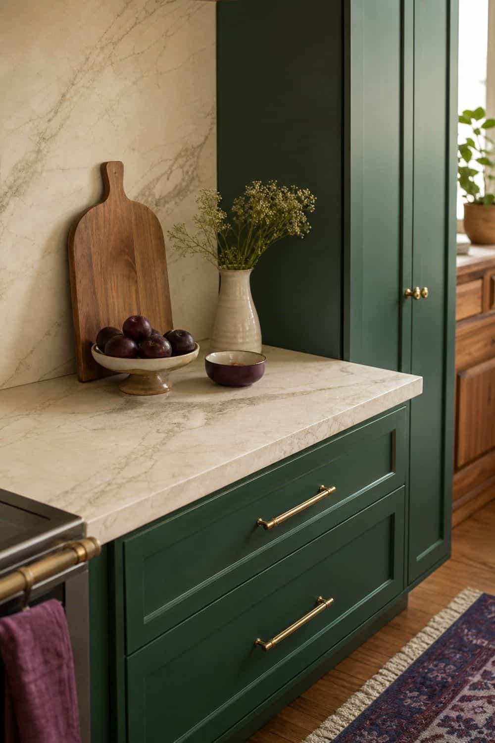
Stone veining gives jewel tones the light and movement they need. Emerald cabinets, sapphire runners, plum ceramics, teal tile, and ruby textiles all feel calmer when they sit near stone with cream, gray, brown, or green veining. Use marble as a counter, backsplash, tray, board, or small shelf detail.
The key is undertone. Cool gray marble can sharpen sapphire and teal, while creamier marble softens emerald and plum. If the room already has several colors, choose marble with gentle movement rather than a high-contrast slab.
8. Walnut Boards Against Saturated Color
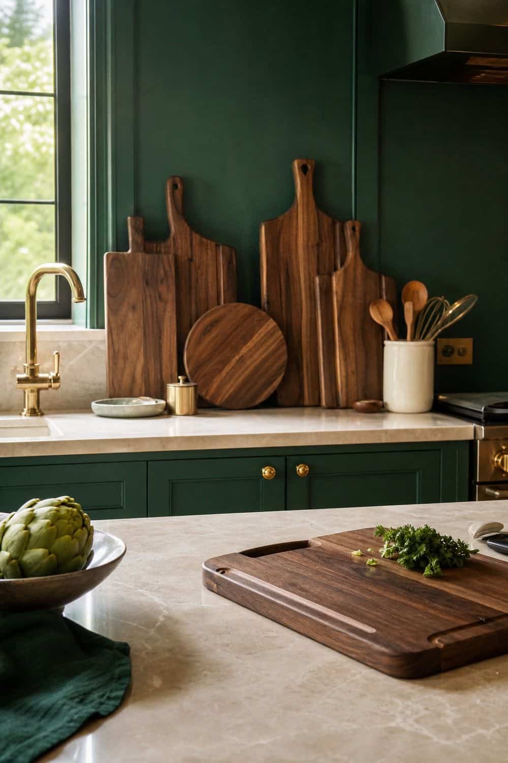
Walnut boards make saturated kitchen colors feel grounded and food-friendly. Lean one near a backsplash, keep one on the island, or stack a few on open shelves where they can warm up tile, paint, and stone. The boards should still be easy to grab. If they block the prep counter or crowd the toaster, they become visual clutter instead of useful texture. Walnut is especially good beside emerald, plum, sapphire, cream, brass, and marble. It adds the quiet brown note that keeps jewel tones from feeling too polished.
9. Warm Lighting for Saturated Color

Layered warm lighting is essential in a jewel tone kitchen because saturated colors change dramatically after sunset. Under-cabinet strips, pendants, sconces, picture lights, or one small counter lamp can keep emerald, teal, plum, and sapphire from going muddy. Use bulbs in the same warm range so the room does not shift from cozy in one corner to cold in another. Task light still matters around knives, sinks, and the stove. The mood should come from layered glow, not from making the kitchen too dim to cook.
10. Smoked Glassware on the Shelf
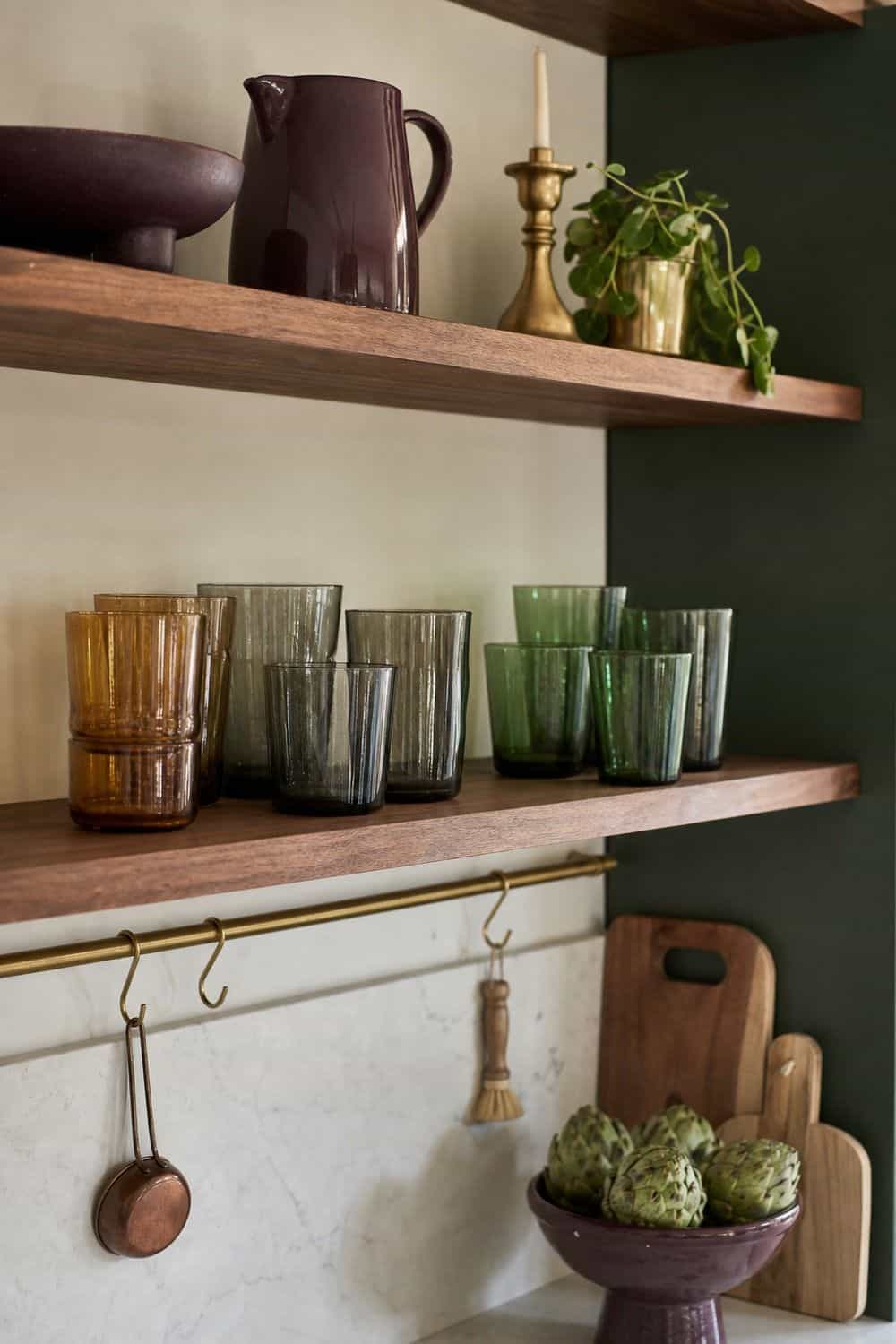
Smoked glassware adds depth without adding another solid block of color. A few amber, gray, green, or smoke-toned glasses on a shelf can echo jewel tones while still letting light pass through. Keep the display practical by showing pieces you actually use. Glassware looks best when it has breathing room, so avoid packing every shelf to the edge. Smoked glass pairs nicely with brass, walnut, marble, dark green, and plum. It can also soften open shelving when white dishes feel too stark.
11. One Main Jewel Tone
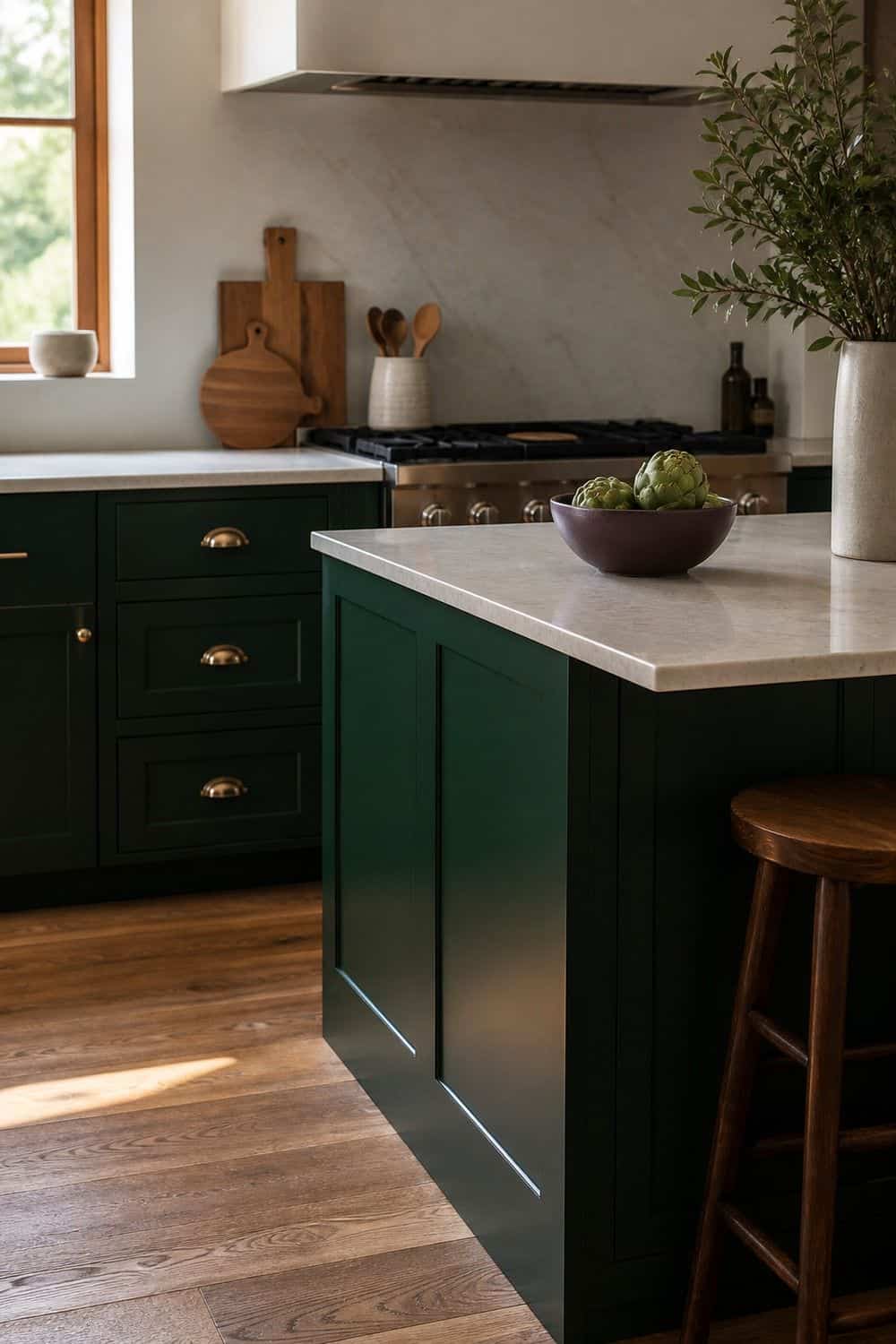
A jewel tone kitchen feels more grown-up when one color leads. Choose emerald, sapphire, teal, plum, ruby, or amethyst as the main note, then let every other color support it rather than compete with it. Pick the dominant color based on the biggest surface you can live with every day: cabinets, island, tile, runner, or stools. After that, add one supporting accent and one quiet neutral. This simple order keeps the room from looking like a color sample drawer, especially once dishes and everyday tools come back out.
12. Jewel Tone Bar Stools at the Island
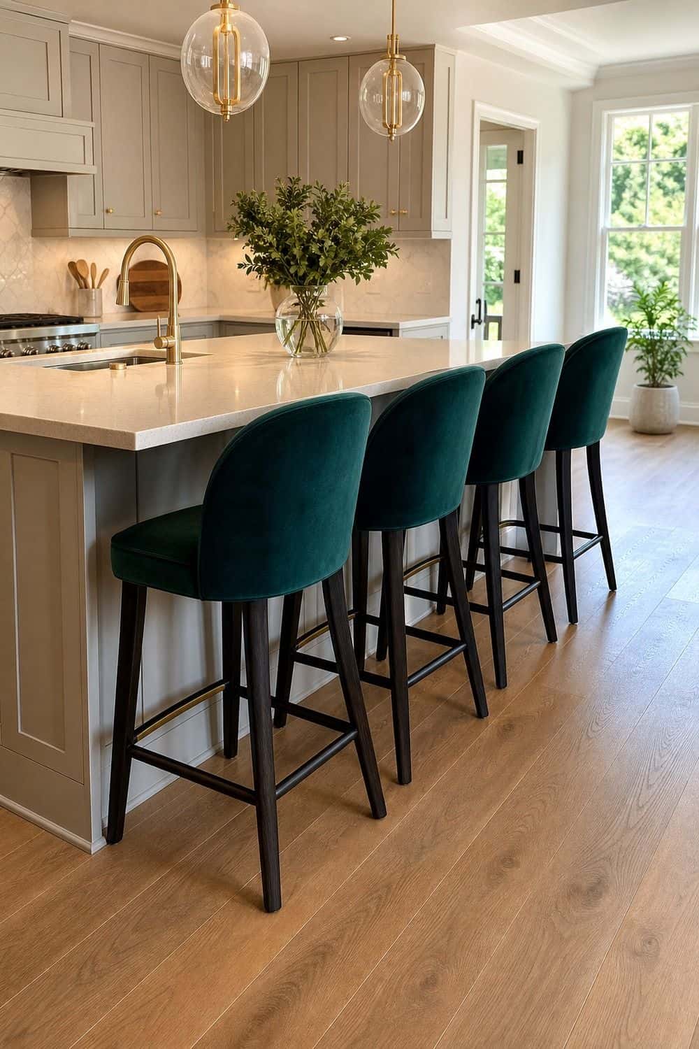
Bar stools are a smart place for jewel color because they are visible but contained. Sapphire, emerald, plum, or deep teal seats can make an island feel special while the cabinets and counters stay calmer. Pay attention to the leg finish and seat material.
Brass legs feel dressier, black legs feel sharper, and wood legs make the color easier to live with. Wipeable leather, velvet-look performance fabric, or painted wood can all work depending on how messy the kitchen gets. Let the stools repeat one color already in the room.
13. Amethyst Accents in Small Doses
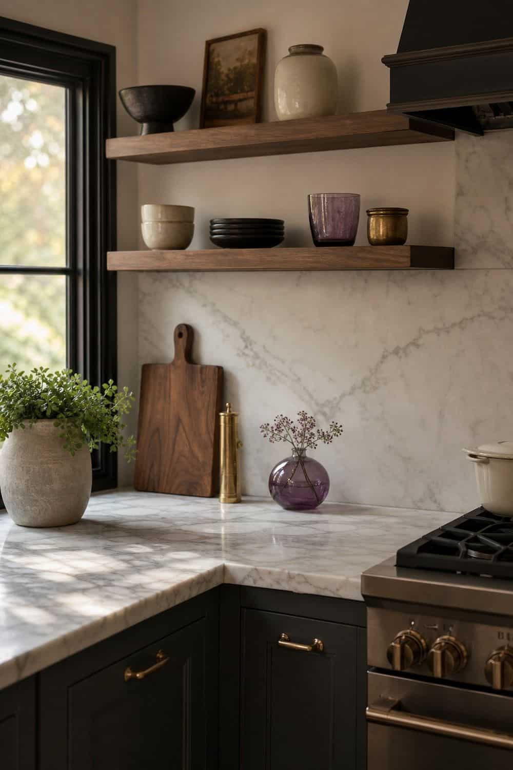
Amethyst accents bring a quiet purple note that feels moodier than pink and softer than burgundy. Try it in a small lamp shade, vase, art print, dish, bowl, or glass piece before using it on a bigger surface. The color looks best when it is slightly muted.
Pair amethyst with walnut, cream, brass, charcoal, dark green, or marble so it feels layered rather than playful. If you use it on open shelves, keep the surrounding pieces simple. Purple needs restraint in a kitchen, but one good accent can be beautiful.
14. A Jewel Tone Pantry Moment
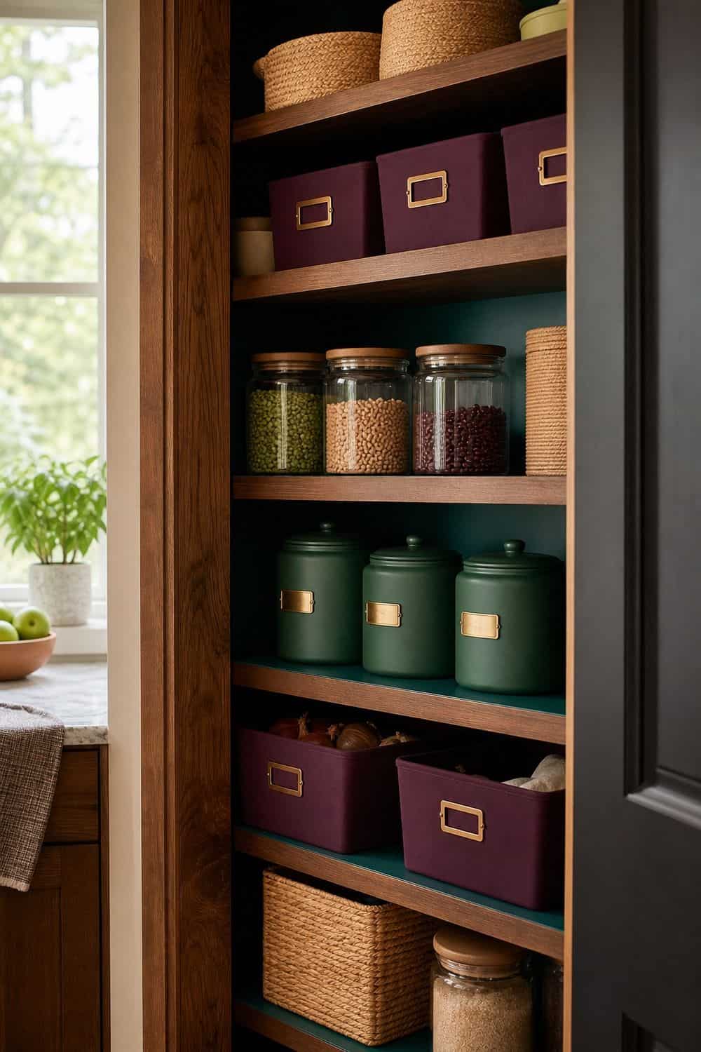
A pantry nook can carry jewel color beautifully because it is already a defined zone. Paint the inside of a cabinet, add teal shelf paper, use plum bins, or place emerald canisters where they will be seen when the doors open. Keep the storage labels and containers practical. The color should make the pantry feel considered, not harder to use. Deep tones work especially well with glass jars, brass label holders, dark wood shelves, and warm lighting. Leave enough negative space so the pantry does not look heavy when it is fully stocked.
15. Cream Walls Around Jewel Tone Accents
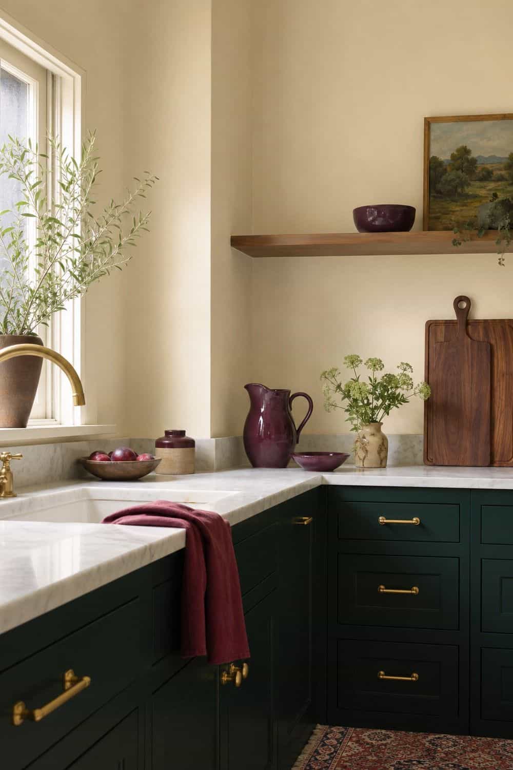
Cream walls are a quiet secret behind many good jewel tone kitchens. They soften saturated cabinets, runners, tile, and ceramics while keeping the room warm enough for everyday cooking. Choose cream rather than stark white if the palette includes emerald, plum, ruby, walnut, brass, or marble. A warm wall color gives the stronger tones somewhere gentle to land. It also helps the kitchen photograph and feel better at night. If the room feels too dark, lighten the walls before adding more decor.
16. Dark Wood for a Grounded Contrast
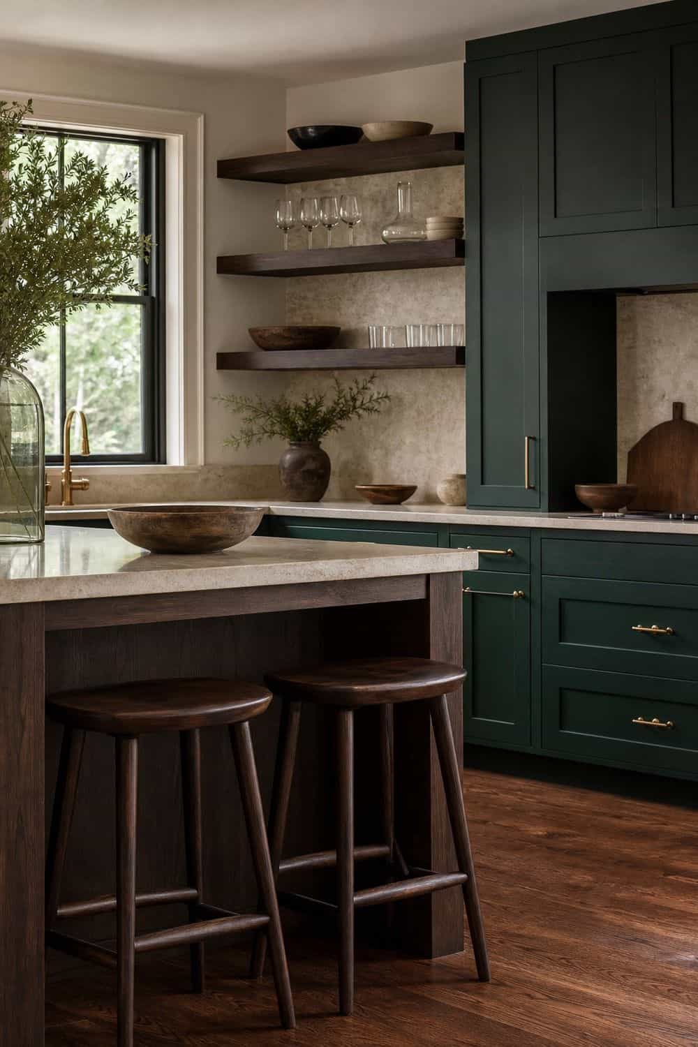
Dark wood makes jewel tones feel richer and less trendy. Walnut shelves, espresso stools, a stained island, or a dark wood hutch can ground emerald, sapphire, plum, and teal in a way that still feels like a working kitchen. Use wood where hands naturally go: cutting boards, shelves, stools, trays, or cabinet details. Too much dark wood can make the room heavy, so balance it with cream, glass, marble, or warm light. The grain matters too. Visible texture keeps the palette from becoming a flat block of color.
17. Metallic Details in Small Doses
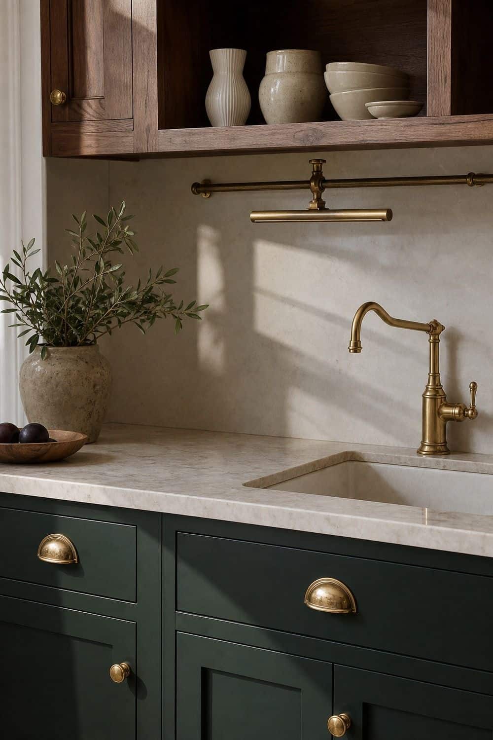
Metallic details can make jewel tones glow, but they lose their charm when every surface shines. Use brass, bronze, copper, or aged nickel in small places: cabinet pulls, a picture light, a rail, a faucet, or a tray. Let one metal be the main finish.
Mixing too many shiny pieces can push the kitchen into a glam costume instead of a layered room. Aged or brushed finishes usually feel calmer beside emerald, sapphire, and plum. The metal should catch light, not steal attention from the color.
18. Colorful Art That Pulls the Palette Together
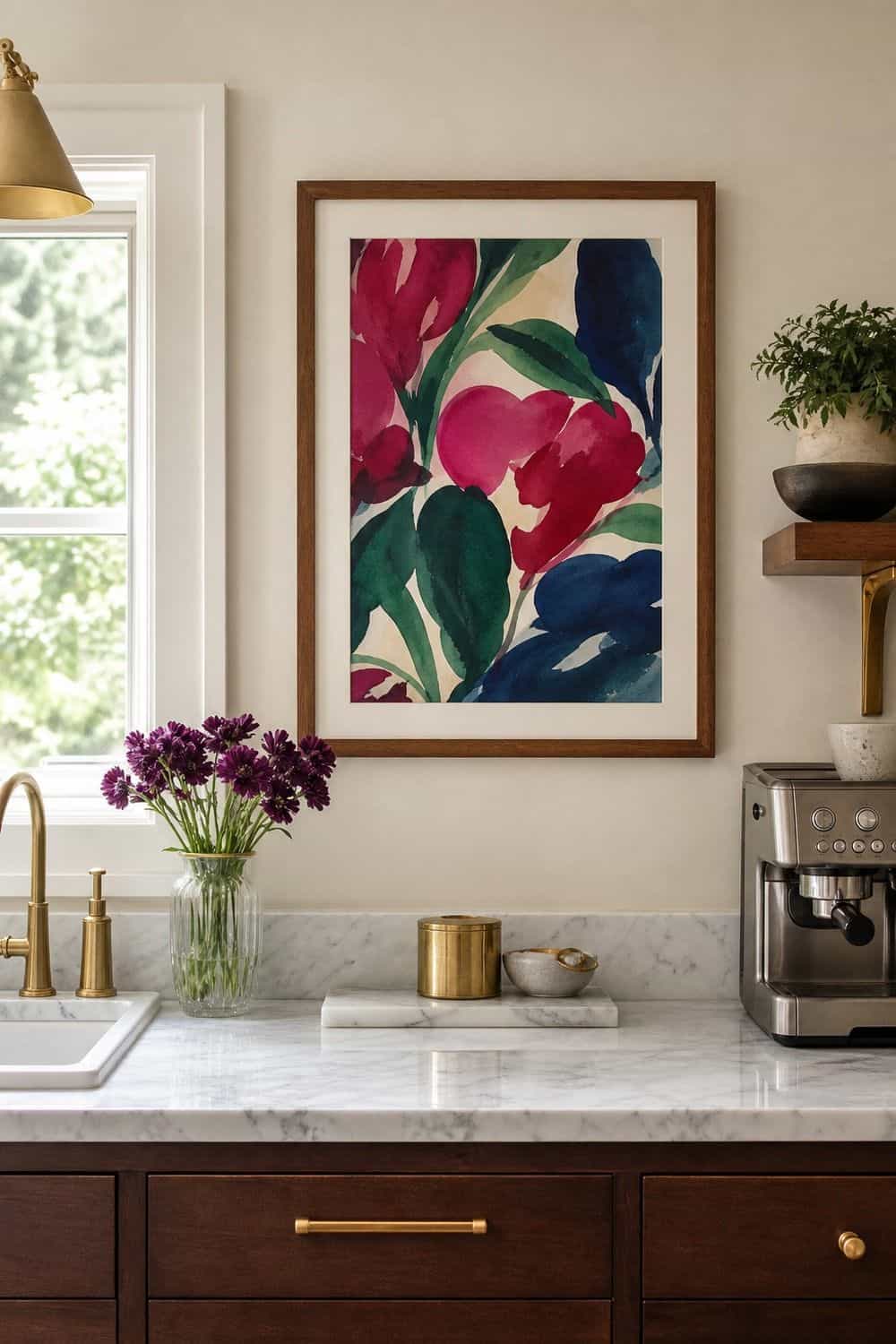
Colorful art can connect a jewel tone palette without adding more objects to the counter. A still life, landscape, botanical print, or abstract piece with emerald, sapphire, plum, or ruby can make the kitchen feel collected.
Hang art away from steam, grease, and sink splash, or use a framed print that can be wiped. A small piece near a coffee bar, breakfast nook, or pantry door is often enough. Let the art echo the palette rather than introduce five new colors at once.
19. Tonal Blues Across Paint and Textiles
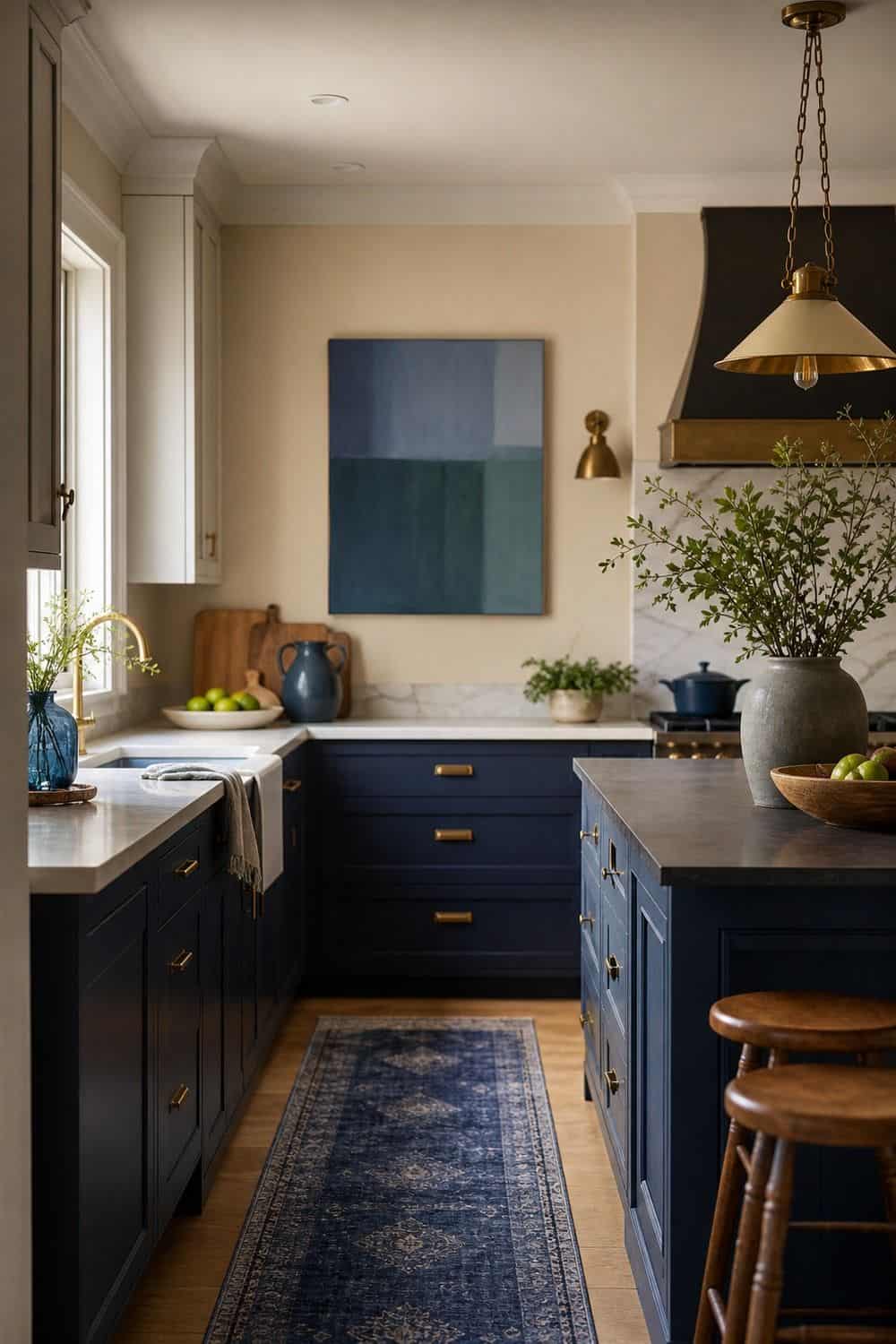
Tonal blues create a jewel look that feels calm rather than loud. Mix sapphire, ink, navy, slate, and blue-green through a runner, island, art, glassware, or stools, then hold the rest of the kitchen steady with cream, wood, and brass.
The trick is varying texture instead of adding more colors. A matte cabinet, woven runner, smoked glass, and marble counter can all sit in the blue family while still feeling layered. Add warm lighting so the palette does not become cold after dark.
20. Tonal Greens With Natural Texture
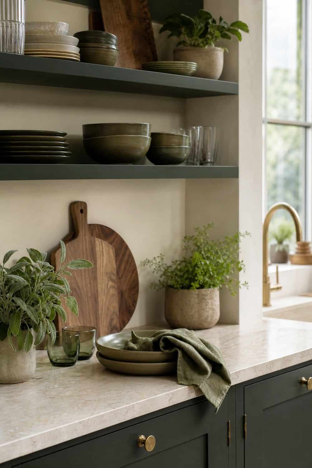
Tonal greens are a natural fit for kitchens because they connect to herbs, vegetables, wood, and stone. Emerald, forest, olive, deep sage, and green-black can work together if the undertones stay warm enough.
Use the darkest green on cabinets or an island, then bring softer greens through plants, dishes, towels, or art. Cream counters and walnut boards keep the palette from feeling too shadowy. If two greens fight each other, separate them with brass, marble, or warm white paint so the room still feels layered.
21. Balanced Color in Compact Layouts
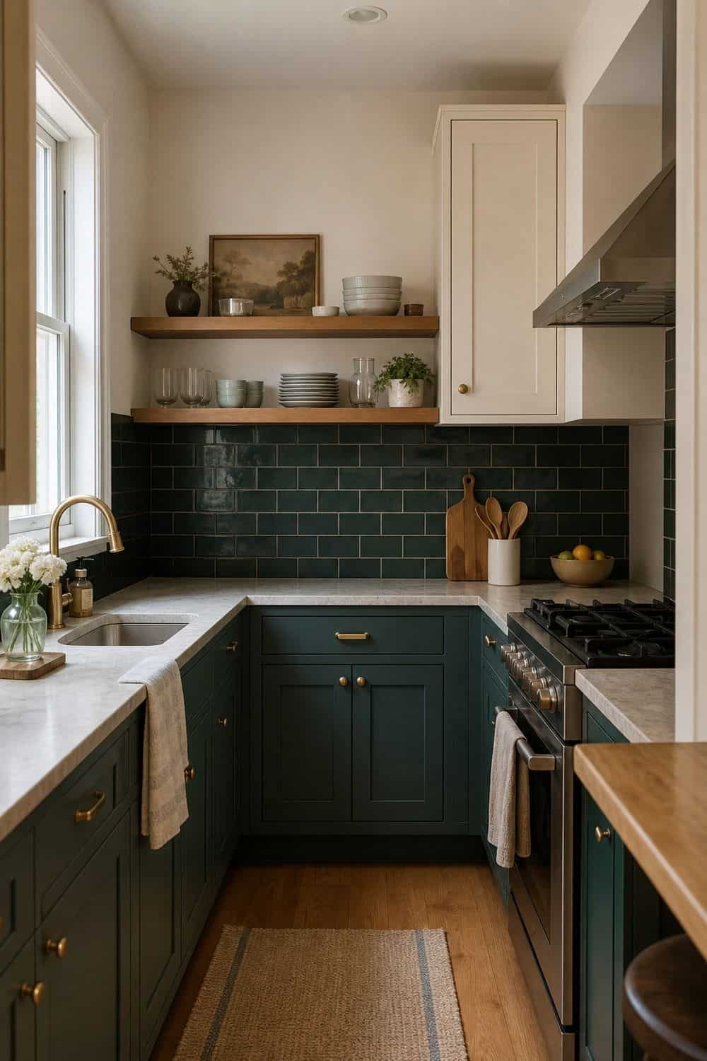
A compact kitchen can still handle jewel tones, but the color needs a clear boundary. Use a painted island, lower cabinets, a runner, open shelf styling, or one backsplash area instead of wrapping every surface in deep color. Keep the counter line open and let vertical surfaces carry more of the mood.
Wall art, lighting, cabinet color, and hardware add richness without taking over prep space. Pale stone, glass, cream paint, and warm bulbs help the room breathe. The goal is drama with enough room to cook.
22. Removable Style Layers for Flexibility

Removable layers are perfect if you want jewel color without committing to a renovation. Start with a sapphire runner, ruby towels, plum bowls, emerald art, teal dishes, brass pulls, or a small lamp on a safe counter. Choose pieces that earn their place. A runner softens the floor, towels dry dishes, bowls hold fruit, and a lamp adds evening glow. When the color lives in useful layers, the kitchen can shift with the season without feeling decorated for one week and ignored the next.
23. Fewer Colors With More Depth

Jewel tones are strongest when they are not all competing at once. Emerald, sapphire, ruby, teal, plum, and amethyst can look beautiful together in a palette board, but a real kitchen needs fewer voices. Choose one dominant jewel tone, one secondary accent, and one neutral anchor. For example, emerald cabinets, plum ceramics, and cream walls will usually feel calmer than emerald cabinets, sapphire stools, ruby towels, teal tile, and purple art all fighting for attention. Leave a few surfaces quiet so the best color can shine.
24. Restraint Around Glossy Glam Details
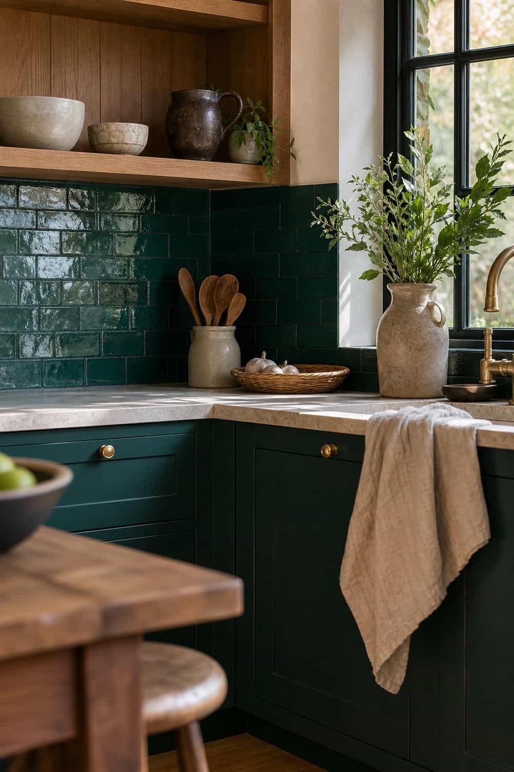
A jewel tone kitchen does not need every finish to sparkle. Too much gloss, mirror, crystal, polished metal, and high-shine tile can make saturated color feel theatrical instead of warm. Balance shine with matte paint, natural wood, linen, stone, or handmade ceramics. If the backsplash is glossy, keep the hardware softer. If the stools are velvet or jewel-colored, let the counters stay simpler. A little glow is beautiful; too much shine can make the room feel less like a kitchen and more like a display.
25. A Sophisticated Finish for Jewel Tone Kitchens
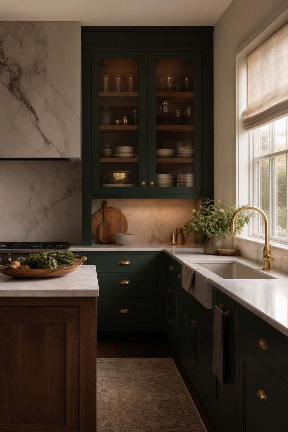
The most sophisticated jewel tone kitchen ideas usually come down to restraint. Let one saturated color make the room memorable, then support it with materials that feel useful and lasting: walnut, marble, brass, cream, linen, glass, and warm light. Before adding another color or accessory, look at the kitchen during a normal cooking hour.
If the counters feel crowded or the palette feels noisy, remove something before buying more. Jewel tones should make the room feel richer, not harder to use. The best version still feels like a kitchen first.
Frequently Asked Questions
What makes a kitchen jewel tone?
A jewel tone kitchen uses saturated colors inspired by gemstones, such as emerald, sapphire, ruby, plum, amethyst, and teal. The look works best when those colors are balanced with practical kitchen materials like warm lighting, cream walls, walnut, marble, brass, glass, and clear prep space.
How do I keep jewel tone kitchen ideas practical?
Keep the strongest color on a surface that can handle daily life, such as cabinets, an island, tile, stools, a runner, or dishware. Leave the main prep counter open, choose wipeable finishes near cooking zones, and use warm task lighting so the room stays useful after dark.
Can jewel tones work in a compact kitchen layout?
Yes, but a compact layout usually needs one defined color moment instead of saturated color everywhere. Try deep lower cabinets, a small runner, jewel-toned stools, open shelf accents, or a painted island, then balance the room with lighter counters, glass, cream paint, and warm bulbs.
What should I avoid with jewel tone kitchen decor?
Avoid using too many strong colors at once, especially if the kitchen already has busy stone, patterned flooring, or dark cabinets. Cold lighting, novelty glam pieces, overly shiny finishes, and crowded counters can make jewel tones feel chaotic instead of layered.
How do I add jewel tones without renovating?
Use pieces that can move or swap easily: runners, towels, bowls, art, small lamps, bar stools, glassware, hardware, or pantry styling. These layers let you try emerald, sapphire, plum, ruby, or teal in real kitchen light before choosing cabinet paint or tile.
Final Thoughts
Jewel tone kitchen ideas work best when the color has a clear role and the rest of the room supports it. Choose the emerald island, sapphire runner, plum bowl, teal tile, or ruby textile that feels right for your light and routine, then give it enough quiet space, warm texture, and practical counter room to feel beautiful every day.
Last update on 2026-09-18 / Affiliate links / Images from Amazon Product Advertising API