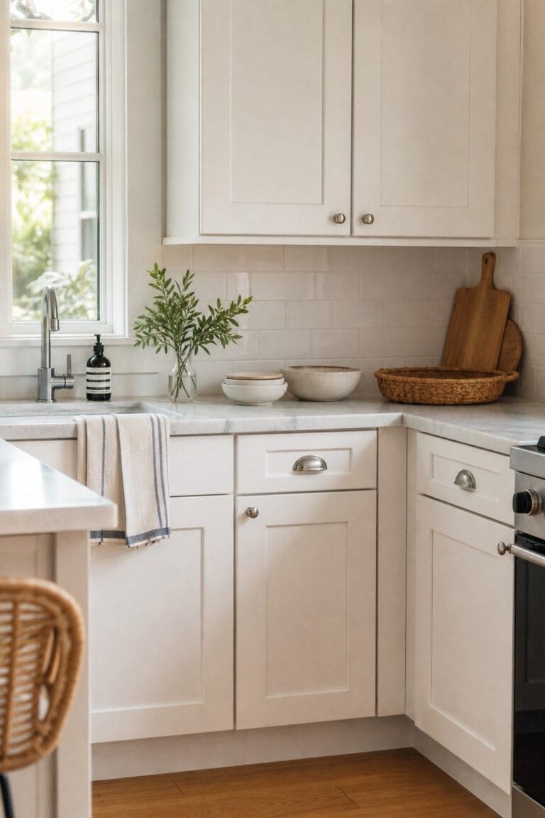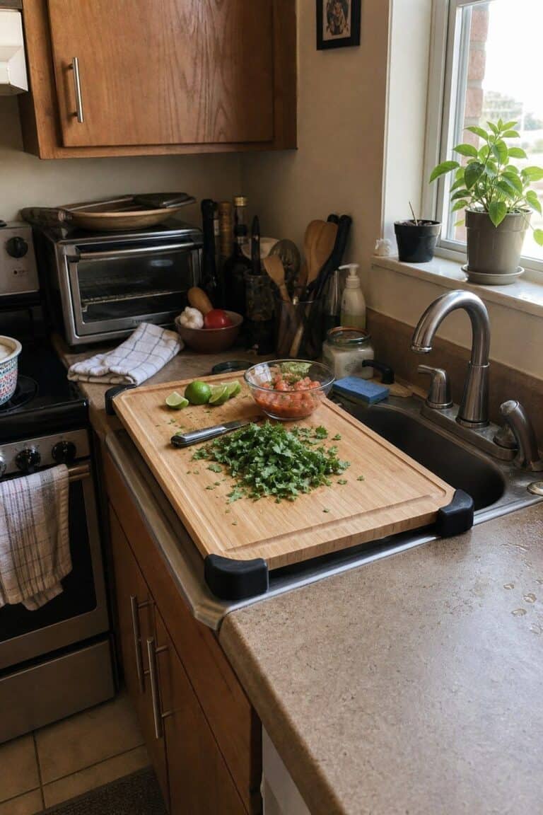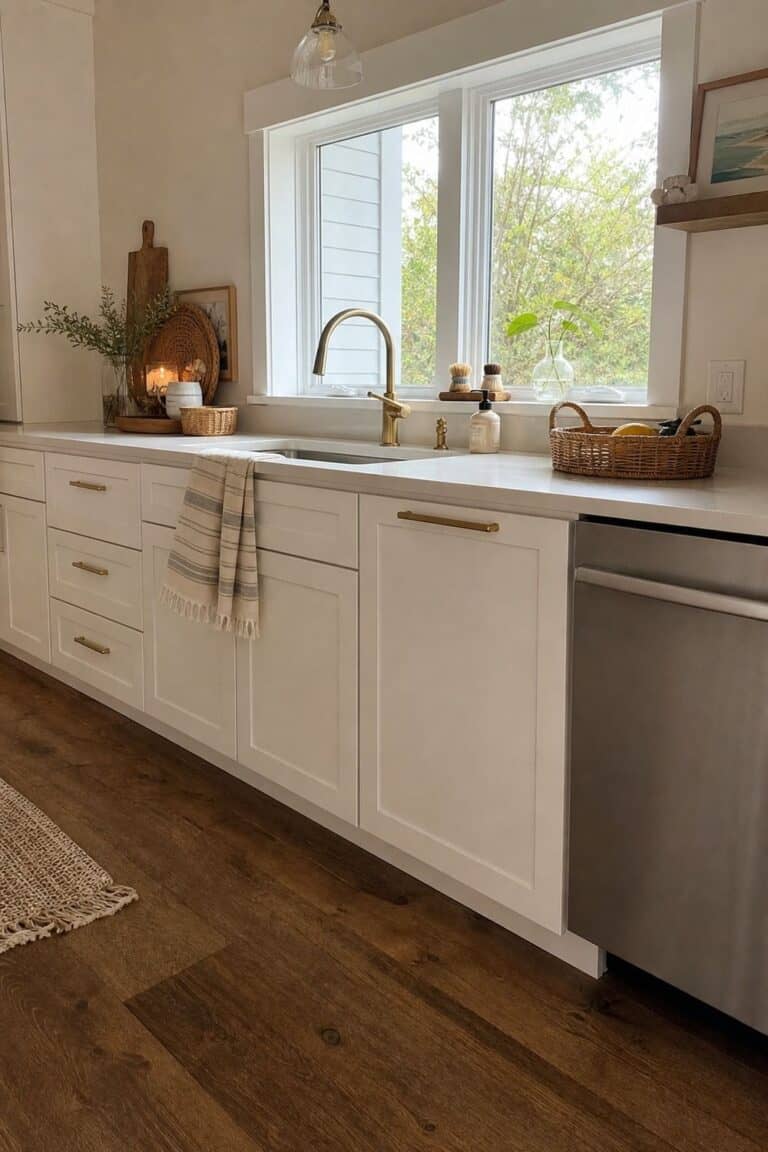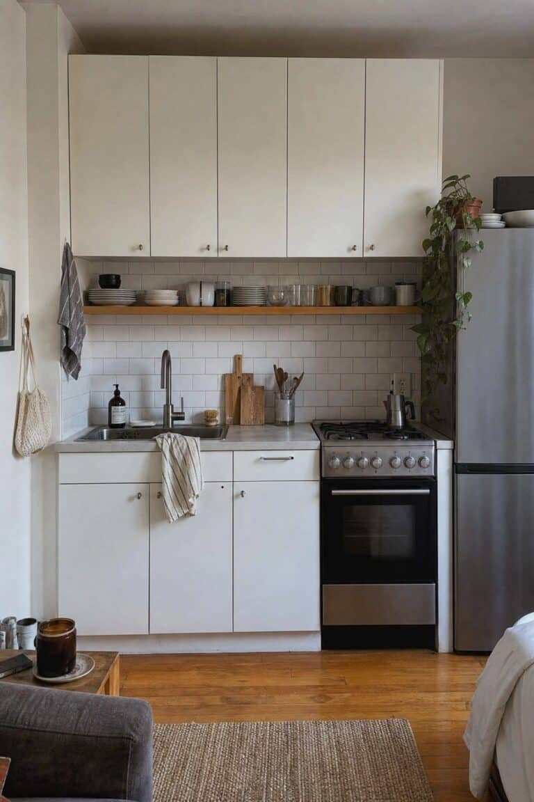
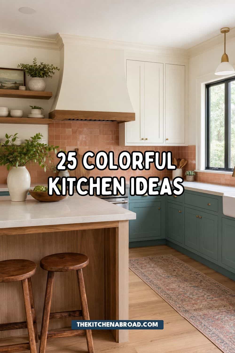
Colorful kitchen ideas are strongest when each shade has a clear place to live, such as cabinets, an island, backsplash tile, lighting, textiles, dishes, or one small painted feature. Choose one lead color, repeat it in smaller accents, and balance it with wood, stone, cream, metal, or quiet counters so the kitchen feels lively without becoming chaotic.
A colorful kitchen can feel bright, layered, and easy to live with when the color decisions are tied to real surfaces. Paint, tile, lighting, rugs, stools, and dishes all change the room differently, so the strongest colorful kitchen ideas start with where the shade belongs and how fixed that choice should be.
A colorful kitchen does not need every shade at once. A better palette usually has one lead color, one quieter support shade, a grounding neutral, and a material that warms the room up. That gives saturated cabinets, patterned tile, or bright accessories enough structure to feel collected rather than random.
You Might Also Like These Blog Posts
- Blue and White Kitchen Ideas
- Butter Yellow Kitchen Ideas
- Cool Blue Kitchen Ideas
- Kitchen Tile Backsplash Ideas
- Eclectic Kitchen Ideas
25 Colorful Kitchen Ideas for a Beautiful Kitchen
1. Lower Cabinets in a Saturated Color

Putting the strongest color on the lower cabinets gives the room weight while keeping the upper half bright. Deep green, blue, clay, cranberry, or smoky teal can handle daily visual attention below the counter, especially when upper cabinets stay cream, white, pale wood, or open. This works nicely in kitchens where natural light is limited because the color feels grounded instead of closing in the walls.
Before painting, compare the cabinet shade against flooring, counters, and backsplash samples in morning and evening light. A satin cabinet finish is usually easier to wipe than flat paint, and it keeps saturated color from looking too glossy. Repeat the lower-cabinet shade once through a runner, dish towel, or small piece of art so it feels connected to the whole kitchen.
2. Kitchen Island as the Color Anchor

An island is a natural place for one bold shade because it sits at the center of the room and already feels like a separate furniture piece. A blue, burgundy, olive, mustard, or brick-red island can add color without requiring every cabinet to change. It also works with wood perimeter cabinets or warm white walls because the color has a clear boundary.
Use the island color as the anchor, then echo it lightly through stools, a fruit bowl, pendant shades, or framed art nearby. Leave enough breathing room around the island so the paint color reads cleanly instead of getting lost behind clutter. If the island has panels or legs, a slightly deeper color can make those details stand out.
3. Tonal Cabinet Palette with Neighboring Colors
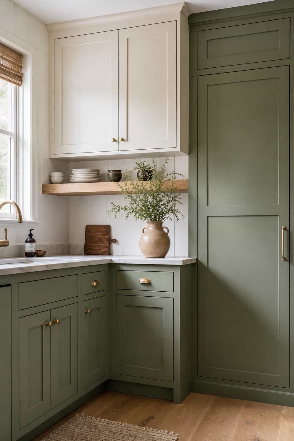
A tonal palette uses related shades instead of high contrast, which is helpful if you want color without a busy, scattered look. Think sage with moss, sky blue with powder blue, clay with terracotta, or butter yellow with cream. The colors feel layered because they belong to the same family, but the room still has movement.
Keep the undertones consistent when comparing samples. A muddy green beside a clear mint can feel accidental, while two softened greens usually sit together more comfortably with stone, wood, and hardware.
This approach works especially well on cabinets, trim, pantry doors, and open shelving. Use hardware, stone, or wood as the quiet bridge between the shades, and avoid adding a third loud color unless it appears in a very small accent.
4. Pantry Door in a Happy Shade

A pantry door gives you a strong color moment without touching the main cabinets. Try tomato red, smoky blue, ochre, jade, or lavender on a flat door, glass door, arched door, or vintage-style paneled door. Because the door is framed by surrounding walls and trim, the color feels contained and architectural rather than scattered across the room.
Small details make this idea feel finished. A brass knob, darker hinge finish, painted trim edge, or glass panel can turn the pantry into a design feature. If the kitchen already has colorful tile, choose a pantry shade that repeats one color from the tile instead of introducing a new unrelated tone.
5. Beadboard Backsplash With Paintable Texture

Painted beadboard brings color and texture to cottage, farmhouse, and older kitchens without the cost of a full tile wall. A pale blue, celery green, soft yellow, or muted coral can make the backsplash feel cheerful while the vertical lines add depth. It is especially useful on sink walls, coffee corners, dry prep zones, or breakfast nooks where heavy grease is not the main issue.
Use a washable finish and seal edges carefully near water. Behind a high-splash range, tile or another more heat-tolerant material is usually safer. Beadboard looks calmest when counters stay quiet, so pair it with simple stone, butcher block, or a lightly patterned surface that does not fight the panel grooves.
6. Subway Tile Backsplash in a Bold Color

Subway tile is familiar enough that a stronger color still feels approachable. Glossy green, cornflower blue, butter yellow, terracotta, burgundy, or teal can make a standard backsplash feel fresher without changing the basic tile shape. The rectangular format keeps the wall orderly, which helps saturated color feel more classic and less trend-driven.
Grout changes the final mood. Matching grout softens the wall and lets the color read as one field, while contrast grout makes every tile line more graphic. If your cabinets are already colorful, choose a quieter tile shade or a handmade variation in the same color family so the backsplash supports the palette rather than competing with it.
7. Handmade-Look Zellige Tile in a Saturated Shade

Zellige-style tile is a good choice when you want saturated color with movement instead of a flat block of paint. Each tile has slight variation, so emerald, cobalt, ochre, plum, or rust can catch light differently across the wall. That surface variation makes the kitchen feel layered even if the rest of the finishes stay fairly simple.
Use this tile where it can be seen clearly, such as behind the range, around the sink, or across one main backsplash wall. Keep neighboring counters, cabinet fronts, and hardware calmer so the tile remains the color story. Because handmade-look tile can feel visually active, a smaller area often has more impact than covering every wall.
8. Patterned Tile Behind the Range

A patterned tile panel behind the range gives the kitchen a high-impact color zone without overwhelming every surface. It can frame the cooking area like artwork, especially with a simple hood above and plain counters beside it. Look for patterns that repeat two or three colors already present in the kitchen, such as cabinet paint, metal finishes, or wood tones.
Keep the surrounding backsplash quieter if the range tile is busy. A plain field tile, plaster-look wall, or painted beadboard can give the patterned area space to breathe.
This is also a good place to use a color you love but would not want across the entire room. The range wall naturally draws attention, so the pattern feels chosen rather than sprinkled everywhere.
9. Peel-and-Stick Backsplash for a Temporary Color Moment

Peel-and-stick backsplash can add color when you need a removable or budget-conscious update. Use it on smooth, clean walls away from intense heat, heavy steam, and uneven texture. A blue checker, green tile look, yellow stripe, or terracotta pattern can brighten a coffee corner, sink side wall, pantry zone, or short backsplash run.
Test a small piece first so you can see how the adhesive behaves on your wall surface. Line up repeats slowly, press out bubbles as you go, and avoid stretching the material. The most successful versions look deliberate because they are trimmed neatly around outlets, counter edges, and corners.
10. Breakfast Nook Wallpaper With Color

Wallpaper is easier to enjoy when it sits away from the messiest cooking zones. A breakfast nook, pantry wall, side wall, coffee station, or small dining corner can handle floral, stripe, fruit, block-print, or geometric pattern without fighting grease and steam every day. This gives the kitchen color and personality while keeping the working backsplash easier to clean.
Balance a busy pattern with plain cabinet fronts, quiet counters, and solid-colored seat cushions or curtains. If the wallpaper has several colors, choose one shade from the print and repeat it once in a stool, lamp, dish, or framed piece. That small repeat helps the pattern feel connected to the kitchen instead of pasted onto the wall.
11. Range Hood as a Color Focal Point

A painted range hood can turn a practical vent area into the main color feature. It works especially well with plaster-look hoods, boxed wood hoods, curved hoods, or simple drywall surrounds that can take paint. Match the hood to the island for a pulled-together look, or choose a deeper contrast shade if the cabinets are pale.
The hood color should relate to the wall behind it. A saturated blue hood over white tile reads crisp, while olive over warm stone feels softer and earthier.
Because the hood sits high, it can carry color without taking over the counters. Keep nearby shelves and art restrained so the shape of the hood remains visible.
12. Pendant Lights Over the Island

Pendant lights add color at eye level without changing cabinets, tile, or counters. A row of enamel green shades, red metal domes, blue glass pendants, or yellow woven shades can make a neutral kitchen feel more personal. Because pendants hang in open space, the color should be strong enough to read from across the room but not so large that it blocks sight lines.
Scale matters more than novelty. Choose pendants wide enough for the island but high enough that people can talk beneath them comfortably. Warm bulbs will make most colors feel softer at night, while cool bulbs can flatten paint and metal finishes. If you already have a colorful backsplash, repeat one of its quieter tones in the lights.
13. Bright Cabinet Knobs on Plain Cabinets
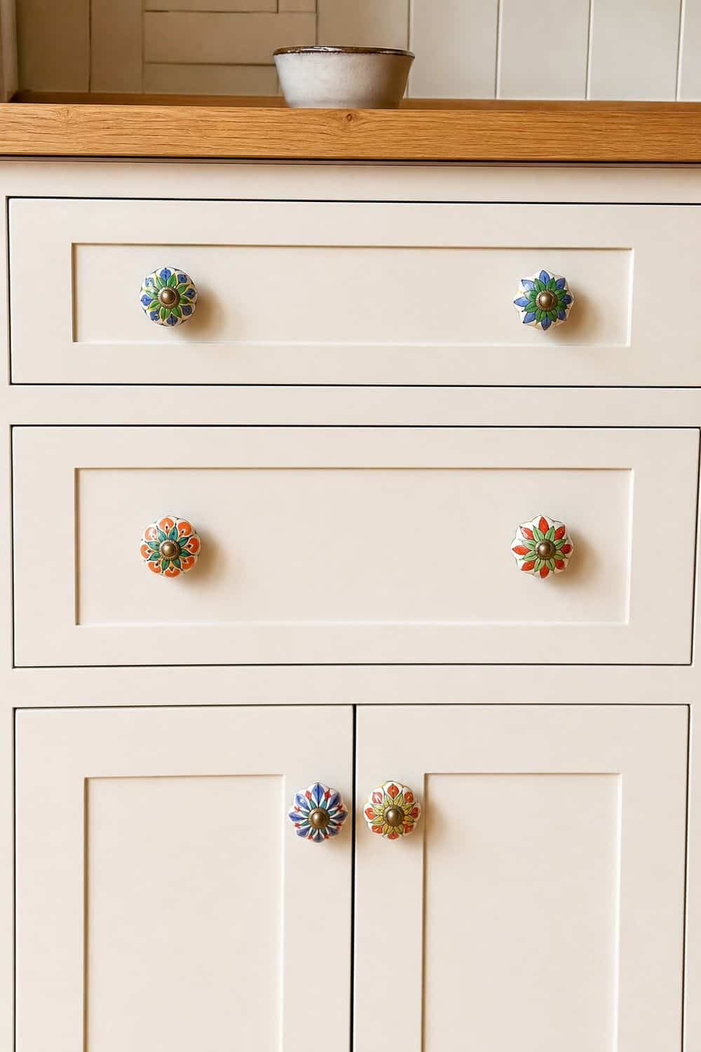
Bright knobs are a small way to repeat color across the kitchen, especially on plain white, cream, wood, or painted cabinets. Ceramic knobs can add pattern, glass knobs can bring a translucent sparkle, and painted wood or enamel knobs can echo a favorite cabinet or tile shade. Because the pieces repeat, even a tiny color choice becomes noticeable.
Keep the knob shape consistent if the color is strong. Mixing too many shapes and colors can make cabinets feel busy, while one clear choice feels cleaner. This is a good update for drawers, pantry cabinets, freestanding hutches, or a baking corner where you want color without changing the larger surfaces.
14. Island Bar Stools With a Bright Finish

Bar stools are one of the easiest ways to bring color into a kitchen because they can move, rotate, or change later. Red metal stools, blue upholstered seats, green wood stools, or yellow woven seats can lift a white, wood, or stone island quickly. Choose one color family for all stools so the island looks lively but still organized.
Leave enough walkway clearance behind the stools so the color does not become an obstacle. If the kitchen already has a bold island, pick a stool color that is slightly quieter or pulled from the same palette. For a neutral island, stools can carry the stronger shade and connect to art, curtains, or a runner nearby.
15. Kitchen Runner With Pattern and Color

A runner adds color across the floor, which is helpful in galley kitchens, sink runs, and long island walkways. Patterned red, blue, green, or multicolor runners can warm up plain cabinets and make the room feel less bare. A low-pile washable style is usually best for real kitchen use because crumbs, splashes, and frequent foot traffic are part of the space.
Use a non-slip pad and choose a width that does not curl against cabinet bases. If the backsplash or cabinets are already strong, pick a runner with one shared color and quieter surrounding tones.
The floor is also a forgiving place to test a palette. If the color feels too loud after a few weeks, it can move to another room without changing the kitchen itself.
16. Cafe Curtains Over the Sink

Cafe curtains bring color to a window without using counter space or covering the whole wall. A gingham, stripe, floral, or solid linen panel can soften the sink area and add a color repeat above the countertop. They are especially useful when the backsplash is plain and the kitchen needs a small textile layer.
Choose washable cotton or linen blends that can handle steam, cooking smells, and occasional splashes. If the room already has patterned tile, use a solid curtain color pulled from the tile instead of adding another pattern. The curtain rod finish matters too, since brass, black, or nickel can connect the window to cabinet hardware.
17. Ceiling Color for an Unexpected Layer

A painted ceiling can make a kitchen feel designed from top to bottom, especially in a breakfast nook, small galley, or room with simple cabinets. Soft blue, pale peach, butter yellow, or muted green can add color overhead without taking over the backsplash. In rooms with higher ceilings, a deeper shade can feel dramatic and cocooning.
Low ceilings usually need softer colors or a finish that reflects light gently. Very glossy ceiling paint can show imperfections, so sample the sheen before covering the whole room.
Connect the ceiling color to one lower element, such as a runner, pendant shade, or dish display. That repeat keeps the overhead color from feeling isolated.
18. Open-Shelf Back Panels in Color
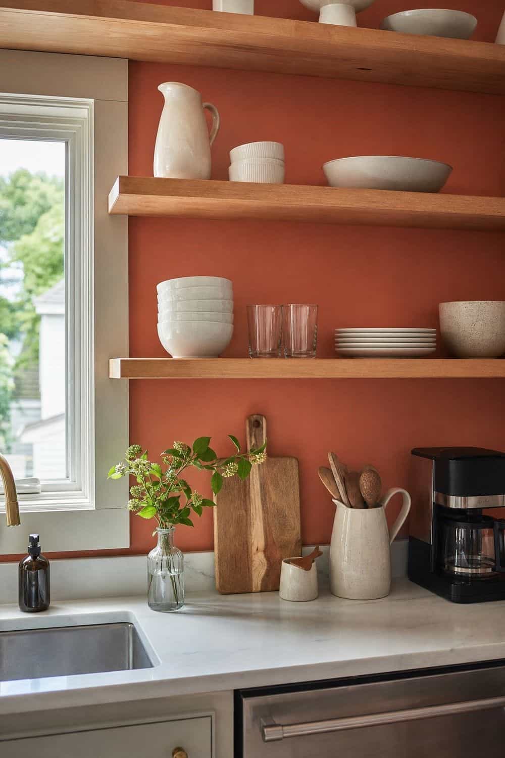
The backs of open shelves, glass cabinets, or a freestanding hutch are perfect places for contained color. Paint, wallpaper, or peel-and-stick shelf liner can sit behind everyday dishes and make the display look deeper. Because the color lives on a back panel, it shows in glimpses rather than covering the whole kitchen wall.
This works especially well with white dishes, clear glass, warm wood, or one consistent dinnerware color. If the shelves already hold many colors, choose a softer panel shade so the display does not feel crowded. Keep the shelf contents useful and spaced enough that the background color can actually show through.
19. Glass-Front Cabinets with Colorful Dishes

Colorful dishes can become part of the kitchen design when they sit behind glass-front cabinets. Stacks of blue plates, green bowls, amber glasses, or patterned serving pieces add color in a way that still feels useful. The trick is to keep shapes and color families consistent so the cabinet looks collected instead of messy.
Arrange heavier items lower and leave small gaps between stacks. If the cabinet interior is painted or lined, choose dishes that contrast enough to be visible.
This idea is strongest when the dishes are actually used. Seasonal or special-occasion pieces can work too, but daily plates and glasses make the color feel like part of the kitchen routine.
20. Cookware Display on Open Shelves
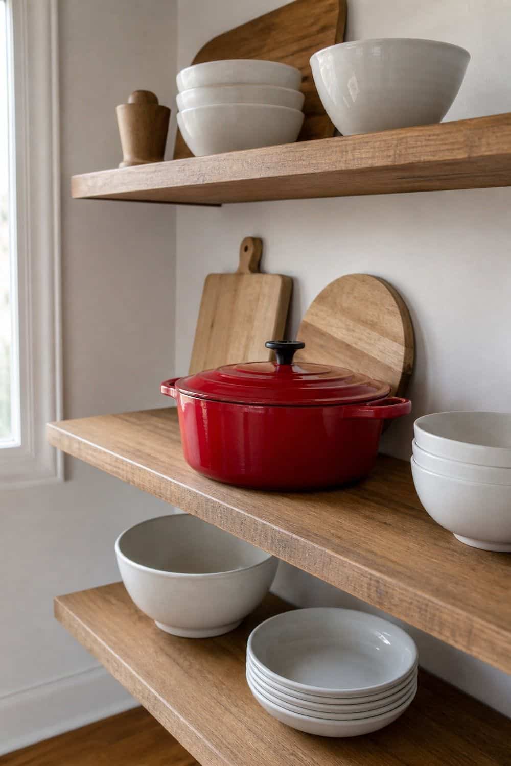
A colorful Dutch oven, enamel pot, or bright pan can add a strong color note when displayed on an open shelf. Keep it to one or two pieces that are genuinely used, not an entire wall of cookware competing for attention. A red pot, green casserole, yellow skillet, or blue enamel piece can echo cabinet paint or brighten a neutral shelf.
Make sure the shelf can support the weight and that the cookware is easy to lift down safely. Surround the piece with quieter objects, such as wood boards, white bowls, or plain glass jars. If the cookware is the brightest thing in the room, let it be the main accent instead of adding several more loud accessories nearby.
21. Small Appliances in a Baking Corner

A colorful stand mixer, toaster, kettle, or coffee machine can anchor a baking or drink station. Since these appliances often stay visible for years, choose a shade you can repeat in a limited way. Pistachio, cream-yellow, cherry red, powder blue, or matte blackened green can all work if the surrounding counter stays tidy.
Give the appliance a real home rather than moving it constantly across the counter. Place it near flour, mugs, filters, baking tools, or whatever supports the way you use it most often.
If the appliance is very bright, keep nearby canisters and trays quieter so the counter still feels usable. One useful color anchor works better than a crowded appliance showroom.
22. Freestanding Hutch in a Statement Color

A freestanding hutch, sideboard, or vintage cabinet can carry color without changing built-in cabinetry. This is useful in older kitchens, existing-cabinet rooms, and layouts where the main cabinets need to stay as they are. A painted hutch in olive, blue, mustard, cranberry, or dusty pink can store dishes, linens, cookbooks, serving pieces, or pantry overflow while adding a furniture-like color layer.
Choose a color that relates to the kitchen but does not have to match every cabinet. Slight contrast can make the piece feel found and personal.
Before painting older furniture, clean, sand, prime, and test the finish on a hidden area. Good prep keeps the color from chipping around handles and shelves.
23. Wall Art in a Blank Kitchen Corner
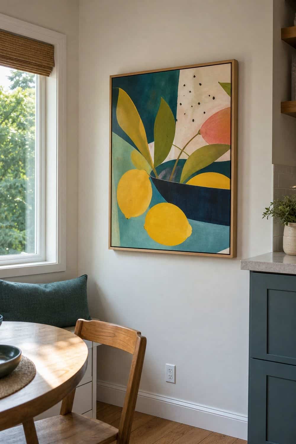
Wall art is a good color layer for breakfast nooks, coffee stations, pantry doors, and blank side walls that do not need tile or shelving. A framed print, food illustration, vintage poster, or small gallery grouping can echo the main palette and make the kitchen feel less purely utilitarian. Art is especially helpful when cabinets and counters need to stay neutral.
Use art to repeat colors you already have, not to introduce five unrelated shades. A print with the island color, runner color, or curtain color will feel connected. Keep frames easy to wipe and avoid placing delicate paper directly above heavy steam or grease. In a narrow kitchen, one larger piece often feels calmer than many tiny frames.
24. Countertop Tray for One Styled Zone

A colorful tray can organize one small counter zone while adding a controlled accent. Use it for olive oil, salt, coffee supplies, tea tins, fruit, a small plant, or everyday cooking tools. Because the tray creates a boundary, the color feels contained and useful instead of becoming loose clutter across the whole counter.
Choose a tray material that fits the kitchen, such as enamel, lacquered wood, metal, ceramic, or woven fiber with a colored rim. Keep only items you use often on the tray, and leave breathing room around it. If the counter is patterned stone, a solid tray color will usually look calmer than a busy print.
25. Sample Board Before Choosing a Palette
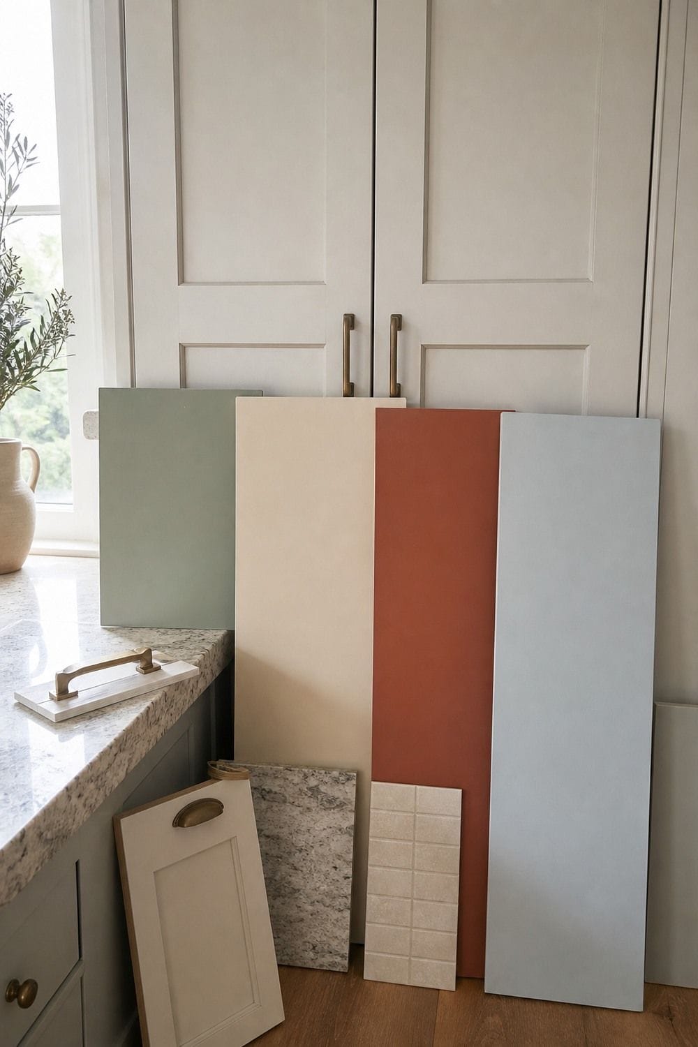
Sample boards are the quiet planning step that can save a colorful kitchen from feeling wrong after the paint goes up. Paint large movable boards instead of tiny swatches, then hold them near counters, floors, backsplash tile, hardware, and appliances. A color that looks soft online can turn neon beside cool stone or muddy beside orange-toned wood.
Check each sample in morning light, afternoon light, and after dark with your actual bulbs on. Tape the boards vertically on cabinet doors and walls because horizontal samples can read differently.
This planning step also helps you build a palette. Pick one lead color, one support shade, one neutral, and one warming material before buying paint, tile, stools, or textiles.
How to Keep Colorful Kitchens Feeling Cohesive
Color works better in a kitchen when it has a job. Cabinets, islands, backsplashes, lighting, textiles, dishes, open shelving, and painted doors all carry color differently, so decide whether you want a fixed surface, a removable layer, or a small accent first.
A strong palette does not need every shade you like. Start with one lead color, add one supporting color, keep one calm neutral in the room, and use wood, stone, brass, nickel, cream, or natural fiber to soften the edges.
Lower-commitment routes include runners, cafe curtains, knobs, art, shelf liner, removable backsplash, dishes, trays, stools, and small appliances. Renovation-level routes include cabinet paint, island paint, tile, range hoods, wallpapered nooks, painted ceilings, and built-in display cabinets.
Frequently Asked Questions
How do I make my kitchen more colorful without painting cabinets?
Use color on pieces that are easy to add or change, such as a runner, cafe curtains, pendant shades, bar stools, wall art, open-shelf dishes, colorful knobs, a countertop tray, or a small appliance. The room will feel more connected if you repeat one color two or three times instead of bringing in many unrelated accents.
What kitchen colors are trending right now?
Current colorful kitchens are leaning into warmer, richer shades rather than stark white or cool gray. Soft greens, muddy blues, butter yellow, burgundy, terracotta, clay, teal, earthy red, and warm cream all feel current. The most livable versions pair color with natural wood, stone, quiet counters, and metal finishes that keep the palette grounded.
How do you choose a color palette for a kitchen?
Start with the fixed finishes you are keeping, such as floors, counters, backsplash, appliances, and hardware. Then choose one lead color, one support color, one neutral, and one warming material. Test large samples in the actual kitchen light before buying paint or tile, because undertones can change beside stone, wood, and artificial lighting.
Can a colorful kitchen still look timeless?
Yes, a colorful kitchen can still feel lasting when the color is placed with restraint and supported by classic materials. Cabinet paint, tile, and islands tend to age better when the shade relates to wood, stone, cream, or metal in the room. Avoid chasing every trend at once, and let one main color lead the design.
What is the easiest temporary colorful kitchen idea?
The easiest temporary ideas are runners, art, colorful dishes, cafe curtains, countertop trays, bright stools, shelf liner, and removable wallpaper or backsplash in a low-splash area. These choices add visible color without requiring cabinet paint or tile work. They are also useful for testing which shades you enjoy living with every day.
How do I use bright colors without making the kitchen feel busy?
Give bright color a clear boundary. Use it on one main feature, such as an island, backsplash, stools, runner, or pantry door, then repeat it lightly in one or two smaller accents. Keep counters, walls, or upper cabinets calmer so the eye has somewhere to rest. This keeps bold color lively instead of overwhelming.
What colors work well with wood cabinets?
Wood cabinets usually pair well with colors that respect the undertone of the wood. Honey and oak tones look good with soft blue, muted green, cream, clay, and butter yellow. Dark walnut can handle deeper green, burgundy, teal, or smoky blue. Always test samples beside the wood because orange, red, and gray undertones can shift the final palette.
Should colorful kitchen cabinets be matte, satin, or glossy?
Satin is often the most forgiving cabinet finish because it wipes better than flat paint and reflects less sharply than high gloss. Matte can look soft and modern, but it may show marks in busy kitchens. Glossy finishes can be striking on doors or trim, though they tend to highlight surface imperfections and fingerprints.
Final Thoughts
The best colorful kitchen ideas are not about filling every surface with color. They are about choosing where color can do the most work, whether that is a painted island, a tile backsplash, a bright runner, a pantry door, or dishes behind glass. Start with one clear color role, repeat it with restraint, and let the rest of the kitchen give that shade room to breathe.