The best quiet luxury kitchen decor finds are useful pieces with restrained color, better materials, and no flashy branding. Start with a marble tray, aged brass hardware, linen cafe curtains, ribbed drinking glasses, and warm under-cabinet lighting, then layer in stone, walnut, ceramic, leather, bronze, and tonal textiles where they improve daily kitchen use.
Quiet luxury kitchen decor is about restraint, material quality, tonal color, and useful detail rather than loud styling. The kitchen should feel calm and expensive-looking because the objects are well chosen, not because every surface is filled.
Focus on the pieces you see and touch every day: hardware, lighting, counter objects, shelves, towels, tableware, and storage. Marble, travertine, walnut, oak, linen, ribbed glass, smoked glass, brass, bronze, porcelain, and ceramic can make a kitchen feel more refined without a renovation.
Top Recommended Products




You Might Also Like These Blog Posts
- Quiet Luxury Kitchen Ideas
- Luxury Kitchen Ideas
- Warm Neutral Kitchen Ideas
- Minimalist Kitchen Ideas
- Natural Wood Kitchen Ideas
Quiet Luxury Kitchen Decor Finds for a Refined Everyday Kitchen
1. Marble Countertop Tray for a Refined Styling Base
A marble tray gives counter objects a weighty base so oils, salt, candles, or coffee supplies look grouped instead of scattered. Choose a size that fits the zone without stealing prep space, and check the underside so it will not scratch stone, wood, or painted counters. Real marble can stain or etch, so read the care instructions before using it near citrus, oil, or coffee. A honed or softly sealed finish usually feels calmer than a very glossy surface, and felt pads can protect delicate counters.

2. Travertine Serving Board for Warm Stone Texture
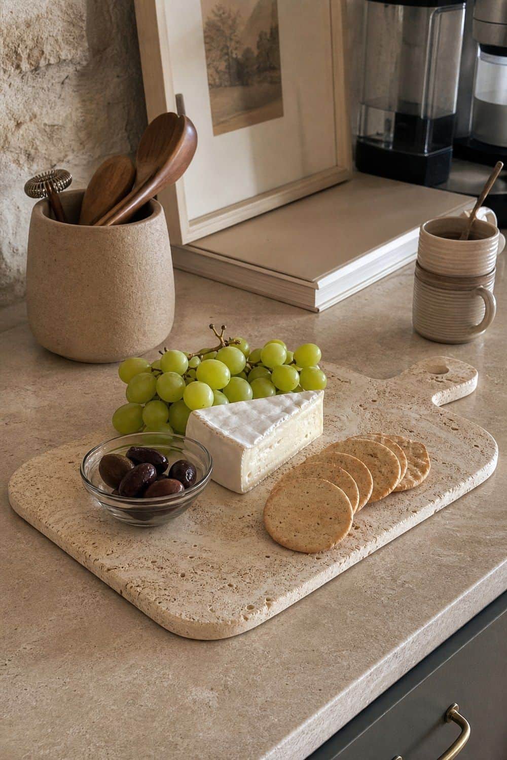
Travertine brings a warmer stone note than cool white marble, which makes it useful on a shelf, coffee corner, or serving setup. The beige movement feels soft and architectural, especially beside wood, linen, and muted ceramics. Check whether the board is sealed and approved for direct food contact before using it with cheese, bread, or fruit. If it is decorative only, place a small dish or parchment layer on top for serving. This keeps the stone useful without treating it like a cutting board.
3. Aged Brass Cabinet Pulls for Subtle Metal Warmth
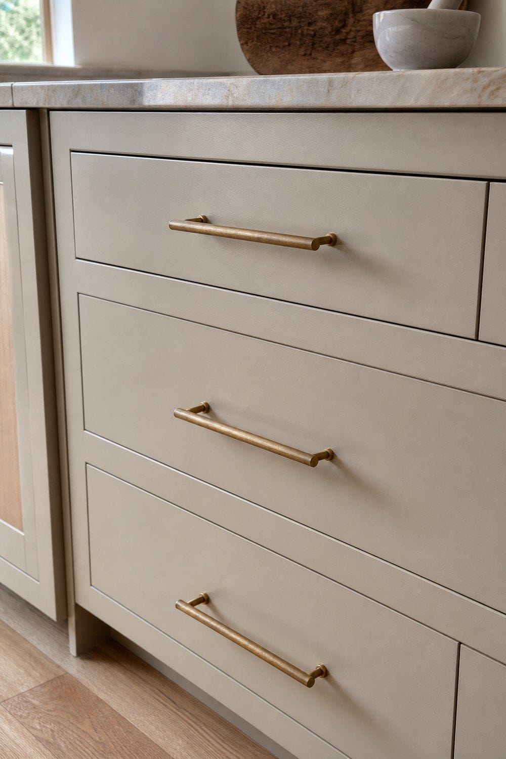
Aged brass pulls can make plain cabinets feel more tailored without the glare of bright gold. Look for a slim, weighty profile with a soft brushed or antiqued finish, then match the screw spacing to the holes already in the doors and drawers. Order one sample first if the cabinet color is hard to match.
Hardware is one of the easiest ways to make a kitchen look more expensive without changing the cabinets. Keep the shape restrained so the finish adds warmth rather than becoming the loudest thing in the room.
4. Unlacquered Brass Knobs for a Living Finish
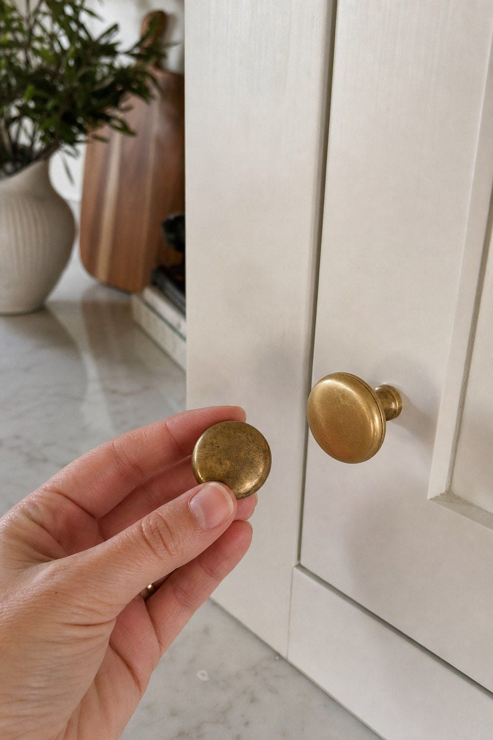
Unlacquered brass knobs add a small detail that changes with touch, air, and daily use. The finish develops patina over time, so it suits kitchens where a little variation feels richer than a perfectly identical shine. Use them on drawers, upper cabinets, pantry doors, or a freestanding piece where the scale is small. If you want the brass to stay bright forever, choose lacquered hardware instead. The appeal here is the gradual softening, not a showroom finish, so expect fingerprints and darker edges.
5. Linen Cafe Curtains for Soft Filtered Light
Linen cafe curtains soften a sink window while keeping the room light and tailored. Warm white, oatmeal, mushroom, flax, or greige linen fits the quiet-luxury palette better than busy print or shiny fabric. Check opacity, washability, and length before buying. The curtain should clear the faucet, sill, and splash zone, and the rod should feel simple enough to disappear into the window. A little filtered light can do more than another counter object, especially if the hem hangs neatly beside stone or wood.

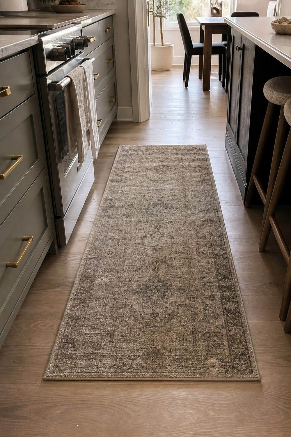
6. Wool Kitchen Runner for Tonal Floor Softness
A wool runner gives a galley or work aisle a richer textile layer than a thin synthetic mat. Low pile matters in the kitchen because cabinet doors, stools, and feet need to move easily. Choose tonal patterning that hides crumbs without making the floor look busy, and avoid long fringe near appliance doors. Use a rug pad if the runner shifts near the sink or stove. Muted taupe, charcoal, oatmeal, warm gray, or softened stripe patterns will usually feel more refined than high-contrast designs.
7. Ribbed Glass Drinking Glasses for Quiet Shelf Texture
Ribbed glasses add texture to open shelves, bar cabinets, and everyday place settings without relying on bright color. Clear glass is the most versatile, while smoke or amber glass can look richer beside walnut, brass, or stoneware. Before buying a full set, check dishwasher safety, rim thickness, and stackability. The glasses should feel good in the hand and fit the cabinet, not just look good in a photo. Repeating one glass style also keeps shelves calmer and makes replacements easier.

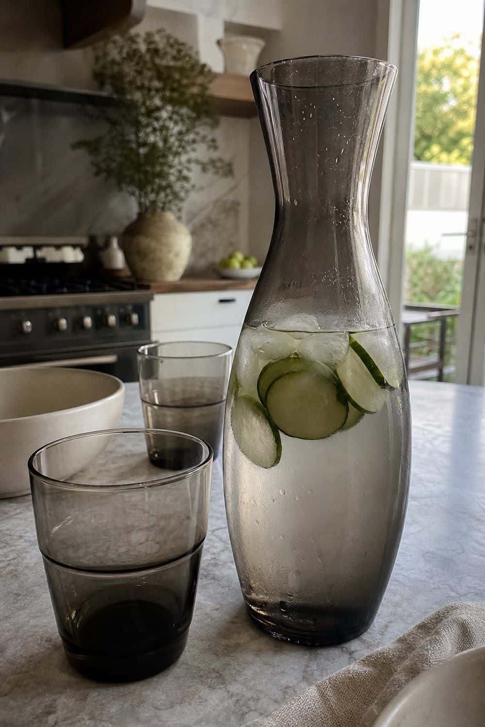
8. Smoked Glass Carafe for Table Water
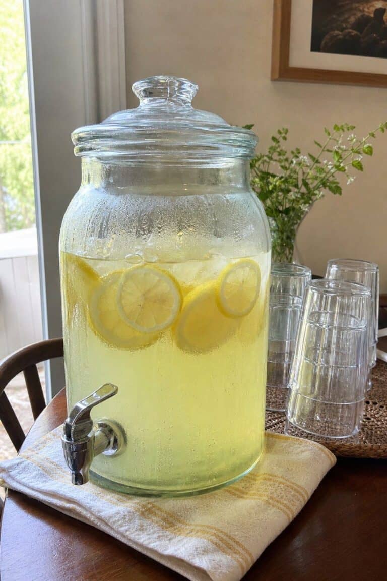
A smoked glass carafe makes everyday water, iced tea, or citrus water feel more considered at the table or island. The darker glass has depth without shouting for attention, especially when paired with plain drinking glasses and neutral dishes. Look for a shape that pours cleanly and fits in the fridge door if you plan to chill drinks ahead. Keep the styling simple: water, ice, lemon, cucumber, or tea is enough. Ornate tableware around it can make the look feel forced.
9. Stoneware Dinnerware Set for Understated Meals
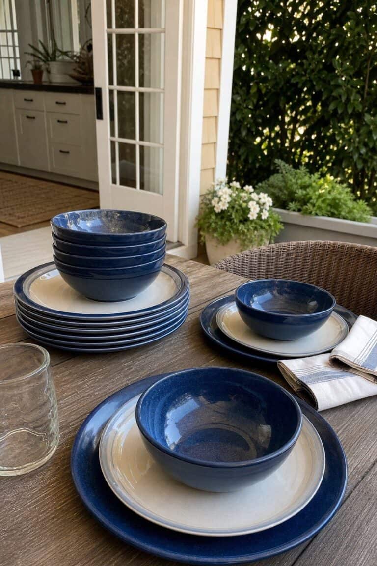
Stoneware dishes create a calm base for shelves and meals because the finish feels solid and useful. Warm white, taupe, mushroom, charcoal, or softly speckled glazes support the look better than glossy patterns or high-contrast rims, especially when the pieces are stacked in a visible cabinet.
Check the weight, dishwasher safety, microwave safety, and how easily plates stack. A dinnerware set should work for weekday meals, not sit untouched because it feels too precious. A low, softly glazed stack can make open shelving look finished.

10. Porcelain Serving Bowl for a Clean Centerpiece
A porcelain bowl can hold fruit, bread, salad, or simple table food while keeping the counter line clean. Low, wide shapes work well on islands because produce stays visible instead of hiding in a deep pile. Choose ivory, warm white, mushroom, gray, or a soft hand-thrown look if the rest of the kitchen already has stone and wood. The bowl should earn its space by serving food or holding produce, not just acting as a blank object in the middle of the counter.
11. Walnut Cutting Board for Rich Counter Contrast
A walnut board adds a dark wood plane behind the counter and can still work for prep or serving. Lean one board against the backsplash near the stove, coffee station, or bread area instead of stacking several boards that compete with each other. Pick a thickness that stands securely.
Walnut needs hand washing and occasional oiling, so it is best for someone who will care for the wood. The deeper tone creates more contrast than pale utility boards while still feeling natural and quiet.

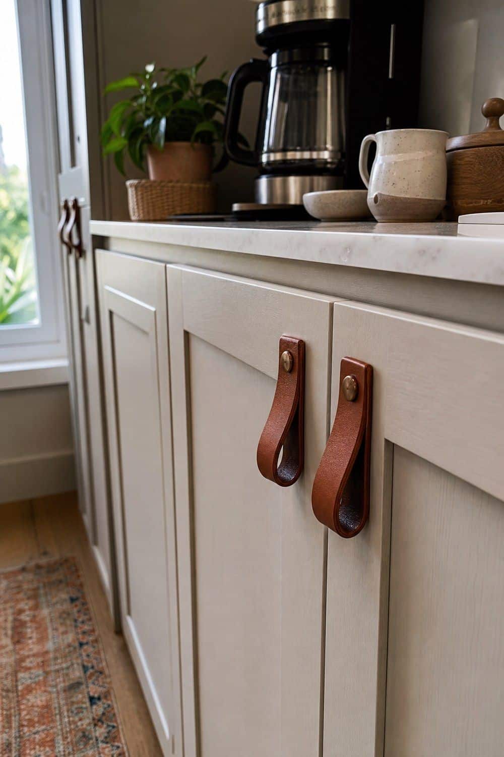
12. Leather Cabinet Pulls for a Soft Custom Detail
Leather pulls can make a pantry, coffee bar, side cabinet, or freestanding storage piece feel custom. Use them in low-splash zones where water, oil, and heavy cooking residue will not hit the material every day, and choose screws that sit flush against the strap.
Check screw spacing, leather thickness, and how the pull feels under tension. Black, cognac, taupe, or dark brown leather pairs well with wood and neutral cabinetry. This is a small detail, so it should feel tactile rather than decorative.
13. Fluted Glass Pendant Light for the Island
Fluted glass lighting adds architecture over an island or table without the noise of a flashy chandelier. The ribbed texture diffuses light and gives the fixture presence even when the color palette stays quiet. Measure the island, ceiling height, and sightlines before choosing a size. Warm bulbs are important because cold light can make glass and stone feel harsh. Brass, bronze, or black hardware will usually pair better than bright chrome in this style, especially near warm cabinetry and stone counters.
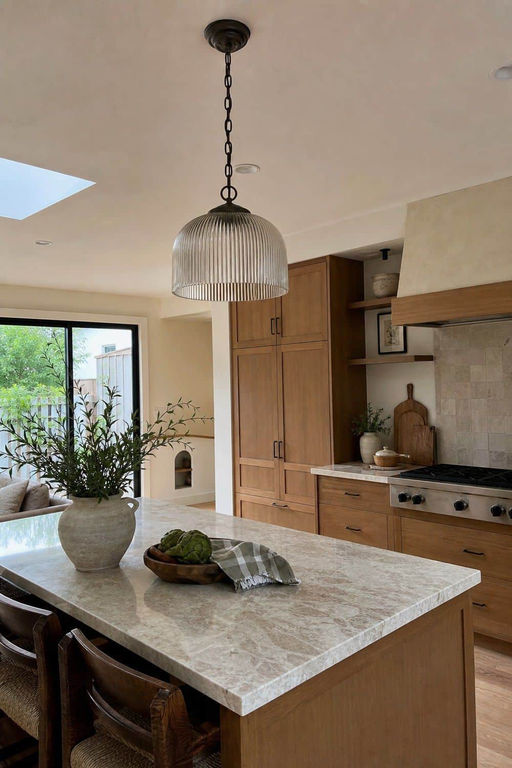
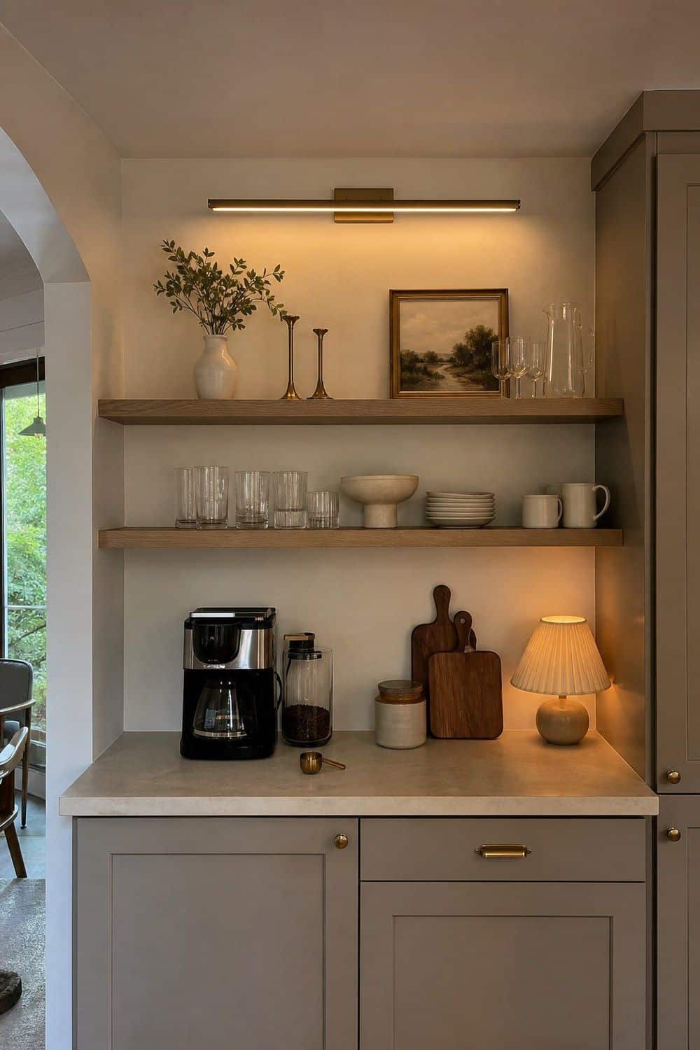
14. Picture Light for Open Shelves or a Coffee Bar
A slim picture light can make open shelves, artwork, or a coffee bar feel designed without adding another object to the counter. It is a subtle lighting layer that works especially well above restrained shelves with glassware, bowls, or one small vase, and it can make a plain niche feel finished.
Choose plug-in or hardwired depending on the wall and budget. Warm color temperature matters, and visible cords should be managed neatly. The light should wash the area softly, not spotlight every item like a display case.
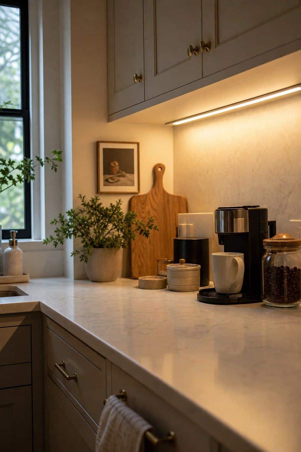
15. Under Cabinet Lighting for a Seamless Prep Glow
Hidden under-cabinet lighting makes counters easier to use and more finished without adding visible decor. Warm white light is usually better than cool blue light because it flatters stone, wood, brass, and neutral paint during prep.
Look for even coverage, hidden cords, and a profile that stays tucked under the cabinet edge. This upgrade supports the invisible-kitchen feeling because the light improves the room while the fixture itself stays quiet. It is especially useful near prep zones and coffee corners.
16. Glass Canisters with Brass Lids for Pantry Display
Glass canisters with brass lids can store coffee, tea, sugar, snacks, or baking staples with a refined shelf line. Use a few repeated sizes instead of filling the whole shelf with containers, because too much repetition can become visual clutter. Airtight seals matter more than the metal finish if food is going inside. Keep labels small or skip them when the contents are obvious. The result should be a clean pantry display that still protects what you actually use daily.

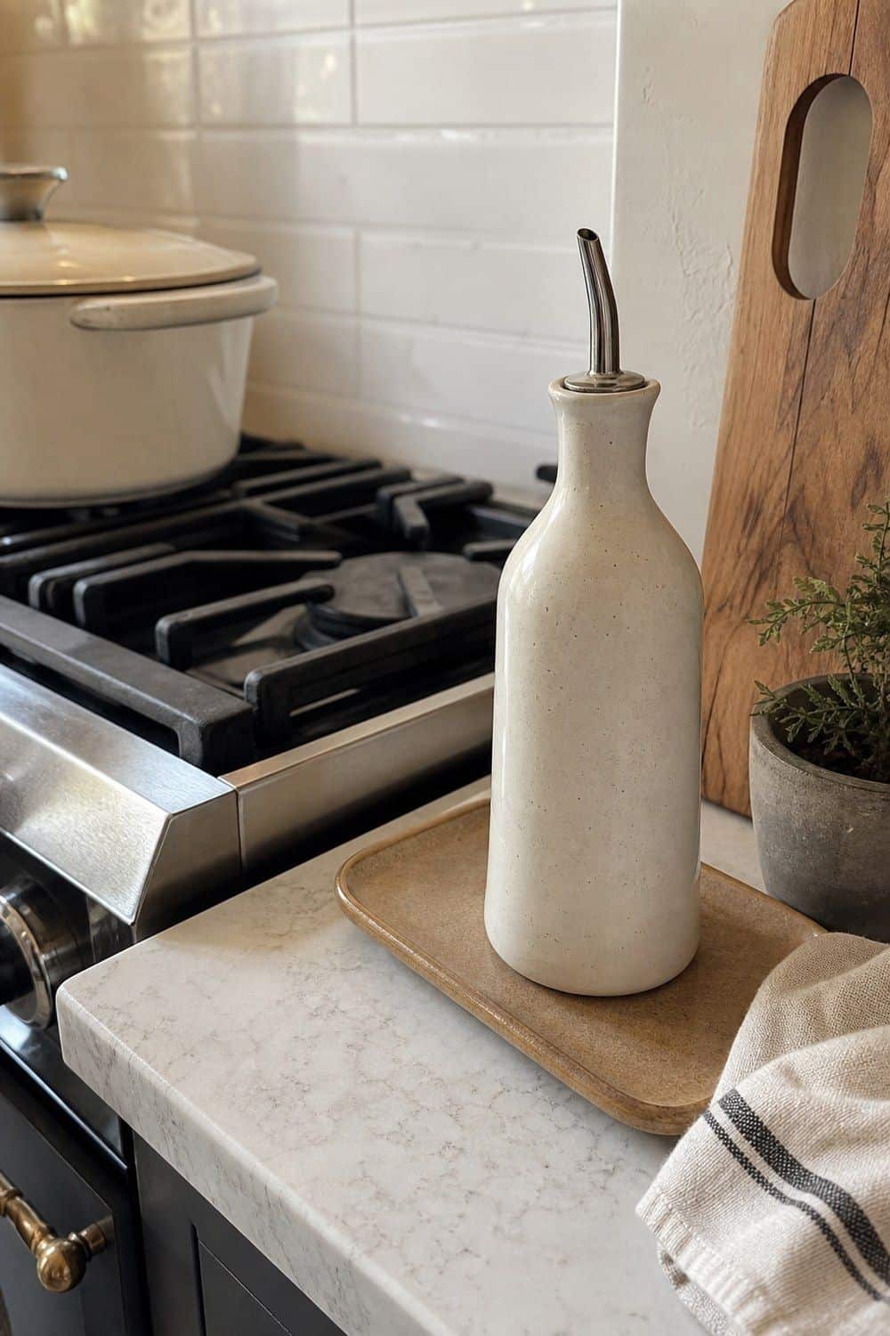
17. Ceramic Oil Dispenser for a Cleaner Stove Zone
A ceramic oil dispenser keeps olive oil near the range while making the stove zone look calmer than a branded bottle. Choose neutral ceramic, a non-drip spout, and a size that matches how quickly you use oil, then place it away from direct burner heat.
Do not buy an oversized dispenser if it will sit for months near heat and light. A smaller bottle that gets refilled often is usually better for freshness. Place it on a tray or wipeable surface if splatters are common.
18. Marble Salt Cellar for Cooking Ritual
A marble salt cellar is a small stone accent with a real cooking purpose. It keeps salt close to the prep board or stove, and the weight makes it feel more substantial than a flimsy container. Look for a lid that opens easily, enough room for the salt you use most, and a surface that can be wiped clean. Built-in spoon storage is useful if you prefer not to pinch salt by hand. Keep it away from steam so the salt stays dry.

19. Cashmere Kitchen Towels for a Tonal Textile Layer
Cashmere here means the color family, not actual wool towels for messy kitchen work. Look for cotton or linen towels in taupe, mushroom, oatmeal, greige, or warm ivory to soften an oven handle, sink rail, or open shelf without adding pattern noise or seasonal color.
Choose towels that can be washed often and still look good after real use. A tonal towel stack feels more refined than bright seasonal prints, especially when the kitchen already has stone, wood, and brass details.

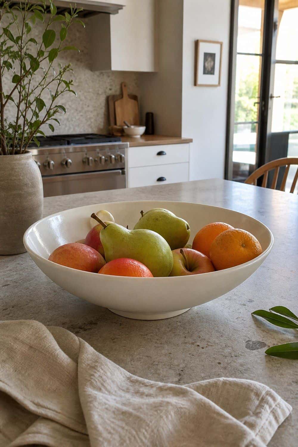
20. Minimalist Fruit Bowl for Island Styling
A restrained fruit bowl keeps produce visible while giving the island a sculptural line. Low shapes in stoneware, wood, metal, or porcelain usually work better than tall bowls that hide bruised fruit at the bottom. Use it for fruit that will actually be eaten: apples, pears, citrus, or market produce that can sit at room temperature. The bowl should look clean when full and still make sense when nearly empty, without needing extra objects around it for balance or height.

21. Bronze Bar Stools for a Tailored Island Edge
Bronze counter stools can give an island a tailored edge, especially beside warm wood, stone counters, or neutral cabinetry. Measure seat height carefully so the stools fit under the counter and leave enough room for knees, elbows, and walkway clearance on busy sides.
Backless stools tuck away more easily, while low backs are better if people linger at the island. Look at footrest placement, frame finish, and seat material before buying. A dark bronze frame is often quieter than shiny gold.

22. Oak Floating Shelves for a Controlled Display
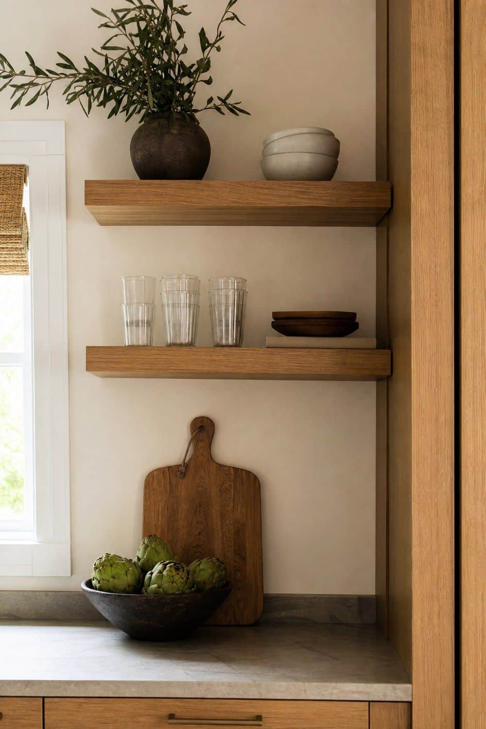
Oak shelves add natural warmth while giving daily pieces a more considered place to live. Keep the display narrow: glassware, one bowl stack, one board, or a small vase is usually enough. Match the wood tone to nearby floors or stools if possible.
Check weight rating, bracket style, and shelf depth before installing. Open shelving only feels luxurious when it is controlled and useful. If every mug, jar, and object goes up there, the effect becomes storage overflow instead of design.
23. Low Ceramic Vase for Sculptural Branches
A low ceramic vase adds one organic shape to an island, shelf, or dining table without taking over the room. Branches, olive stems, or a single seasonal arrangement fit the look better than lush flowers in many colors.
Choose a vase with enough weight that it will not tip when stems lean. Matte white, stone, taupe, gray, or dark ceramic can bridge wood, metal, and glass details. Keep the arrangement low enough that it does not block conversation or prep space.

24. Marble Lazy Susan for a Refined Coffee Corner
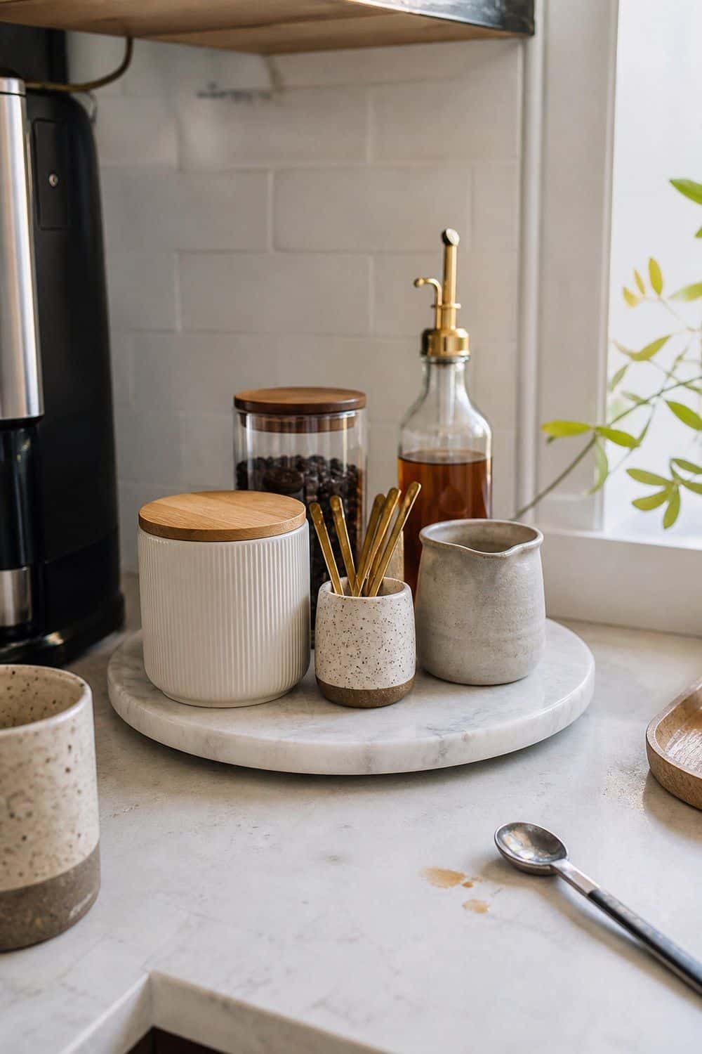
A marble lazy Susan can organize syrups, tea, coffee supplies, mugs, or small jars while adding a quiet stone detail. It fits a coffee corner, pantry shelf, or counter corner where rotation makes items easier to reach. Check diameter, weight, and how smoothly it turns before loading it with glass bottles. Keep the selection limited so the stone reads as refined storage, not a spinning pile of supplies. Wipe coffee and syrup spills quickly, especially on unsealed or honed marble surfaces.
25. Linen Placemats for Everyday Dining Polish
Linen placemats add a refined fabric layer to breakfast nooks, islands, and casual dinners without making the table feel formal. Oatmeal, greige, ivory, mushroom, taupe, or charcoal sets are easy to pair with stoneware and simple glassware, especially in a tonal table setting. Check washability and storage before buying a full set. Everyday placemats should fold or stack neatly and survive real meals. If the fabric wrinkles a little, that can feel relaxed rather than messy when the color palette stays quiet.

Other Quiet Luxury Kitchen Decor Tips Worth Knowing
Quiet luxury differs from flashy luxury because it relies on fewer objects, better materials, quieter colors, and no obvious logos. Tonal color helps: warm white, oatmeal, taupe, mushroom, greige, charcoal, walnut, bronze, and soft brass usually feel calmer than hard black-and-white contrast or bright metallic shine.
To make a kitchen look more expensive without remodeling, start with hardware, lighting, counter organization, textiles, tableware, and shelf restraint. Keep the kitchen livable by choosing pieces that store, serve, light, hold, soften, or improve a daily routine.
Frequently Asked Questions
What makes kitchen decor feel like quiet luxury?
Quiet luxury kitchen decor feels restrained, material-led, and useful. It usually uses stone, linen, wood, ceramic, warm metal, glass, soft lighting, and tonal colors instead of logos, shiny finishes, novelty pieces, or crowded counters.
What should I buy first for a quiet luxury kitchen?
Start with pieces that improve visible daily zones: a marble tray, aged brass pulls, linen cafe curtains, ribbed glasses, under-cabinet lighting, a walnut board, or a ceramic oil dispenser. Useful upgrades will look better than decorative filler.
How do I make a kitchen look expensive without remodeling?
Replace dated hardware, add warm hidden lighting, simplify counter objects, use better towels, choose calmer tableware, and group small items on stone or wood trays. The room looks more refined when everyday pieces are fewer and better chosen.
What colors work best for quiet luxury kitchen decor?
Warm white, ivory, oatmeal, greige, mushroom, taupe, walnut, bronze, charcoal, muted stone, and soft brass tones work well. The palette should feel layered and calm rather than stark, glossy, or overly high contrast.
Is quiet luxury kitchen decor the same as minimalism?
Not exactly. Minimalism focuses on reduction, while quiet luxury focuses on restraint, quality materials, and refined daily objects. A quiet luxury kitchen can still feel warm, layered, and lived in when the pieces have real purpose.
What materials should I look for in quiet luxury kitchen accessories?
Look for marble, travertine, walnut, oak, linen, ribbed glass, smoked glass, aged brass, unlacquered brass, bronze, porcelain, and ceramic. Matte, honed, brushed, or softly glazed finishes usually fit better than high-gloss options.
How do I keep quiet luxury decor from feeling cold?
Balance stone and glass with linen, walnut, oak, warm bulbs, ceramic, and soft brass. Keep some useful pieces visible, such as a board, bowl, towel, or carafe, so the kitchen does not feel like an unused showroom.
Can quiet luxury work in a small kitchen?
Yes, quiet luxury can work in a compact kitchen when the pieces are useful and scaled carefully. Try one stone tray, better hardware, linen curtains, ribbed glasses, warm lighting, or a refined towel set instead of adding many decorative objects.
Final Thoughts
The best quiet luxury kitchen decor finds make everyday routines look calmer and feel better. Choose restrained materials, tonal colors, warm lighting, useful storage, and a few tactile details that suit the way you cook, serve, and gather. The result should feel refined, not staged.
Last update on 2026-11-07 / Affiliate links / Images from Amazon Product Advertising API